17.10.19
Now even Better
Behind the scenes of the Better brand refresh. For over ten years we’ve been building remarkable brands rooted in relevant strategic thinking, but a lot has changed since 2009.
 Written by John Taylor
John Taylor
Written by John Taylor,
Creative Director
Back then The Spice Girls had just finished a reunion tour, Donald Trump was being taken to court and Boris Johnson was in a position of power in London.
Nowadays the world is a very different place. Ah … wait … ok, maybe things haven’t changed all that much. But we definitely have.
The last decade has seen us relocate to our Middlesbrough studio, develop our BetterBrandBuilder™ process, continue building our team with amazing local talent and strengthen our board. Most importantly however, as our skills and processes have evolved, our output has matured and our client base has too. As we continue to support long standing local clients like PD Ports, Active and NECS we have also gone nationwide, branding property developments across London with Metropolitan Thames Valley Housing, modernising a 500 year old maritime institution with Trinity House and even refreshing Europes’s best selling kombucha with Equinox.
Amongst all this growth and progress, there was one thing that hadn’t got much better; our own brand. In amongst all our hard work, we’d lost sight of our own brand story and image. It’s an easy mistake to make when you’re focused on doing what you do. The phone never stops, there’s project to deliver, timescales to meet and clients to delight.
Better is an award-winning brand agency born in the North East.
Our ten year anniversary gave us the opportunity we needed, a chance to reflect. We realised that the quality of service and the product we provide had long outgrown our original brand and it was time to make our brand better.

Rediscovering our brand story
Our first step was to run an extensive Discover process, interviewing clients and team members alike, to take stock not only of what has changed but what has stayed the same. A brand refresh isn’t about throwing the proverbial baby out with the bath water, so we asked, “Which qualities have we hung on to that have helped us get where we are?”
Our redefined WHAT is simple, it describes what we do, to what standard and also hints at a crucial part of our DNA, all in 12 words. We’re all about spreading our wings and rising to meet new challenges, wherever they appear on the map. But we also know that where we started has played a huge part in where we’ll end up. For us, being born in the North East gives us a very specific personality, mindset and approach. It’s something we want to stay true to, no matter how far we travel. This an essential part of who we are.
We make remarkable, relevant brands with real results. Our relentless search for ways to grow, learn and improve means that we always try to live up to our name.
Defining HOW that feels authentic and differentiated is often something organisations struggle with. It sounds obvious to say that clients expect ‘remarkable’ and ‘different’ work from agencies, of course they do, but being different for the sake of being different is as bad as blending in. Better is absolutely focused on crafting remarkable creative work, but the brief and strategic basis for it must be authentic, evidence based and insight driven. When we create work that is authentically relevant and creatively remarkable, we get real results.
With every brand we build, our words are chosen carefully. ’Remarkable’ is a good example; it’s a superlative of sorts, describing something striking and worthy of attention. But it is also something that is taken note of and talked about. These are both essential qualities for a successful brand. When we’re solving a visual problem, remarkable for us means something that surprises us, maybe even makes us nervous, because we know that is how you get attention, get talked about and create stand-out work.
Personality goes a long way
We often talk about the importance of Brand Archetypes in defining brand personality. Depending on what the sector is, sometimes these can be one of the biggest differentiating factors.
During an analysis of competitors language we found that 30 leading brand agencies fell into just five categories with their claims. Amongst them they promised: Meaning, Simplicity, Disruption, Intelligence and Results. In reality most of them promised a blend of these. That’s because this is exactly what every good brand – and indeed every good brand agency – should have.
In an ideal world, every brand would have an easily definable and earth-shatteringly disruptive element that makes it stand out from the crowd. But the reality is … sometimes they don’t. Sometimes the reason one four-piece rock band is more successful than another is down to the personalities that write and perform the songs, rather than the pencils and instruments they use.
There’s plenty of businesses whose core functionality is 80% the same as the brand next door but it’s that 20% difference that can make all the difference. That’s why Brand Personality is so important. Personality is a two-way street, it doesn’t just effect how you look, it effects how you talk, how you act and how you think as a brand. So yes, your brand should project its personality, making it externally visible and audible to your audience, but it also needs to live that personality, reflecting it internally and allowing it to inform the culture you make and the decisions you take.

During our process, Better’s brand archetype was defined as ‘a creative seeker’, open minded and self reliant, always searching for a better way. Our lead archetype ‘seeker’ is powered by ‘creator and the ‘everyman’. Down to earth resourcefulness coupled with non-linear thinking and aesthetic creativity. This archetype blend, along with our WHAT and HOW, helped to inform our Brand Personality.
Sometimes agencies can be perceived as superior and difficult but we always try to act as equal partners with our clients. Neither dictators nor servants, we aim to be collaborators. That works best when we listen, understand and make friends. There can also be a misconception that creative agencies are all about the latest trends and style over substance but instead we’re thoughtful, considered and logical. Our design thinking may be distinctive but it’s always underpinned by a structured rationale and insight.
And finally we’re gritty. What does that mean? Well, wherever we may end up, we were forged in the North East, in the building that built the world. It’s a region that breeds hard grafters and master crafters, bold and brave people who aren’t afraid to get stuck in or get their hands dirty. We say what needs to be said and do what needs to be done.
It’s the blend of all these qualities that have helped us succeed over the last ten years and will continue to see us succeed for many more. It’s why we seek out people with a specific mindset: ambitious, open minded and value driven change-makers. They’re our perfect partners and we’ve found them in every sector. Just like us they can appreciate what it takes to truly make brands better.

Visual volume
Approaching the visual look and feel for a brand agency presents another interesting challenge; visual volume. Depending on the sector we often find that visuals need to operate at different volumes to work in harmony with visuals of a clients product or service. With a branding agency this challenge becomes a bit of a paradox. On one hand an agency needs to have a brand that is distinctive and different enough to be both meaningful and recognisable. And yet they also need a brand that is recessive and neutral enough to frame their work; which consists of other peoples brands, each distinctive and different in its own unique way.
Some agencies solve this by having a very distinctive ‘house style’ that runs through all of their work, making anything they do immediately identifiable, which in turn allows them to brand themselves with a matching style. Most agencies don’t do this however, instead the final execution and design rationale of the work they create is led entirely by their response to each creative brief. This means the final look and feel of all of their work will change shape and style according to the client or challenge they are dealing with.
This is exactly how we approach BetterBrandBuilder™ projects, adapting our style and response to create a relevant look that feels authentic and helps to amplify the Brand Stories we create. In many ways our clients are the stars, so in communications and especially on our website, the work has to take centre stage. The last thing we wanted was a noisy agency brand that will clash with– or distract from– the client work we are showcasing. We knew right from the start that our new brand would be relatively minimal, mostly black and white, to allow our work to do the talking. We didn’t want any large dramatic brand elements or distractions, in essence we tried to strip it back to the least amount of elements necessary, then lavish attention on the few key components we really valued.
Show, don’t tell
With such huge amount of power and meaning in our name, we felt early on that the logo should be a wordmark rather than a symbol. This triggered the search for an appropriate typeface which, of course, had to be guided by the personality traits we defined in our Brand Story. This is a perfect example of why defining a brand archetype and personality is so crucial. Having taken the decision to allow our client work to shine by deliberately reducing our brand elements and colour palette, we have to express a lot of our individuality through just a wordmark and type choice.
Typeface selection is effectively a way to reinforce brand tone and character, making your tone of voice both visible and recognisable to a reader; even before your message is read or understood.
Early wordmark exploration tried a number of different potential routes: we explored our ‘down to earth’ character through experiments with more personal handwritten wordmarks, we tried typefaces that were ‘new and improved’ iterations of our previous identity, we tested big bold sans-serif options that ‘leaned forward’ and we even tried versions where every letter was doing a different thing.
In the end the style that felt closest was a refined and sophisticated, modern serif. But while this general ‘style’ felt like a grown up version of our familiar wordmark, we wanted it to feel more uniquely ‘Better’. As a result we decided that the best way to show our in-house craft skills and convey our unique personality would be to create our own typeface from scratch.
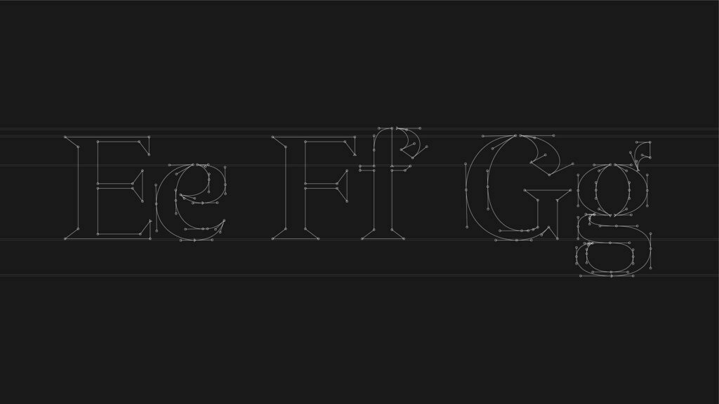
Letter construction from our own typeface
A modern serif that’s Better
Working into the definition of ‘modern serif’, we began to sculpt elements unique to us. For the lower case letter e, which stars twice in our wordmark, we softened its curves adding a sense of warmth and friendliness. Our aim was to almost make it smile.
Elsewhere this ‘modern serif’ harks back to its hand-lettered lineage, calligraphic strokes adorn the terminals of the lower case z, the tail of the y, the terminal of the f and c, the shoulder of r and the arm of the k amongst others. These subtle historical cues help to evoke a sense of craftsmanship, artistry and precision.
While the modern serifs we initially explored all had an air of intelligence, by shaping the serifs themselves into more chiselled wedges we sharpened this impression even further while helping them balance with the more calligraphic flourishes. Finally across the type face we wanted to add a subtle nod to our North East roots, so we built in and emphasised any opportunity for the typeface to feel stencil-like and industrial.


A coat of many colours
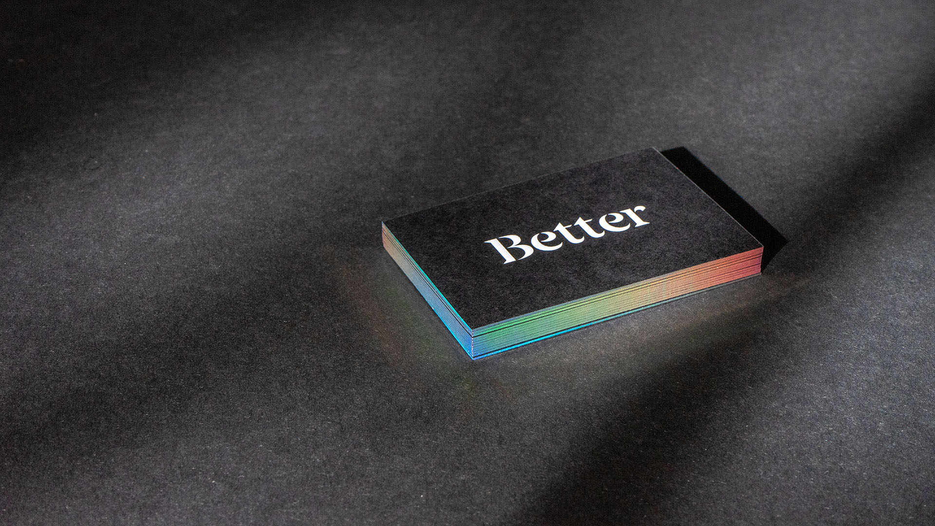
One final element that we introduced into our brand is the spectrum. While the vast majority of our look is sophisticated black and white, we wanted a way to reflect our chameleon like nature, adapting to each client and brief. Because no single colour could represent this kind of diversity, we used them all, creating a fluid spectrum that literally shifts and adapts on our website as work is selected and viewed.
This spectrum accent only really comes alive in motion but we found a way to make the effect physical on our business cards. As well as having standard foil and embossed foil, we also created a shifting spectrum by using holographic edge painting. It makes me think of a black door that is just slightly ajar … and through the crack you can see all kinds of intriguing, almost magical, lights and colours shimmering inside.

Would anyone get that though?
Now, people often say, “Yeah but would anyone get all of that if you didn’t tell them?”
Does everyone ‘get’ all of this instantly? Do they need to read a long explanation just to ‘understand’ our brand? Do they need to be designers themselves to appreciate it? Well, no, no and no. Of course most people don’t ‘get’ all of this at first glance, nor could they necessarily articulate everything we’ve written about here.
Instead, what most people say is things like, “Loving the new brand, really reflects who you are now.” Or “Really impressed with what the guys at Better have done with their new brand.”
As interesting as it is to peek behind the scenes of any brand build, when our job is done right, the audience doesn’t need to ‘know’ the ins and out of why we’ve done what we’ve done. We consider every stylistic element so that they don’t have to. As long as all these micro-signals within brand elements are carefully considered, curated, crafted and all stem from an authentic story; the audience doesn’t need to understand it because they will feel it.
They will ‘get’ it, but they will ‘get it’ instinctively in their heart and in their gut, we are here to trigger the right reaction from an audience before they even get time to think. That’s why spent so long perfecting our own typeface.
Does anyone need to know that? No. They just say “Wow,” when we hand them our card. Because that’s exactly what we want them to feel when they work with Better.


