Refreshing Europe’s best selling kombucha
Client
Equinox / Flower of life
Project
The Equinox Kombucha Rebrand
Services
Sector
The Brief
With ambitious goals to double production and increase revenue 500% by 2020, Equinox needs to step out of a limiting ‘health drink’ silo. The challenge here is to create a credible, relevant soft drink brand capable of not only championing an emerging category but growing far beyond it.
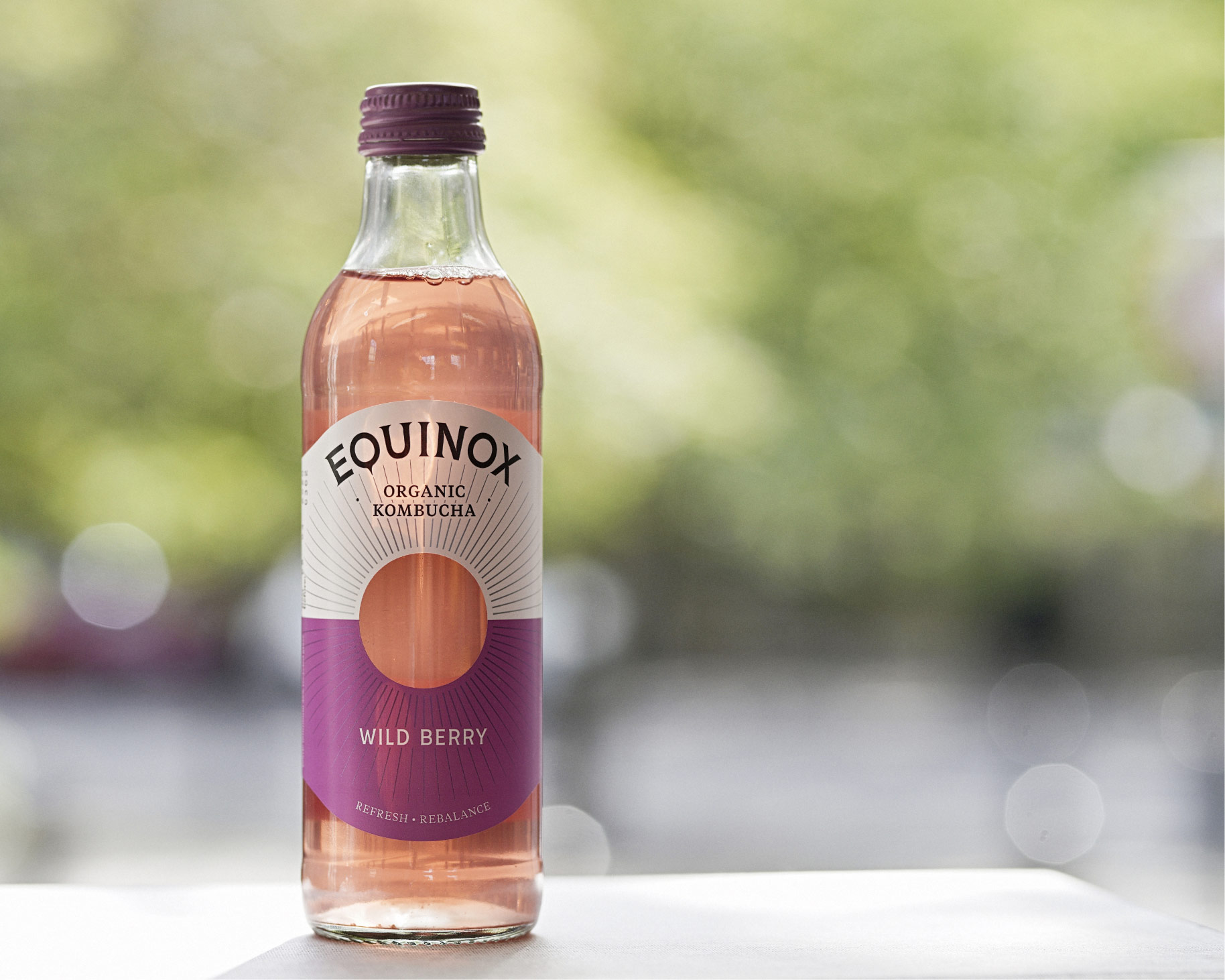
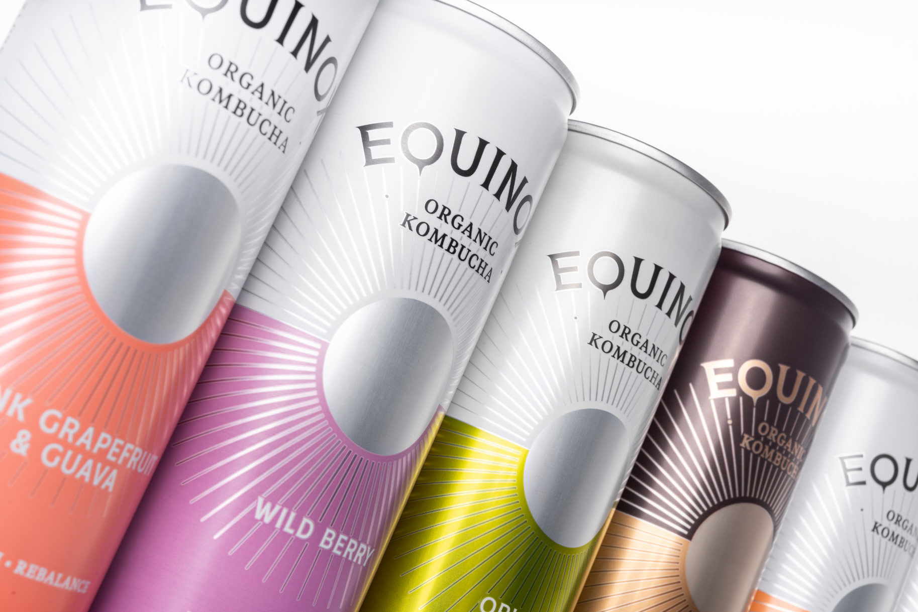
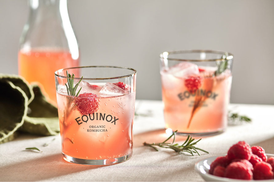
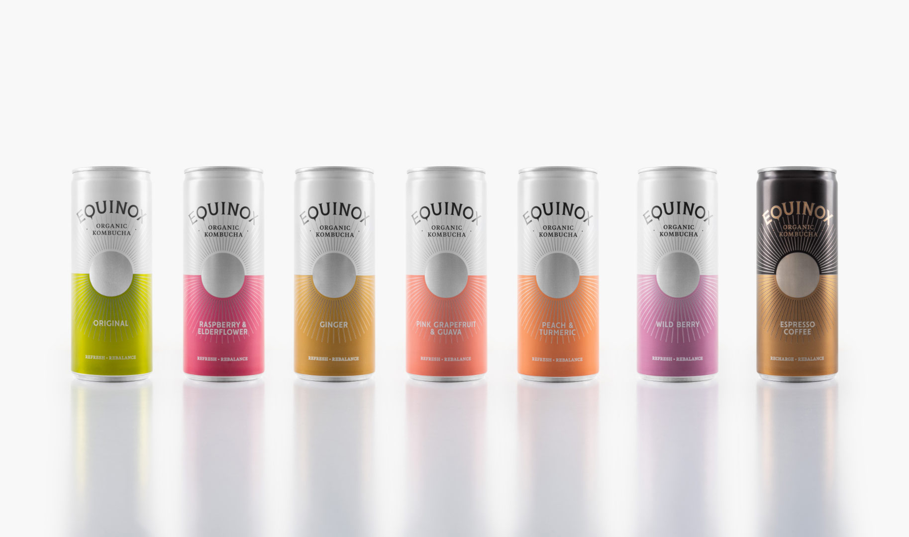
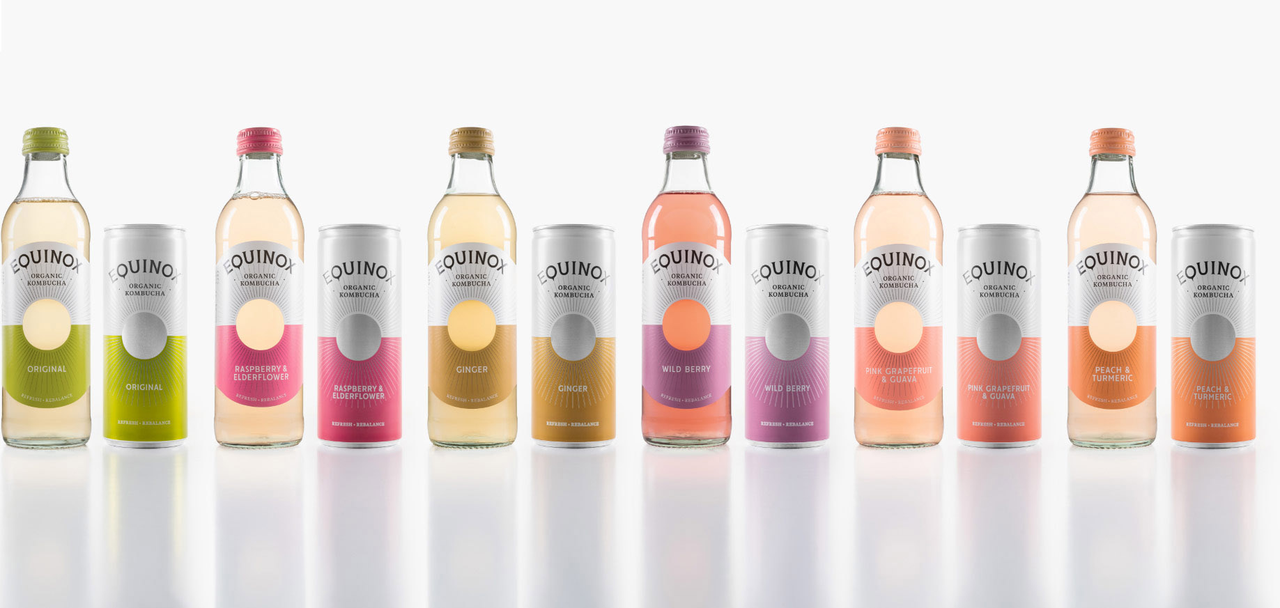
With a unique production method and blend, growing flavour range and low sugar content; Equinox Kombucha is a distinctive and authentic healthy adult soft drink alternative. Already the number one selling Kombucha in the UK and Europe, the brand had reached a tipping point. To grow further and create mass appeal, Equinox acknowledged the need to clarify their story and refresh their look and feel.
The Solution
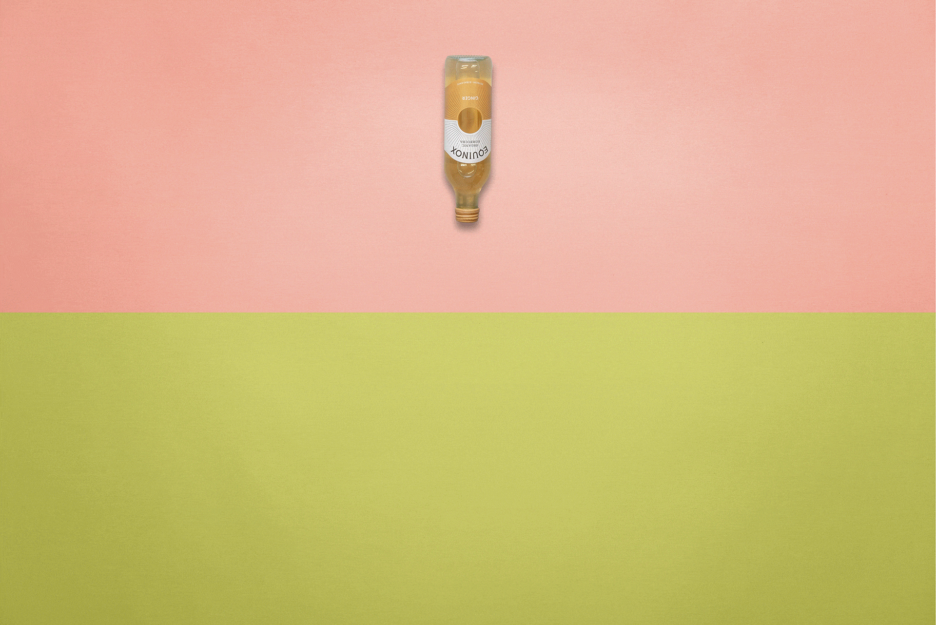
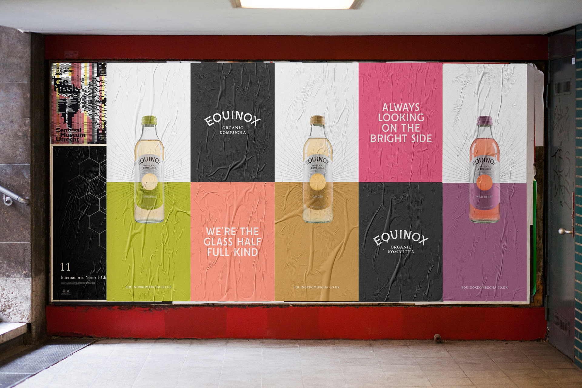
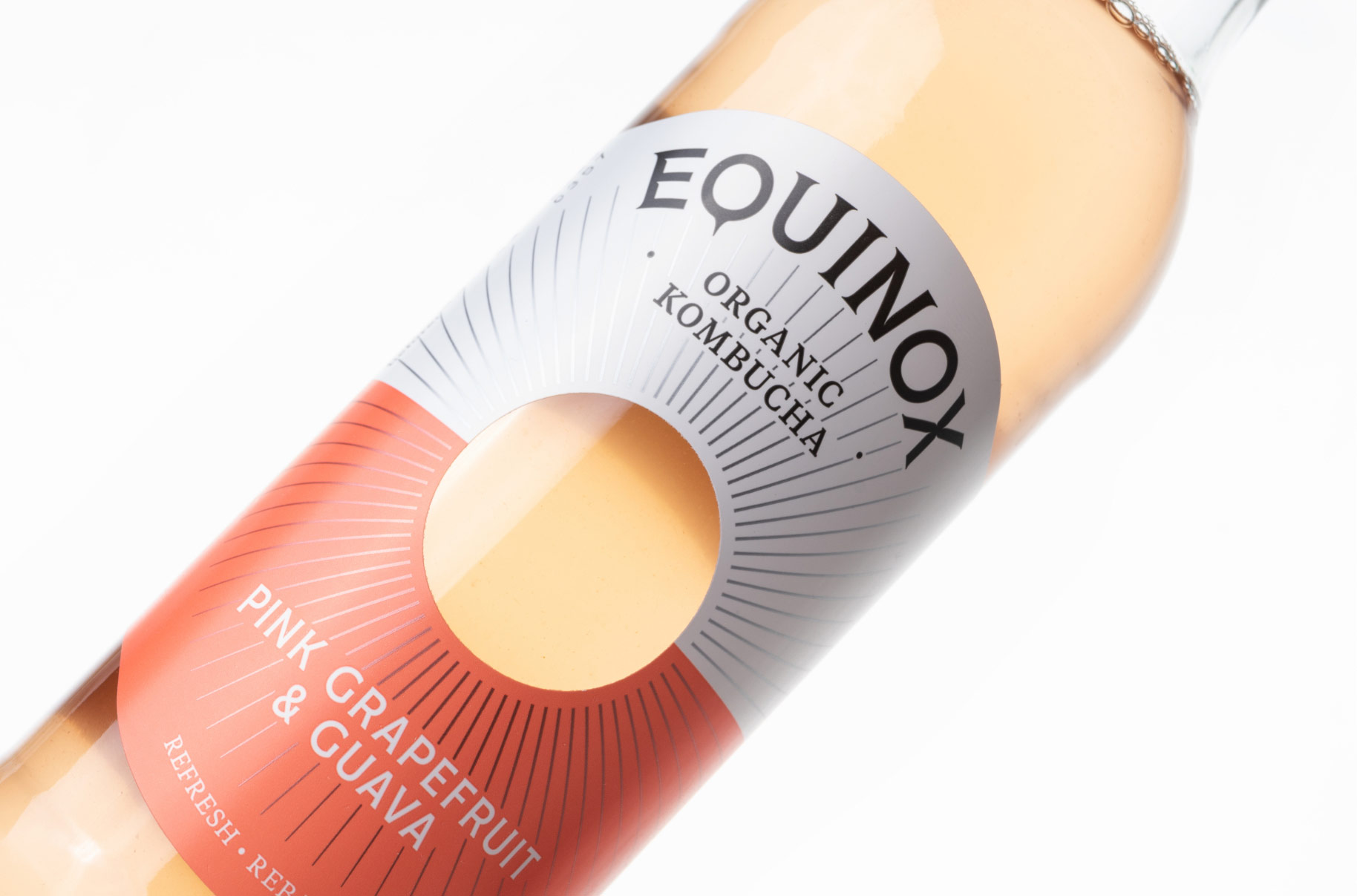
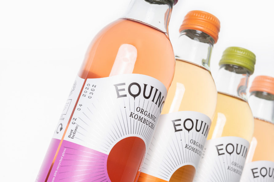
The existing brand was viewed as “a bit GCSE” during consumer research but more importantly, it was becoming an unnecessary barrier to listings. Alongside this, the generic alcopop bottle shape was sending the wrong signal to consumers unfamiliar with kombucha. We deconstructed existing iconography, retaining only what was useful, then rebuilt a mature, sophisticated, calm and, most importantly, balanced brand … complete with its own iconic bottle shape.
Refreshing Europe’s best selling kombucha
The Brief
With ambitious goals to double production and increase revenue 500% by 2020, Equinox needs to step out of a limiting ‘health drink’ silo. The challenge here is to create a credible, relevant soft drink brand capable of not only championing an emerging category but growing far beyond it.
With a unique production method and blend, growing flavour range and low sugar content; Equinox Kombucha is a distinctive and authentic healthy adult soft drink alternative. Already the number one selling Kombucha in the UK and Europe, the brand had reached a tipping point. To grow further and create mass appeal, Equinox acknowledged the need to clarify their story and refresh their look and feel.
With ambitious goals to double production and increase revenue 500% by 2020, Equinox needs to step out of a limiting ‘health drink’ silo. The challenge here is to create a credible, relevant soft drink brand capable of not only championing an emerging category but growing far beyond it.
The existing brand was viewed as “a bit GCSE” during consumer research but more importantly, it was becoming an unnecessary barrier to listings. Alongside this, the generic alcopop bottle shape was sending the wrong signal to consumers unfamiliar with kombucha. We deconstructed existing iconography, retaining only what was useful, then rebuilt a mature, sophisticated, calm and, most importantly, balanced brand … complete with its own iconic bottle shape.
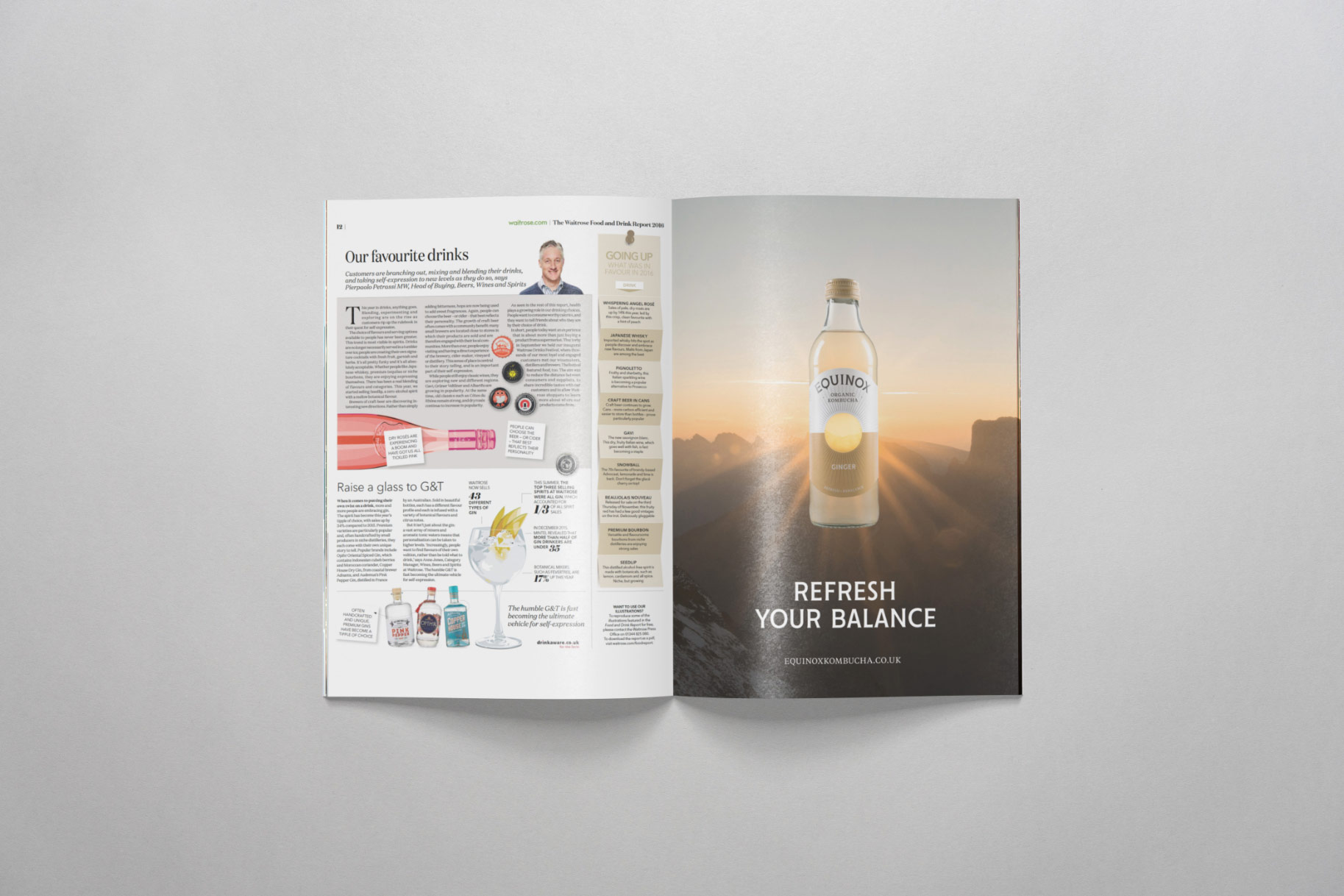
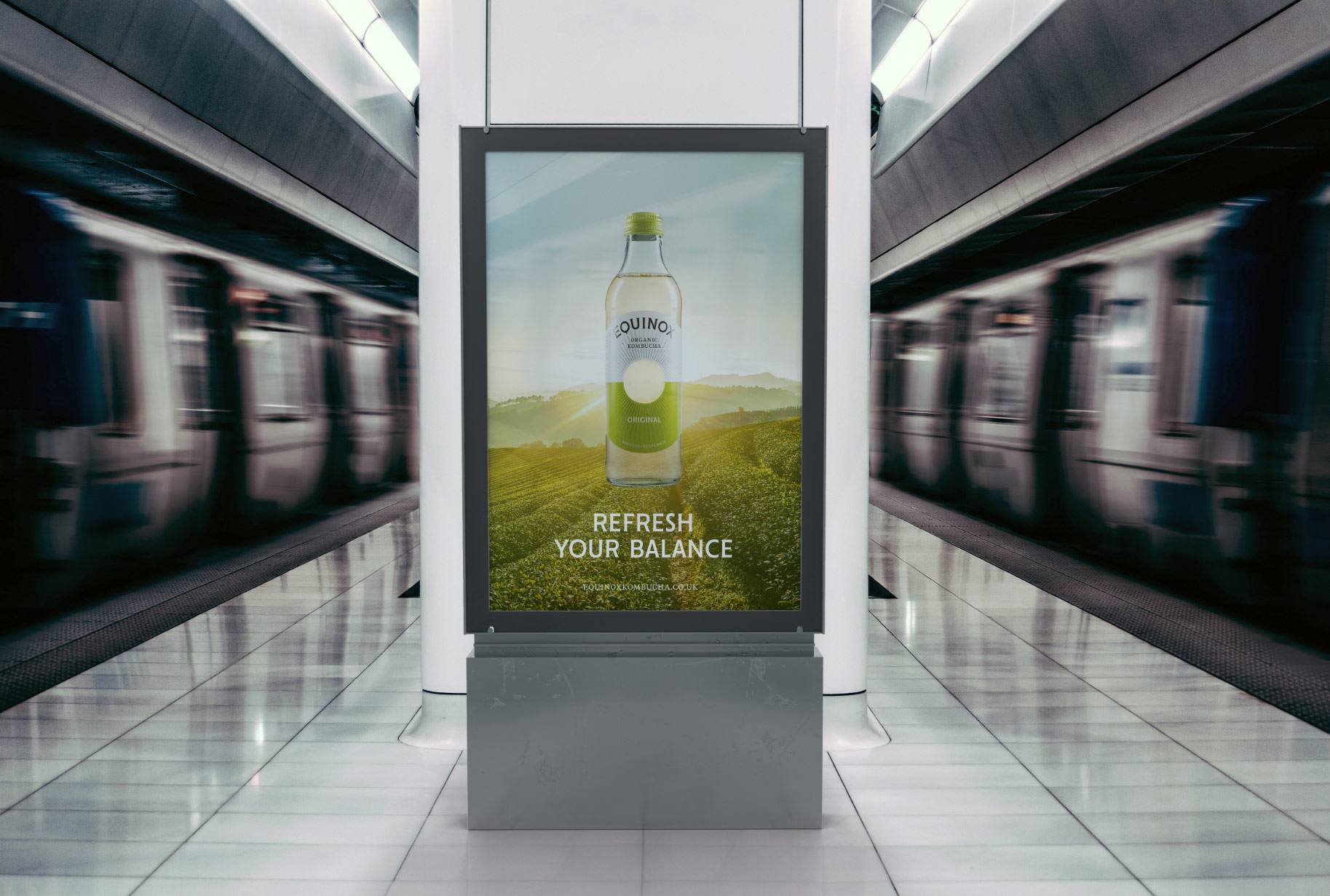
Refresh and rebalance
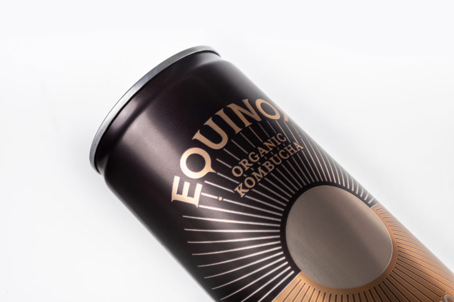
Let the sun shine
“We had grown up and it was time to change our brand look and feel to reflect this. 2018 was the year of rethinking, redesign and repositioning for Equinox. With the new brand complete, the big boys started to take notice. New partnerships with Holland & Barrett, Co-Op and Mitchells & Butler and investment from Yeo Valley.”
Daniel Spayne
Managing Director, Equinox Kombucha
“Since the new brand was launched we’ve secured additional investment from Yeo Valley and seen a 100% increase in sales within our key listings across Europe.”
Daniel Spayne
Managing Director, Equinox Kombucha