Posted in: Work

Finding balance with Equinox Kombucha – Part One

Part one of a behind the scenes look into the journey and work in creating a new brand for Europe's best selling Kombucha.

23rd September 2019

John Taylor

John Taylor

John Taylor

Written by John Taylor,
Creative Director

With a unique mix of commercial and creative talents, coupled with a wealth of experience, John leads the brand strategy and creative direction for Better’s portfolio of national and international brands.

Our case studies are awash with slick graphics, evocative imagery and lovingly crafted animations, all made to immerse the viewer in the Brand Worlds we create. But to make effective work, it needs to be relevant as well as remarkable.

There is often a huge amount of work that precedes and underpins the final visual output of any brand refresh. If the visual aspects are the highly visible tip of the iceberg, then the Discover process and the Brand Story are what lurks beneath the surface; ensuring our creative is built on meaningful foundations.

In this two part feature we will take a deep dive into the process that led to the new Equinox Organic Kombucha brand. First revisiting the Discover phase and then, in part two, demonstrating the exploration and experimentation of the Create phase.

Equinox Kombucha's previous bottle design

Equinox Kombucha’s previous bottle design

The challenges

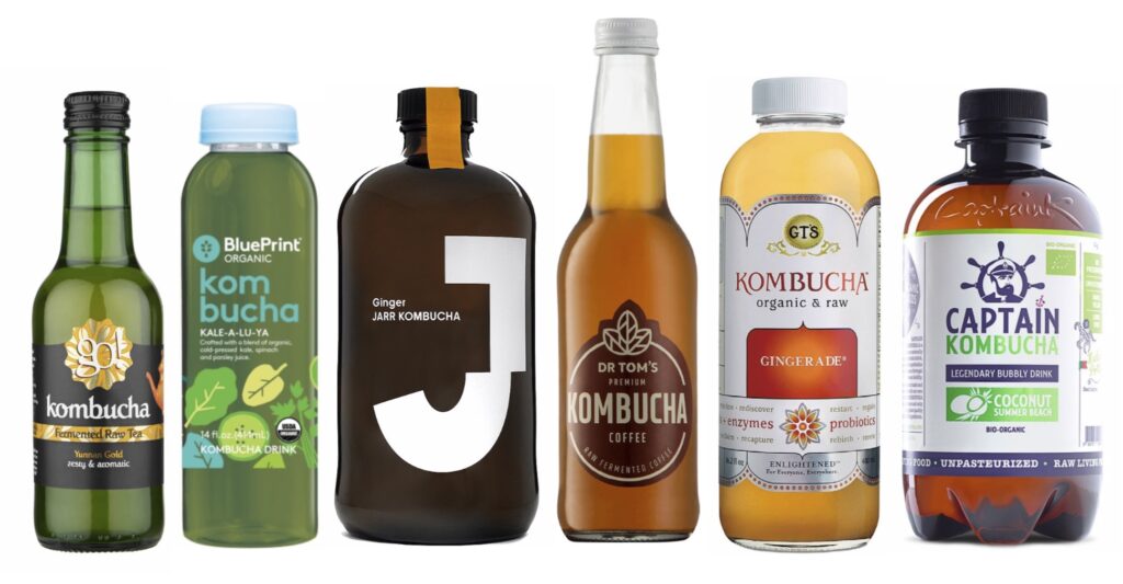
When they approached us, Equinox Kombucha were already the number one selling kombucha in the UK and Europe. Stocked in Waitrose, Able & Co, Whole Foods, Planet Organic and in over 500 independent retailers, their award winning flavours and authentic process had already won them a healthy base of even healthier kombucha converts.

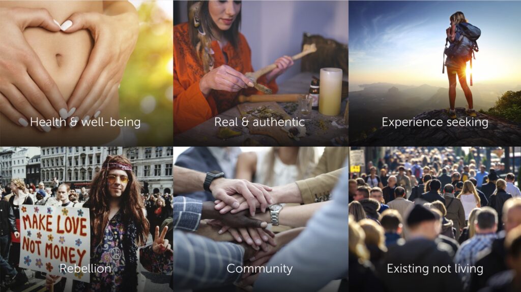
But they were at a tipping point. Major players were entering the kombucha category, awareness of kombucha in the UK was about to spill over into the mainstream and demand for a refreshing, natural and genuinely healthy soft drink had never been higher. There was a clear opportunity to grow Equinox as a brand, to champion a category but more importantly, to think beyond the category. Equinox needed a re-brand that would help them become more than ‘kombucha’ and instead be seen as a credible, relevant soft drink that could gain mass appeal.

To do this we had two challenges to solve: first of all how to describe a new kind of drink that has very few (if any) parallels. While Equinox may be the best tasting kombucha, most UK soft drinks consumers don’t even know what kombucha is.

Secondly, although the juice inside the bottle is of the highest standard … the outside of the bottle was far less refined. So much so that it was proving to be a barrier to being listed in stores.

A high altitude overview

Equinox leadership brand workshop

Equinox leadership brand workshop

As with all BetterBrandBuilder™ projects, we started with a bespoke Discover process. So before splashing down into an ocean of soft drinks, we started our journey in orbit; observing the wider global trends that drive modern consumer behaviour. By playing these back to Equinox in our initial workshops, we quickly identified which consumer influences had the most resonance with them. The three highest scoring pillars became key parts of later focus groups, as it was important that we checked that what mattered to Equinox also mattered to the public.

Equinox workshop voting exercise
Global trends and consumer behaviour

Global trends and consumer behaviour


  • Health & Well-being prompted comments about the importance of empowering people to make healthier choices as well as making that choice easy and accessible. Easy health or at least an easy ‘healthier’ option was felt to be an important part of Equinox’s promise.
  • Real & Authentic felt like a consumer trend that mapped easily onto Equinox’s DNA. They brew with integrity, don’t take short-cuts and don’t make fake kombucha. They feel like the real deal because they are.

  • Rebel Nature definitely came out as a strong mantra from the Equinox camp. The was a real sense that they were taking on huge lumbering giants whose only ‘freshness’ comes from endless revamps or flavour and colour variants rather than genuinely changing the game.

Alongside this, we mapped out the vast soft drink landscape, to identify where we could logically steal new customers from.

Clearly with a fixed number of hours in every day and a limited number of ‘drinking occasions’ within that day, you can’t continually invent new reasons to drink. Consumers have to replace an existing drink with Equinox. Fairly early on we knew that it was going to be easier to appeal to people who actively want to be healthier … it is unlikely anyone drinking full fat coke and red bull 24-7 are actively looking to make an instant switch to the opposite end of a health spectrum pilgrimage.

Equinox bottle comparison and landscape

Initial observations put us in an ideal place to compete with:

  • Bottled waters (natural, healthy but lacking in flavour)
  • Diet fizzy drinks (full of flavour but also full of unnatural artificial sweeteners)

  • Fruit juices and smoothies (full of flavour, natural but absolutely loaded with sugar)

Because we ticked all three boxes (all natural, low in sugar & calories, and refreshing flavour) as well as having novelty and intrigue on our side, there was a good chance we could attract and convert health conscious drinkers from these markets.

But to do this, our brand needed to adopt the right visual identity to lead the new world of kombucha and also fit into the established grammar of soft drinks and waters.

The local landscape

Next, amongst a churning sea of soft drinks, we needed to chart the new and slightly chaotic island of kombucha.

The local landscape for Equinox

The local landscape for Equinox


Because kombucha is still an emerging category in the UK there are really no established aesthetic codes or visual grammar to identify it. However, there are a few emerging visual trends or directions that we could clearly observe and perhaps test.

  • Kid Bucha These brand of kombucha have radioactive vibrance, cartoonish colours or childlike illustrations that feel like a kids tv channel.
  • Doctor Onboard These kombuchas attempt a bizarre medicinal-nautical mash-up. Often in brown glass or brown plastic bottles, they have a ‘remedy’ feel, looking more like medicine or chemicals than a soft drink. Often the iconography is poor, unsophisticated modern day clip-art.

  • Hippy Evangelist These kombuchas have sanitised Asian vibes, usually with the obligatory buddha / mandala / henna tattoo iconography and messages of enlightenment.

  • Clean and Pure Extreme minimal kombucha, total clarity meets science led cosmetics. Often bold simplified outlines or silhouettes that allow the juice to be the star in a totally clear bottle.

  • Hyper Exclusive The penthouse suite of kombuchas. High end, high cost, super premium, super minimal, a small batch alcohol aesthetic fused with olde worlde apothecary cues.

This varied ensemble illustrated that there is a definite opportunity to establish clear visual codes, as right now they don’t exist with the same clarity as waters, juices and soft drinks. But once again to help us attract the largest audience, we needed to borrow some familiar equity with soft drink codes rather than creating something totally new and too alien to the market.

Diary of a kombucha convert

Meanwhile, as we got familiar with the competitors back at the studio, we asked some consumers to get familiar with Equinox in their homes. We selected a sample group of kombucha converts and kombucha virgins and asked them to complete video diaries. These gave us micro-portraits of their lifestyles, buying habits and first impressions … best of all they were all captured on video, so we could really see their true feelings. Especially during that crucial first sip.

Buyer video diaries

Buyer video diaries
Shopper safari focus group

Shopper safari focus group

Alongside these video diaries, we also ran shopper safaris and follow-up focus groups. The former allowed us to see how our consumer sample normally shops in a supermarket. Where do they look for ‘healthy’ drinks, what do they perceive as ‘healthy’ drinks, which bits of the shelf do they avoid or visit less frequently. We also ended each safari by supplying our participants with some Equinox to drink at home.

The follow-up focus groups allowed us to get detailed thoughts on their first experience of Equinox along with their perceptions of a whole range of existing products, helping us to understand not only want they perceive as healthy but also what they expect healthy drinks to look like. This was crucial in understanding what not to do. It helped to get strong reads on bottle shapes, glass colours and design languages that turned off consumers and fought against a ‘health impulse’. For example: although some reported kombucha as uplifting, offering a boost of sorts, they were universally distrustful of energy drinks. So any visual or verbal aspects that strayed too close to energy drinks would be rejected and create a potential barrier to purchase.

Because everything was up for grabs at the start of the project, including the name itself, these focus groups also allowed us to test reactions to the name. What we found was that it was really the design that was dragging the name down at times. When we analysed the comments, words and associations people used when discussing the name we actually found that it was overwhelmingly positive and also that there was a lot of relevant meanings that were being underused or not expressed at all in the visual components of the brand.

Equinox name DNA

Equinox drew positive associations of balance, natural, earthly, powerful, health, light and even summer. With only very few mentions of the ‘hippy’ or ‘mystical’ and many of those seemed to be led by the current visuals rather than the word itself.

Finally, using everything we’d learnt and heard so far we constructed six potential territories that Equinox could conceivably explore. These acted as mini-manifestos, mood boards with an attitude that Equinox could adopt. Testing these conceptual spaces allowed us to get a strong read on what resonated with converts and newcomers alike. It helped us identify what message and feeling could have the broadest appeal, because we didn’t want to preach to a health guru echo chamber … instead we wanted to attract people at different points along their health pilgrimage.

Six of the best

As with a lot of user testing and focus groups, the results aren’t always what you expect. Our six spaces consisted of the following:


  • A little natural lift – get over the bumps and slumps of your day, naturally.
  • Recharge & rebalance – harness the power of nature to get back to you .

  • Fight the fake – go alternative, go natural, get real.

  • Ancient Eastern Energy – when life feels like a fight, take a sip and stay sharp.

  • Crafted without compromise – raw, organic, traditional, kombucha without the compromise.

  • The gut life – if you want to feel better, go with your gut, treat it to Equinox.

We initially thought the ancient eastern origin story would resonate as a strong but in the end it was a blend of the recharge & rebalance wording, the sentiment of a little natural lift and the raw, organic, crafted without compromise promise that won the day.

Equinox leadership brand workshop

What to implement

At the end of Discover we were left with very clear directions on what to brief into the Create phase. There was a sense that kombucha as a category was natural, balancing (good for your gut) and offered a sense of healthy uplift. Equinox as a name and brand was seen as bright, its name helped to emphasise balance, tasted refreshing, feels raw and real, is organic, healthy and honest.

Any look and feel needed to be a light, bright, antidote to gloopy smoothies and sweetener laden fizzy drinks. It should feel more adult and sophisticated than fizzy drinks to match it’s grown up flavour profile but should never tip into alcohol territory or energy drink codes.

Part Two coming soon

Join us soon for the second part of our Equinox deep dive where we cover the Brand Story, on pack and off pack messaging plus the vital visual exploration that formed the new Equinox Brand World.

Share this post


Browse other posts

Innovative digital product recognised with award nomination

15th April 2024

Innovative digital product recognised with award nomination

We’re delighted to announce that our revolutionary digital platform, Steady On Your Feet, has been shortlisted at the Tees Tech Awards 2024.

What’s driving so many identity changes?

12th April 2024

What’s driving so many identity changes?

As one of the world’s most luxurious car brands unveils a refreshed logo, we look at why many in the automotive industry are opting for a pared-back identity.

Redefining possible with Chartwell

5th March 2024

Redefining possible with Chartwell

By clarifying their strategy and revitalising their brand, we've helped a leading global consultancy firm prepare for a new phase of growth.

Words are the word

28th February 2024

Words are the word

Every brand should tell a story. And that's why it's so important that the words you use and how you use them are defined from the very start.