25.08.20
Building heritage brands
Whether a brand has been around for 15, 50 or 500 years, they'll inevitably come a time for change. But how do you best move identities forward while respecting the past?
 Written by James Bolton
James Bolton
Written by James Bolton,
Brand Strategist
For any organisation, a change in brand can be a big step. And for those brands with a wealth of heritage, a deep-rooted history or an attachment to a previous identity, it can be an even bigger leap of faith. But one thing’s for certain: it’s a journey that any organisation must take to remain relevant and stay ahead of the rest.
In this post we’ll assess the challenges historic brands face, take a look at how best to move identities forward and run through some of our recent relevant projects.
Using the past to inform the future
On the face of it, it’s a difficult question — how do you update a brand with decades or even centuries of heritage? A brand that’s likely to be cemented in the minds of both internal and external stakeholders alike?
The bad news is there’s inevitably difficult decisions ahead. Perhaps the biggest being what parts of your brand should be kept, refreshed or left firmly in the past? On the plus side, the answers are more than likely already floating around; they might not be immediately clear, but it’s part of our job to unpack and unpick solutions and recommend routes. This ties into the biggest advantage any well-established organisation has.
You can draw on history, authentic points of difference and deep-rooted beliefs to inform your future.
Even though they might not be at the forefront of your brand in its current form, they’ll inevitably be bubbling away underneath the surface acting as almost unwritten rules and hidden guidelines that your business lives by.
With this in mind, in most cases it won’t be about reinventing the wheel. It’ll be about adapting and evolving; reflecting and respecting the past while being appropriate for now and the future.
Updating 500 years of maritime heritage

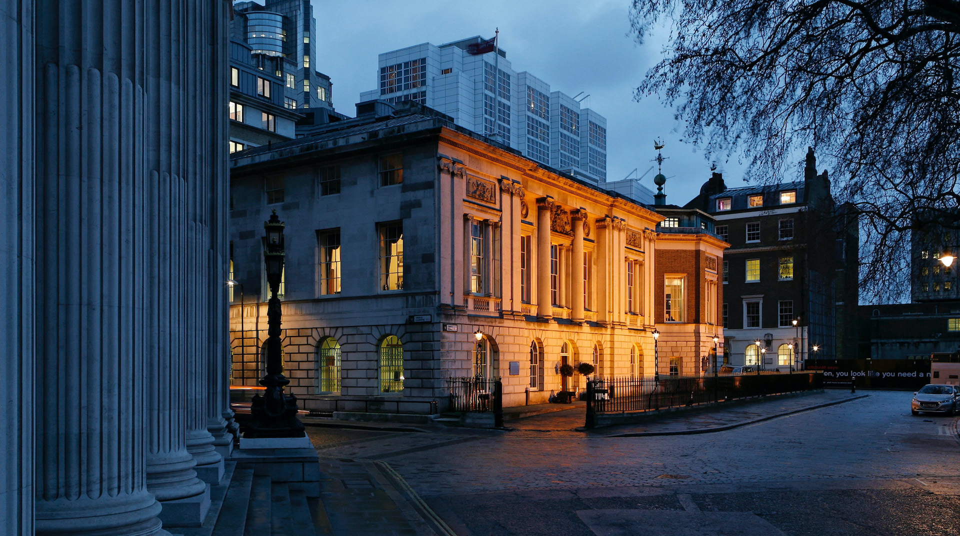
Established by Henry VIII way back in 1514, Trinity House have been supporting and safeguarding shipping and seafarers for over 500 years. They’re an organisation that’s survived through world wars, changes in monarchs and a whole lot more.
Simplifying it so it could be used successfully in the digital age but without losing its meaning or sacrificing its stature.
But recently they’ve been facing challenges with their identity. A refresh was needed that appealed to a wide range of audiences, from those involved in maritime through to members of the public visiting the organisation’s properties. Crucially, they also needed an identity that was fit for today and potentially the next 500 years — one that represented the organisation of today, while elevating its proud and significant maritime history.
Taking on the evolution of Trinity House’s brand proved a unique challenge. First of all, it involved acknowledging the lengthy heritage and prestige of the organisation. It also involved re-carving the logo.
Continuity proved key. For Trinity House conveying its unique history and purpose is so central to its identity and relationship with its audiences. Factor in that the resulting logo had to sit as comfortably and distinctively on top of a gilt-edged letterhead, as it does on a high-vis vest and the challenge becomes even more complex. Finding a solution which would suit the broad range of locations and touchpoints required a lot of research and engagement with key stakeholders.

The result was a simplified and modern ‘outline’ update on the existing heraldic shield: an approach which retained the existing design elements of regal lions and ship motifs but in a design much more relevant and able to be scaled up or down for modern day requirements. A carefully selected evolution of fonts, typography style and colour palette helped to reinforce its contemporary feel and ensure the brand toolkit were fit for purpose and could be applied consistently across the diverse communication deliverables.
The resulting design allows the charity to move forward into the future with a practical, relevant and modern identity. It is supported by a number of stylised visual elements inspired by the charities activities, such as wave patterns and radars, adding extra features to the brand’s toolkit to support the divisions of the organisation.

To inform the visual elements, we also carried out detailed stakeholder research and workshops, helping to clarify Trinity House’s unique position and responsibilities. This can be especially important for historic brands, helping to gain a true understanding of current perceptions. In many cases, internal views can be in contrast to external thoughts and vice-versa. Both help to provide reasoning for recommendations and potential positioning.
Neil Jones, PR and Records Manager at Trinity House, said:
“One of the most important outcomes of the rebranding project is enhanced clarity and understanding of the corporation’s overall mission and vision by internal and external stakeholders.
“Additionally the new visual brand identity now represents the organisation and is supported by clear guidelines providing the foundation for our modern communication requirements.”
Evolving a historic education identity
Established in 1929, Red House is an independent school based in the North East of England. With small class sizes and a focus on the unique requirements of the individual, Red House deliver academic excellence by nurturing the curiosity of each and every child.

Similar to Trinity House, the school needed to evolve their identity and elevate its execution to match the status of their pedigree. And while much of their existing style felt inconsistent, slightly generic and lacking in execution, there was some attachment and positivity around the spirit and heritage of their crest.
The first and most sensitive stylistic change was to completely redraw the crest, creating versions with both positive and negative shadows for use on light and dark backgrounds. The previous incarnation of the crest had lost all the character of the original hand drawn version. We worked with an illustrator to re-draw the crest, retaining crucial symbolic elements and giving them the craft and status they deserve. These drawings were then taken into the studio and meticulously re-traced and digitised into a new, richly detailed and finely crafted Red House crest — a modern interpretation, built for modern use but retaining all the character and heritage of the original.
Changes are normal and natural
These two examples show the delicate balance that needs to be struck when updating brands that are steeped in heritage and history. And whether a brand has been around for 15, 50 or 500 years, changes are bound to take place. It’s perfectly normal and natural.
Even if your service or product has remained the same, changes in personnel, positioning and the market are part and parcel of life as an organisation. And so too should be reflecting these changes in your brand and identity.
Get in touch to find out how we can help you create, refresh or roll out your brand.


