Building independence in top-tier education
Client
Red House School
Project
The Red House School Rebrand
Services
Sector
The Brief
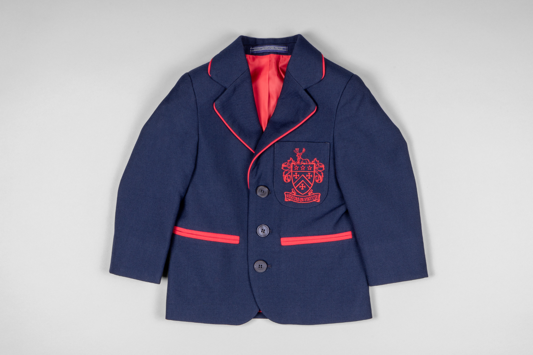
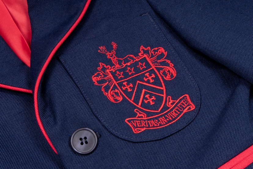
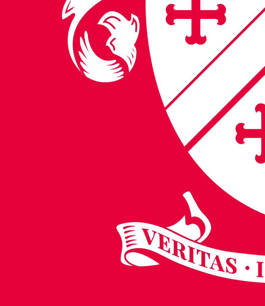
Red House needed to evolve their identity and elevate its execution to match the status of their pedigree. Much of the existing style felt inconsistent and fairly generic, however there was some attachment to the spirit and heritage of the crest, if not its execution.
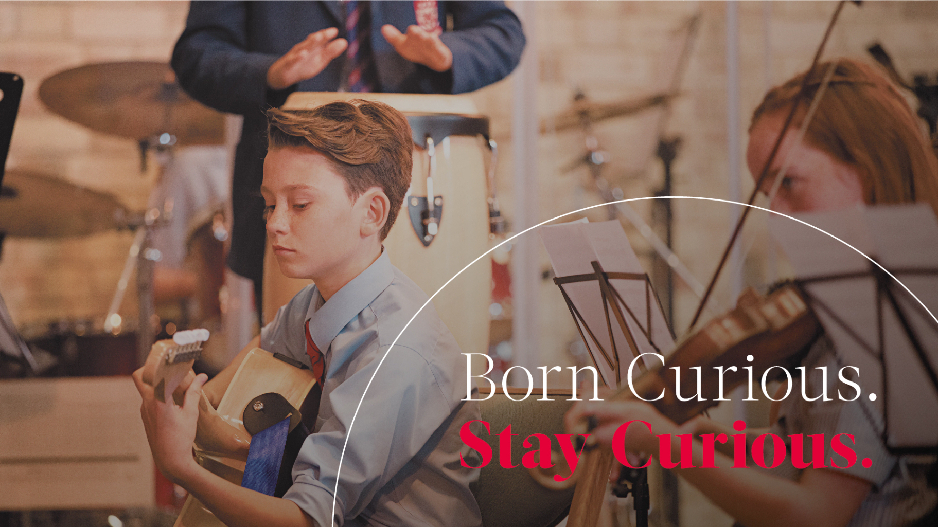
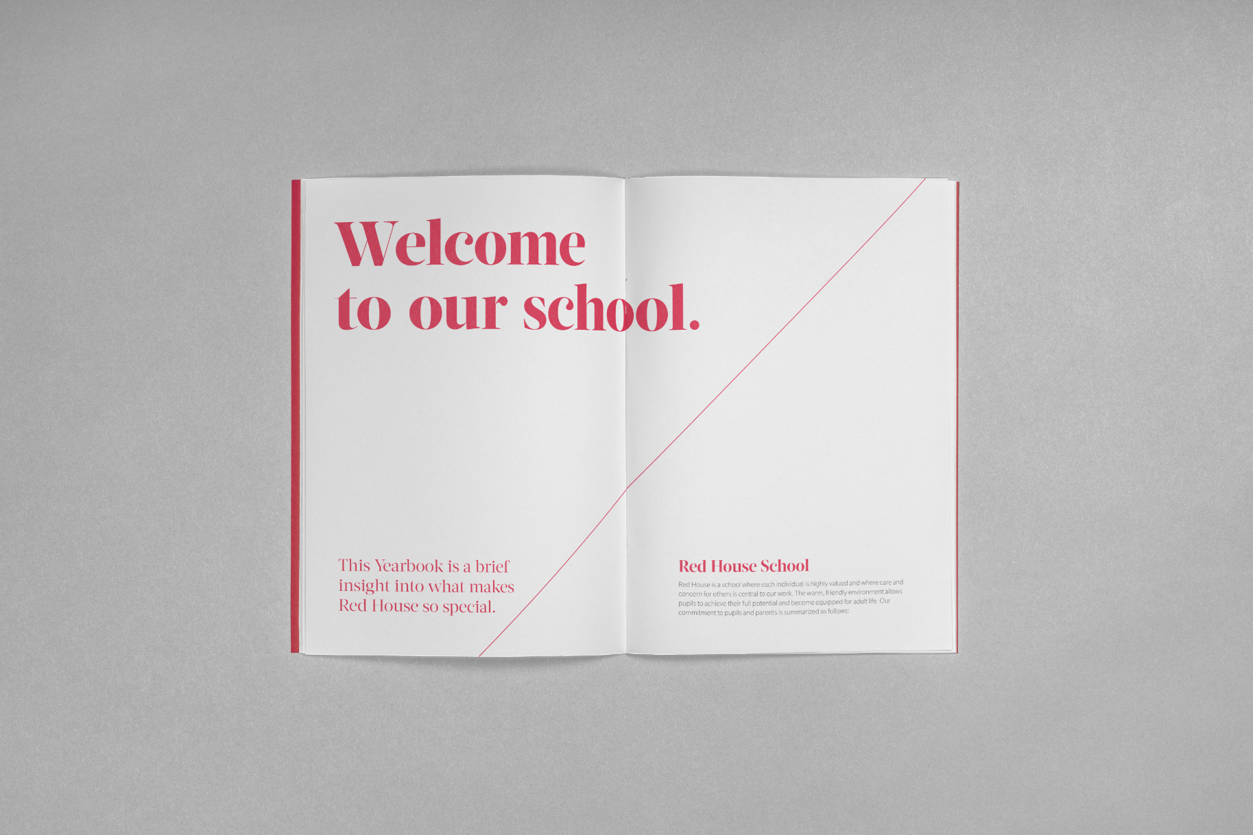
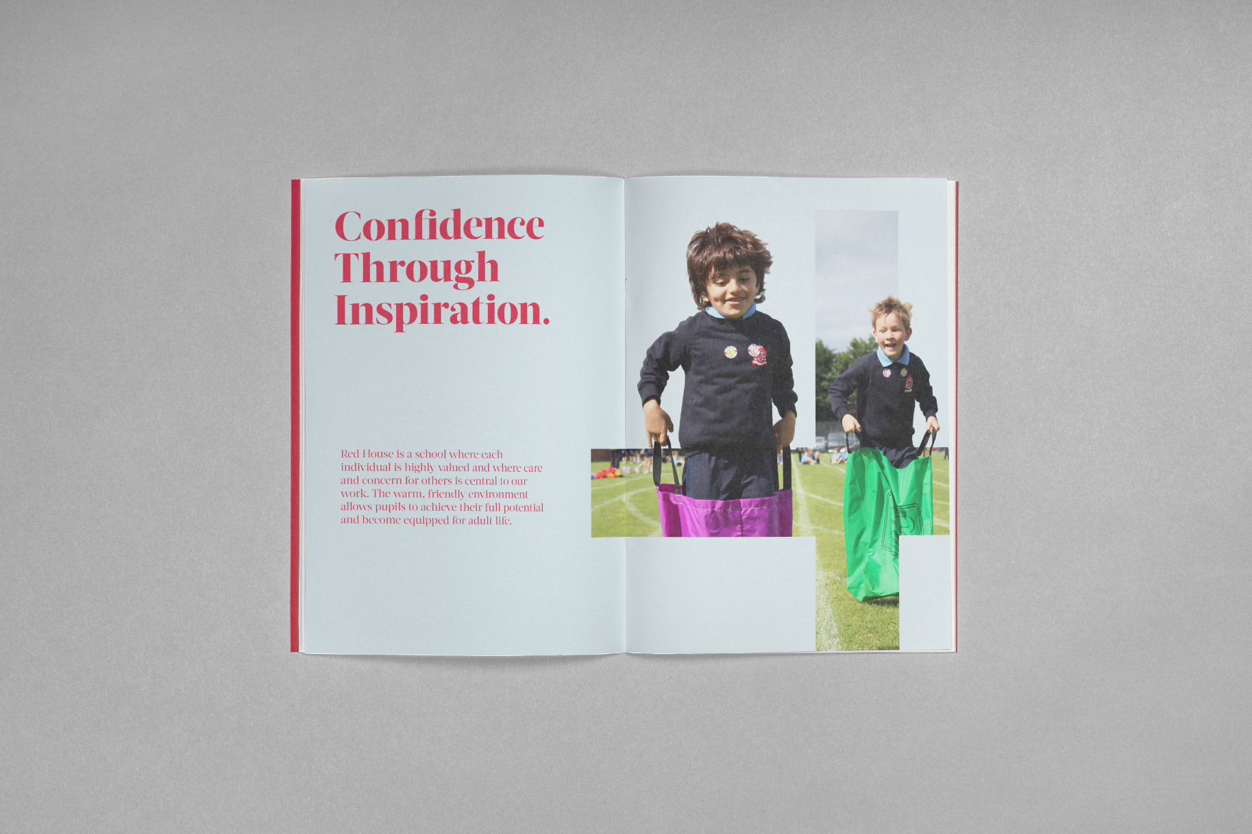
Red House is an Independent School currently based in Norton, Teesside. Red House delivers academic excellence by nurturing the curiosity of each and every child. Their small class size and unwavering focus on the unique requirements of the individual, allows them to craft a uniquely bespoke education with a genuine warmth.
The Solution
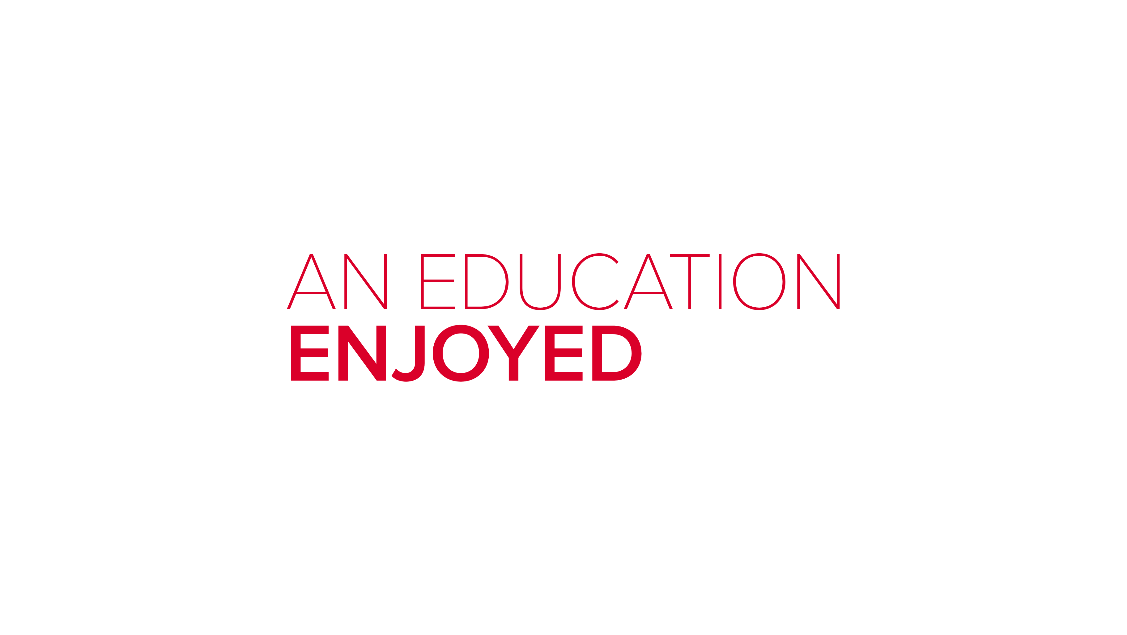
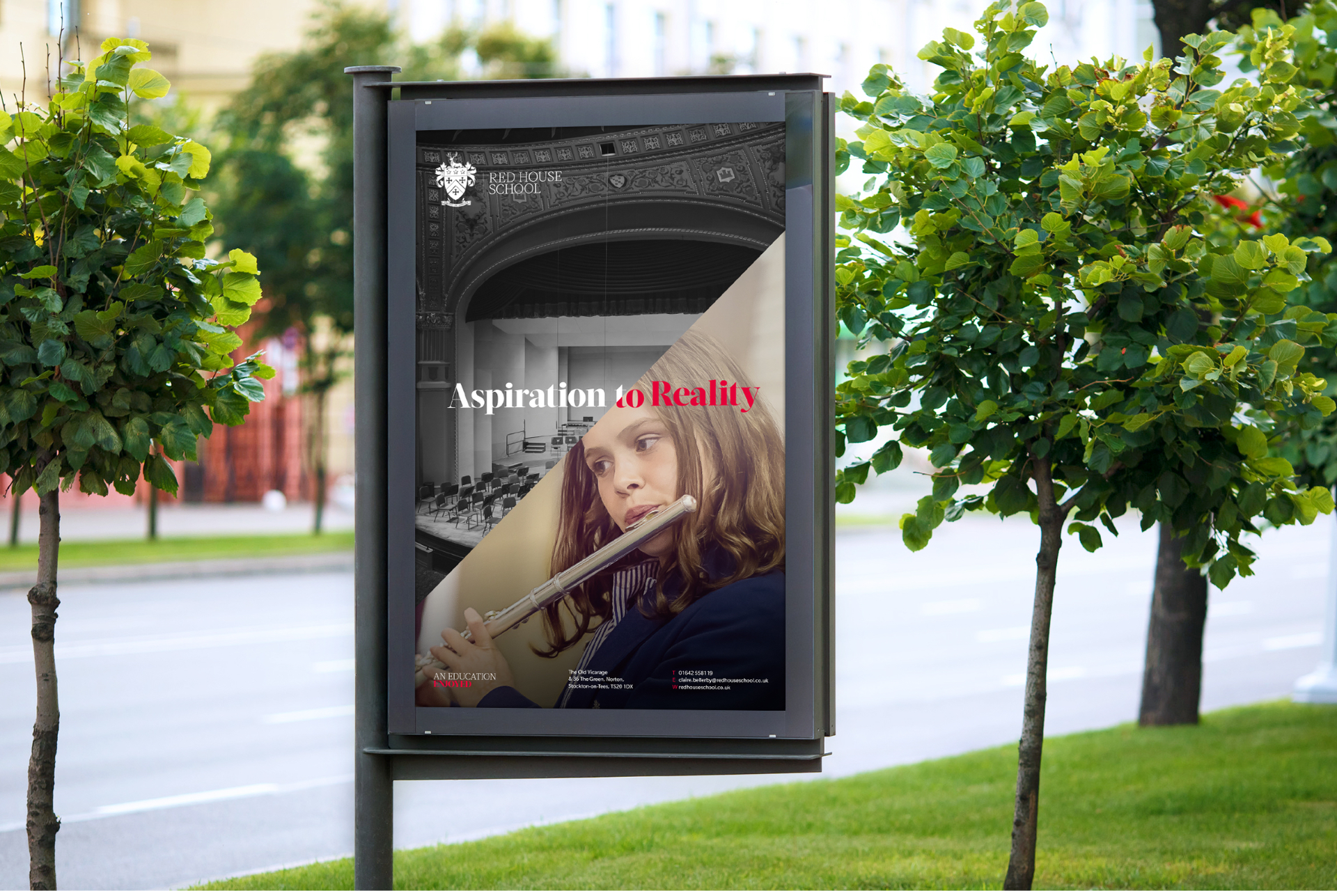
Taking onboard the sensitivities around the crest we evolved it by returning it to its former glory, albeit with a few modern flourishes. Alongside this came a reinvented brand world, typography balanced traditional serifs with modern sans to reflect the schools blend of traditional values and modern approach. Elsewhere the crest was deconstructed and into four symbols that were enlarged and used as distinctive framing elements, revealing slices of colour and photography.
Building independence in top-tier education
The Brief
Red House needed to evolve their identity and elevate its execution to match the status of their pedigree. Much of the existing style felt inconsistent and fairly generic, however there was some attachment to the spirit and heritage of the crest, if not its execution.
Red House is an Independent School currently based in Norton, Teesside. Red House delivers academic excellence by nurturing the curiosity of each and every child. Their small class size and unwavering focus on the unique requirements of the individual, allows them to craft a uniquely bespoke education with a genuine warmth.
Red House needed to evolve their identity and elevate its execution to match the status of their pedigree. Much of the existing style felt inconsistent and fairly generic, however there was some attachment to the spirit and heritage of the crest, if not its execution.
Taking onboard the sensitivities around the crest we evolved it by returning it to its former glory, albeit with a few modern flourishes. Alongside this came a reinvented brand world, typography balanced traditional serifs with modern sans to reflect the schools blend of traditional values and modern approach. Elsewhere the crest was deconstructed and into four symbols that were enlarged and used as distinctive framing elements, revealing slices of colour and photography.

Deerly beloved


Symbolic gesture