08.03.21
Just my type
Wordmarks and typography can signal your brand character before you’ve even said a word.
 Written by John Taylor
John Taylor
Written by John Taylor,
Creative Director
In a previous blog, we examined archetypes and the importance they play in defining your brand character.
Of course, character ultimately informs your tone of voice; a ‘hero’ archetype will communicate very differently to a ‘jester’ or an ‘innocent’. But in the fight for attention, brands can sometimes have mere seconds to convince or intrigue. So how do you visually telegraph character before your brand says a word?
The answer lies in typography, an art-form that traces its roots back through the invention of the printing press in the 1400s, past the handwritten calligraphy that preceded it and all the way back to 1st-century Rome. What began as a single uniform style of calligraphy, laboriously hand-lettered by monks, has become an explosion of over half a million different fonts; all available at the click of a mouse.
But there is more to modern typography than clicking a dropdown, picking a font and typing your brand name. Having access to 300 television channels, doesn’t mean you always end up watching quality programming. It’s the same with brand-building; because anything is possible with type, a brand should consider its choices.
Typography is a vital component of your brand toolkit that shouldn’t be wasted. In terms of perception and understanding, the brain acknowledges and remembers shapes first, then colour, then form and finally; meaning.
So long before you read and understand a logo or strapline, your brain has already processed the characteristics and associations the letterforms convey.
This means type choice and type design is often a balancing act, distinctive enough to stand-out, characterful enough to express something about your brand, yet legible enough to be read and understood.
At Better, once we have clearly defined the Brand Story, including the Archetype and Tone of Voice, we write an Identity Brief for the visual half of our Create phase. Often this will provide the springboard for a more distilled typography brief. Usually no more than three words, these mini-briefs really focus the mind when searching for typefaces, they are invaluable if we need to create letterforms or entire typefaces from scratch.
With our recent brand refresh for Dropps, one of the first challenges was updating the letterforms in the logo without changing them so much that brand recognition would be lost. Our starting point was Dropps’ philosophy of “Eliminate the Stupid, Elevate the Core”. We needed to strip away anything that was unnecessary. Dropps don’t just use nature to clean, they engineer it, they make it as effective as possible. So we knew that the type needed to feel minimal, engineered and, ultimately, modern. They are a forward-thinking brand and this refresh needed to reflect that.

Minimal, engineered, modern
The new letterforms shed the unnecessary weight that made the old logo feel slightly juvenile. Every shape is pared back and reduced, distilled to its simplest geometric components. Finally, details are finessed such as flowing the terminals into their neighbouring character and adding custom ink traps; to both compensate against the flexographic printing technique and add a subtle fluidity to the forms. The letters in the logo set the direction for the main brand typeface choices, three weights of Silka again sticking closely to a style dictated by Dropps’ core ethos.
Now, no logo or typeface alone can convey everything about a brand. However, with these changes, Dropps immediately conveys a more mature, intelligent and modern personality that is much more in line with who they are in the marketplace and who they seek to appeal to.

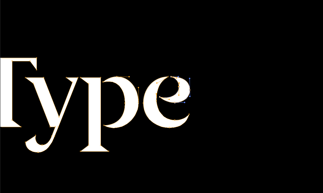
I set the serif
Better’s own identity is a stark contrast to the hyper-minimal, sans-serif simplicity of the Dropps identity. It’s much more complex and references a deeper history of lettering with its chiselled serifs and calligraphic flourishes. Again, every element here is deliberate and considered; all built from a three-word brief that reflects both our approach and our industrial roots. For the Better wordmark, our three-word brief was: friendly, intelligent and gritty.
![]()
Building on a ‘modern serif’, we began to sculpt elements unique to us. For the lowercase letter ‘e’, which stars twice in our wordmark, we softened its curves, adding a sense of warmth and friendliness. Our aim was to almost make it smile.
While the wordmark alone helped to convey the qualities we set out in our brief, the best way for us to display our skills as an agency was to create the entire character set, giving us our own custom typeface that is uniquely Better. Calligraphic strokes adorn the terminals of the lower case z, the tail of the y, the terminal of the f and c, the shoulder of r and the arm of the k amongst others. Along with elements of our personality, these subtle historical cues help to evoke a sense of craftsmanship, artistry and precision. Finally, across the typeface we wanted to add a subtle nod to our North East roots, so we emphasised any opportunity for the typeface to feel stencil-like and industrial.

A cut above
Creating a custom typeface gives brands a truly unique asset that only they can own, and sometimes it can even contain subtle references to what a brand does. With Access, we created two distinct cuts of the same typeface. In the first cut, structured monospace letterforms were separated to form crisp industrial stencil-like silhouettes. The second cut uses outlines reminiscent of overhead architectural plans, letters echoing the shapes of rooms, with the end of their stems opened up to allow access. With such a minimal brand, the letterforms became a key tool to elevate the brand into a more innovative, luxury space.
All of these cues are conveyed in an instant but they all began with a simple three-word brief: bespoke, industrial, luxury.

Never underestimate the power of typography to help convey your brand character and, in the case of custom typefaces, give your brand a unique and ownable asset. Think carefully about how your brand should sound, if you were to hire an actor to provide a voice over for your brand, who would it be? You wouldn’t choose just anyone. Choosing the wrong voice could even make your message fall flat or seem ridiculous. Typography is that same principle made visual.
But to reach that stage, you have to find your tone of voice, which starts with understanding your archetype. If you need help uncovering your organisation’s personality or discovering and distilling your core brand purpose, drop us an email or give us a call.


