
Taking global home mobility to the next level
Client
TK Elevator
Project
The Access Global Rebrand
Services
Sectors
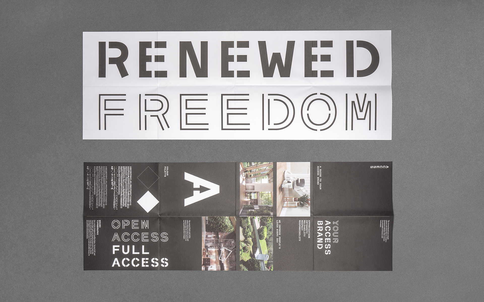
The Brief
The challenge here was not only to refresh and evolve the brand but to also clearly distinguish it away from the parent brand of TK Elevator. With an award winning product line that reaches from mid-tier to luxury, there was also a clear opportunity to elevate the brand from a potentially clinically feeling mobility look, into a more aspirational lifestyle space.
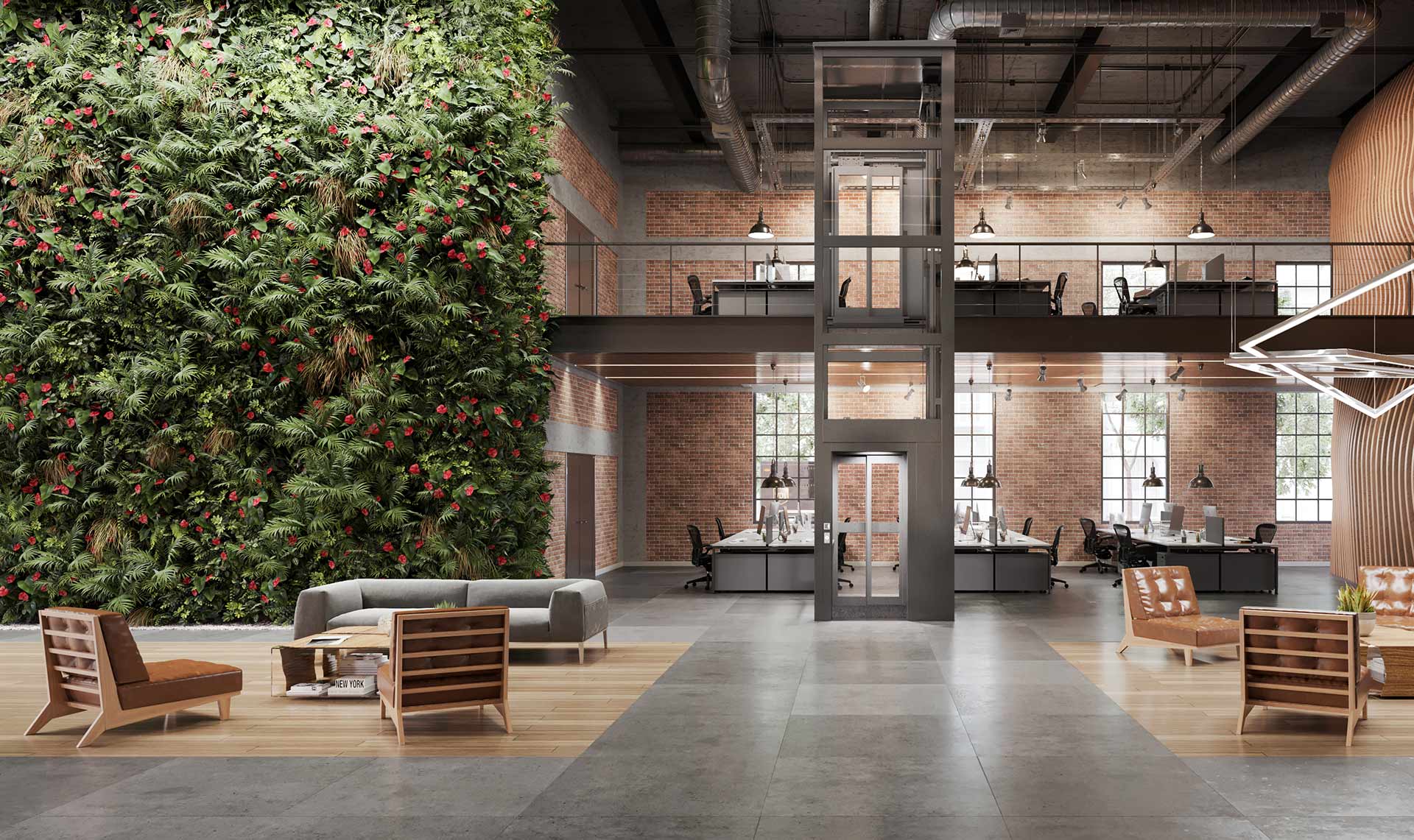
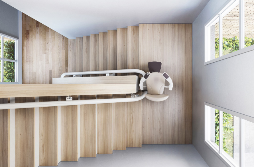
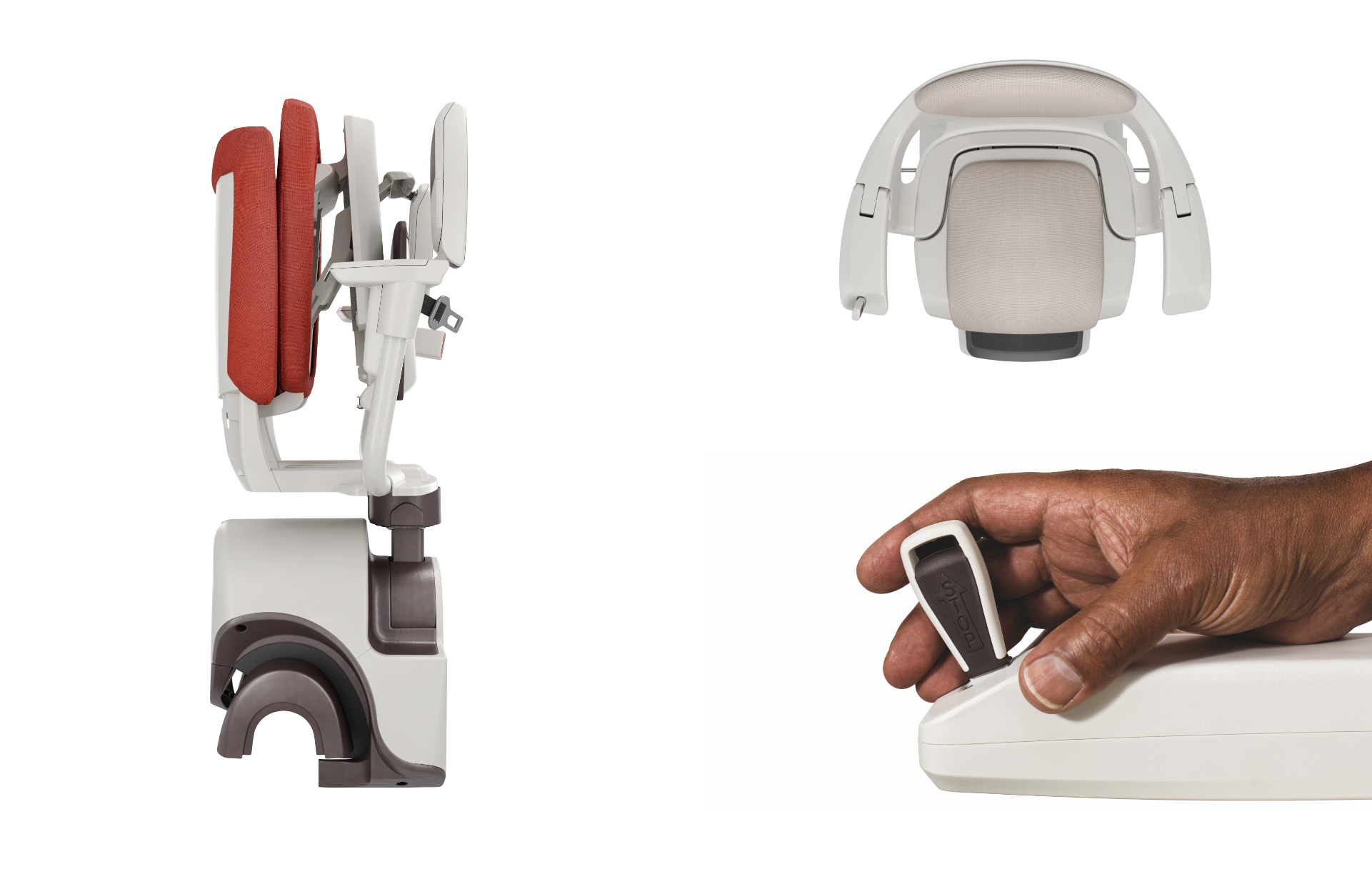
Access BDD make life easier by supplying stairlifts, homelifts and platform lifts to dealers across Europe, South-East Asia, the Middle East and North Africa. With a mission statement of “Access everywhere, for everyone” their brand is built around a core of empowerment through innovation.
The Solution
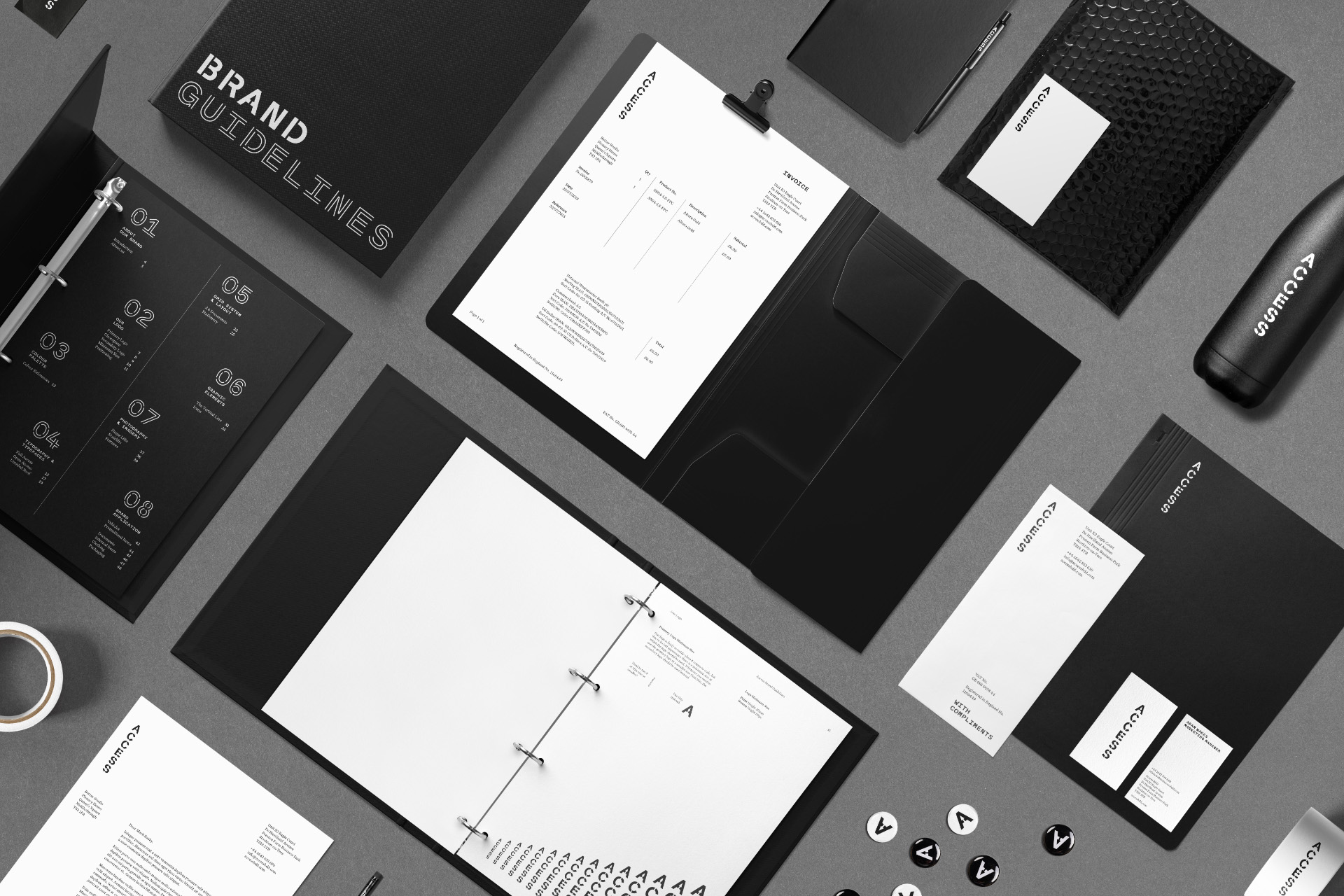
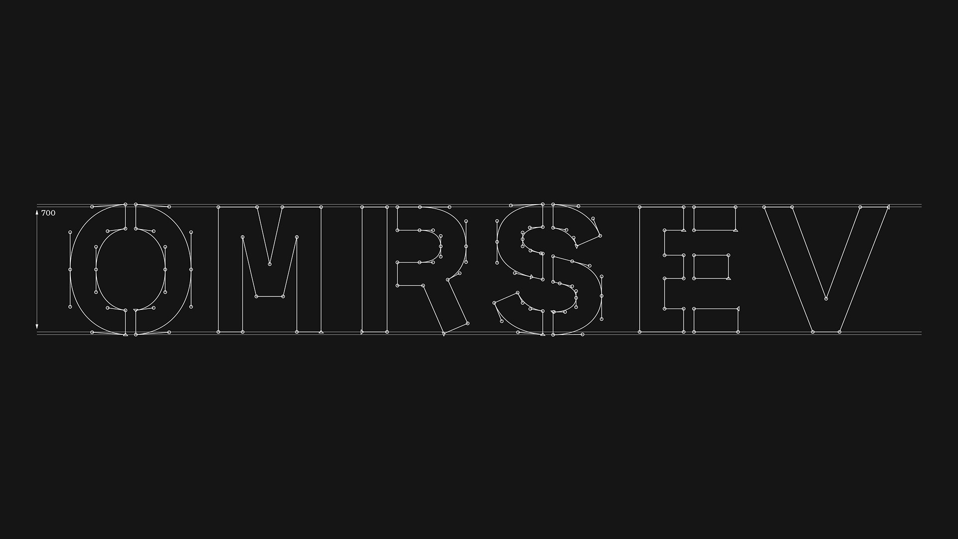
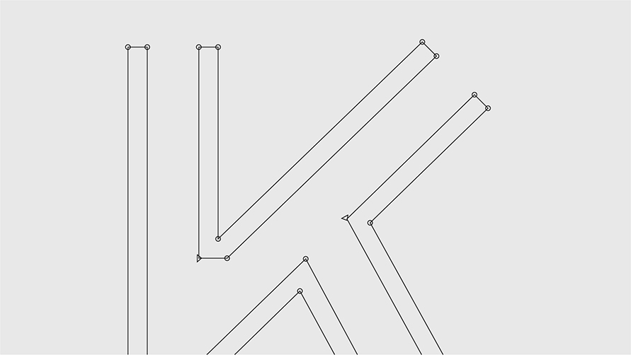
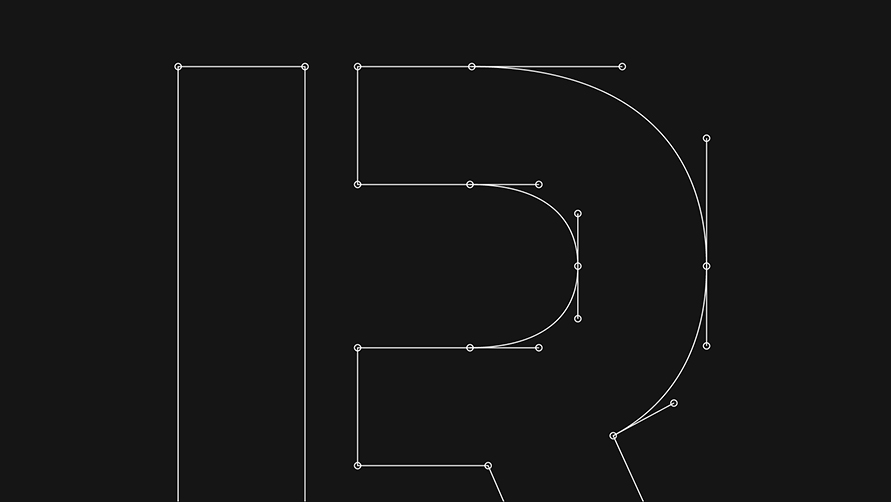
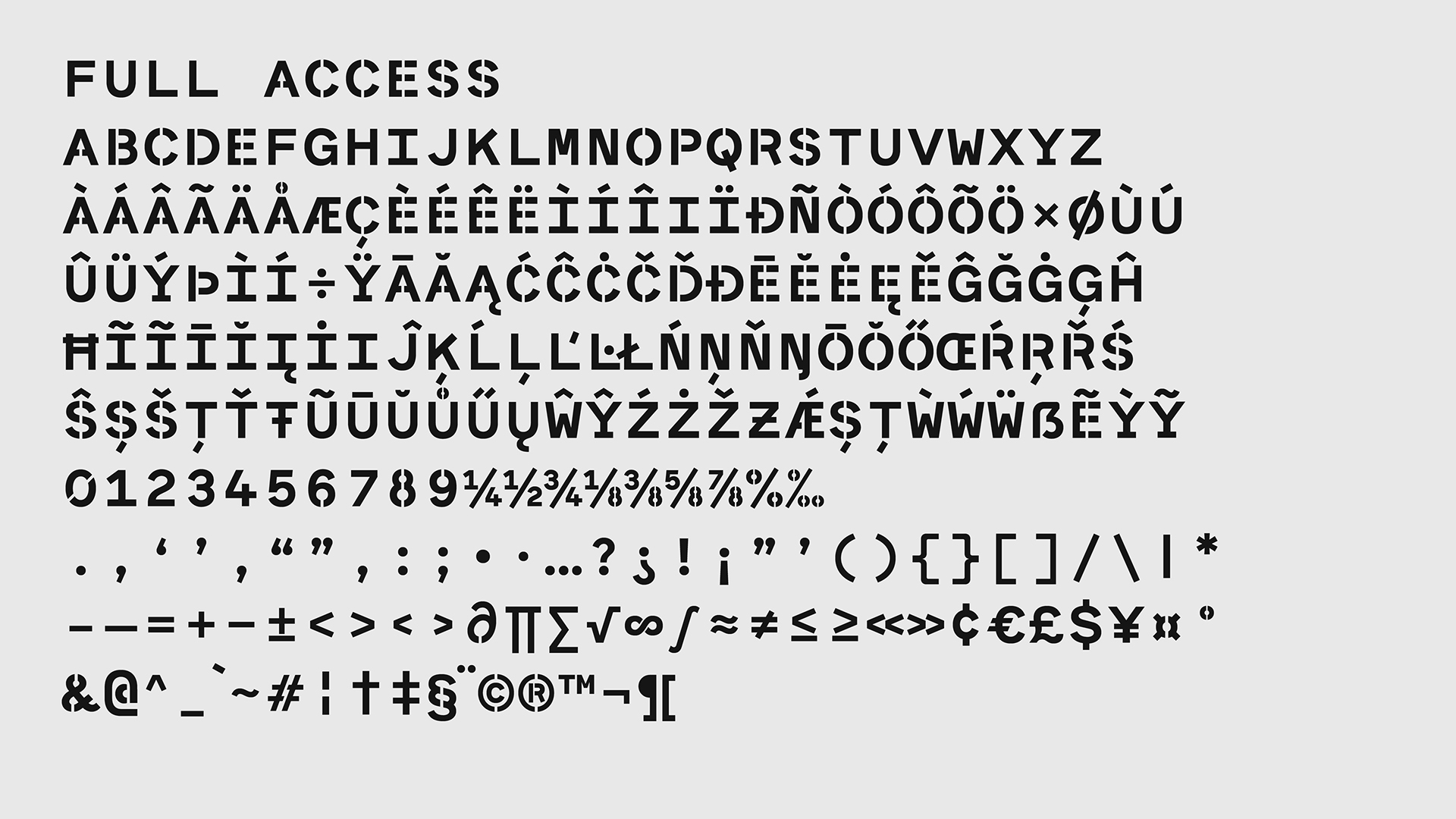
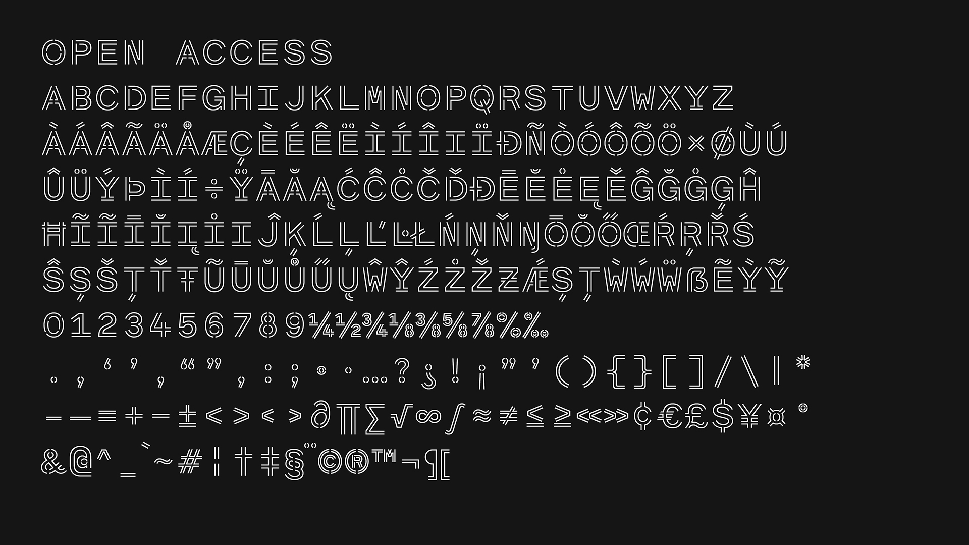
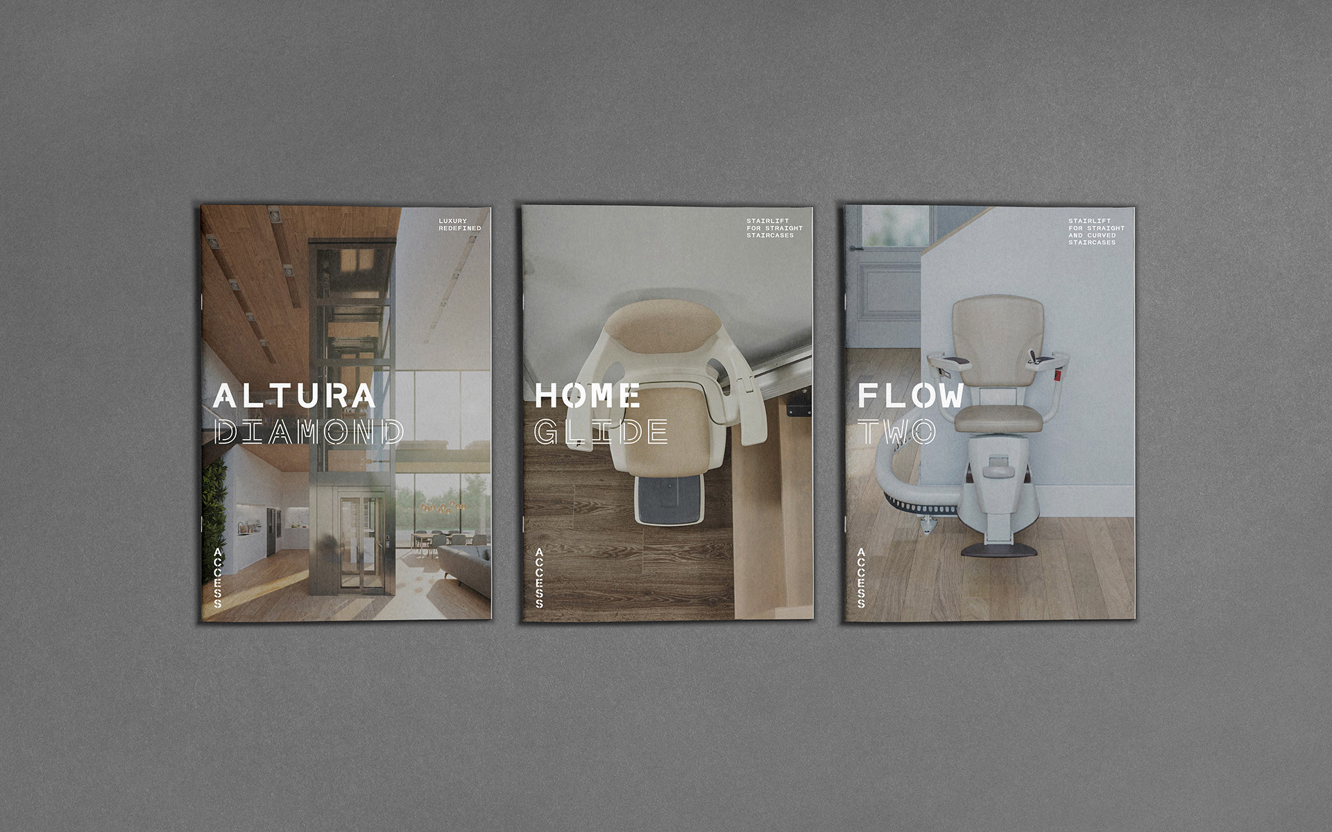
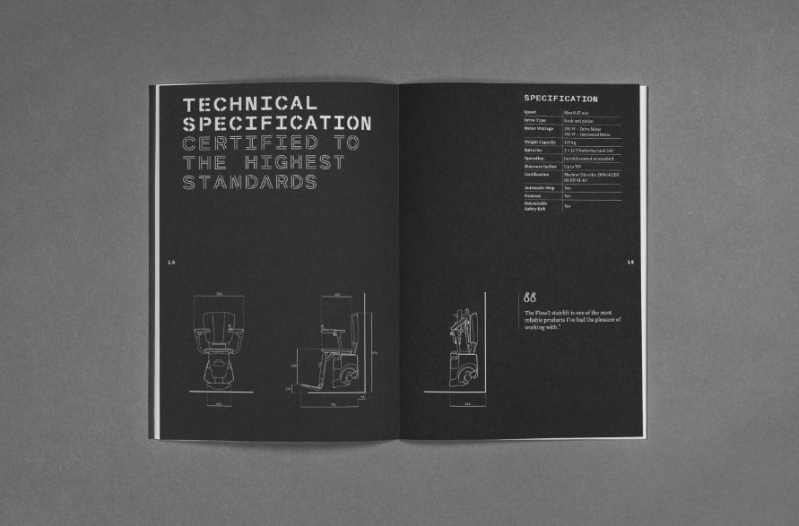
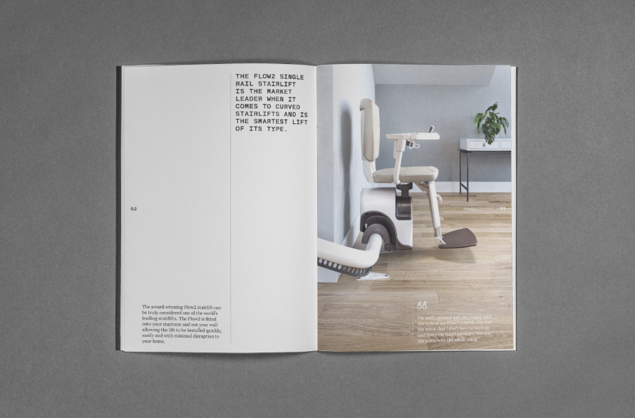
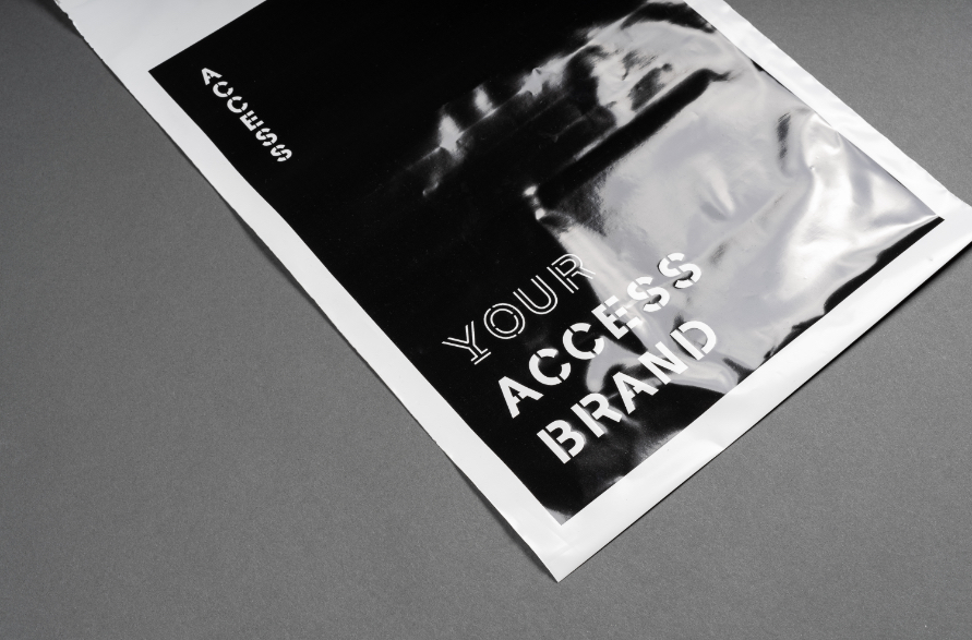
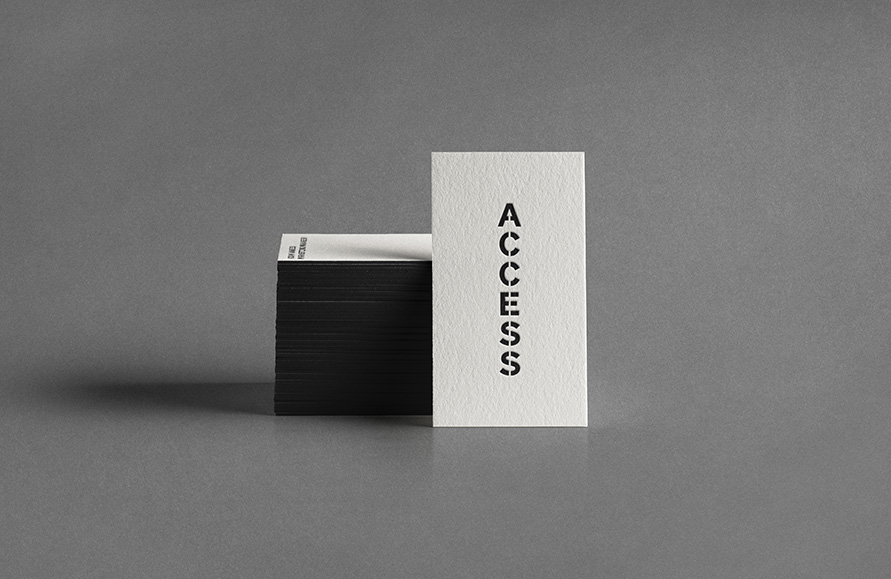
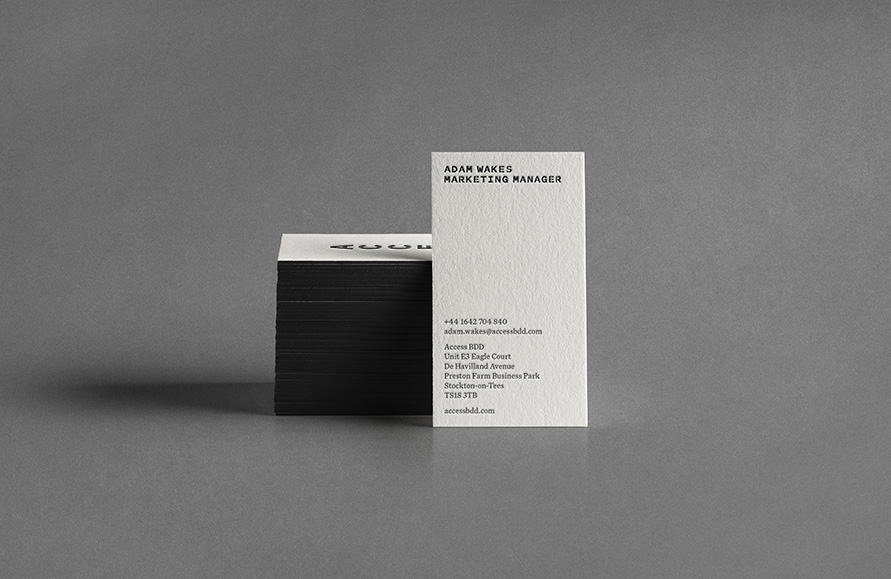
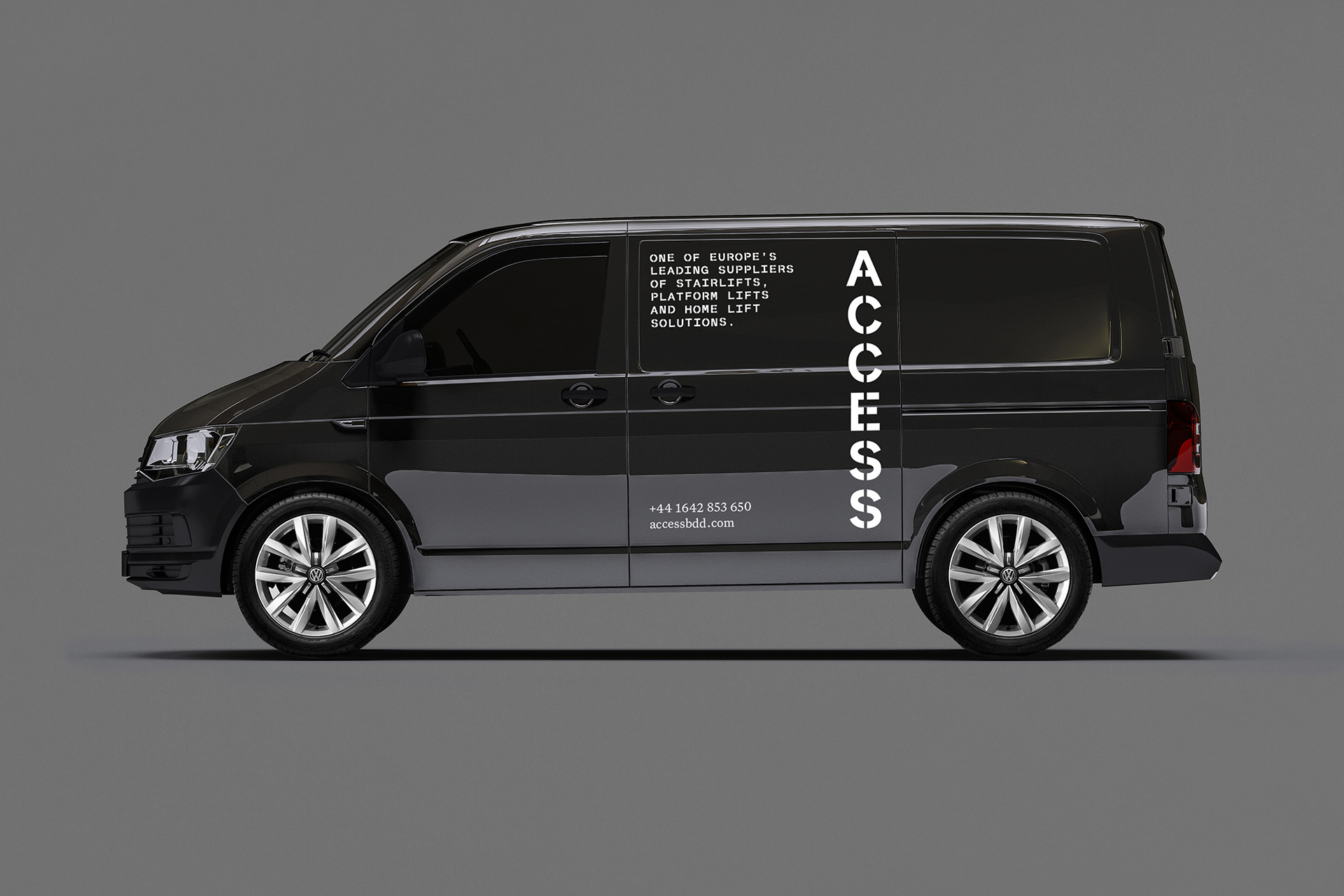
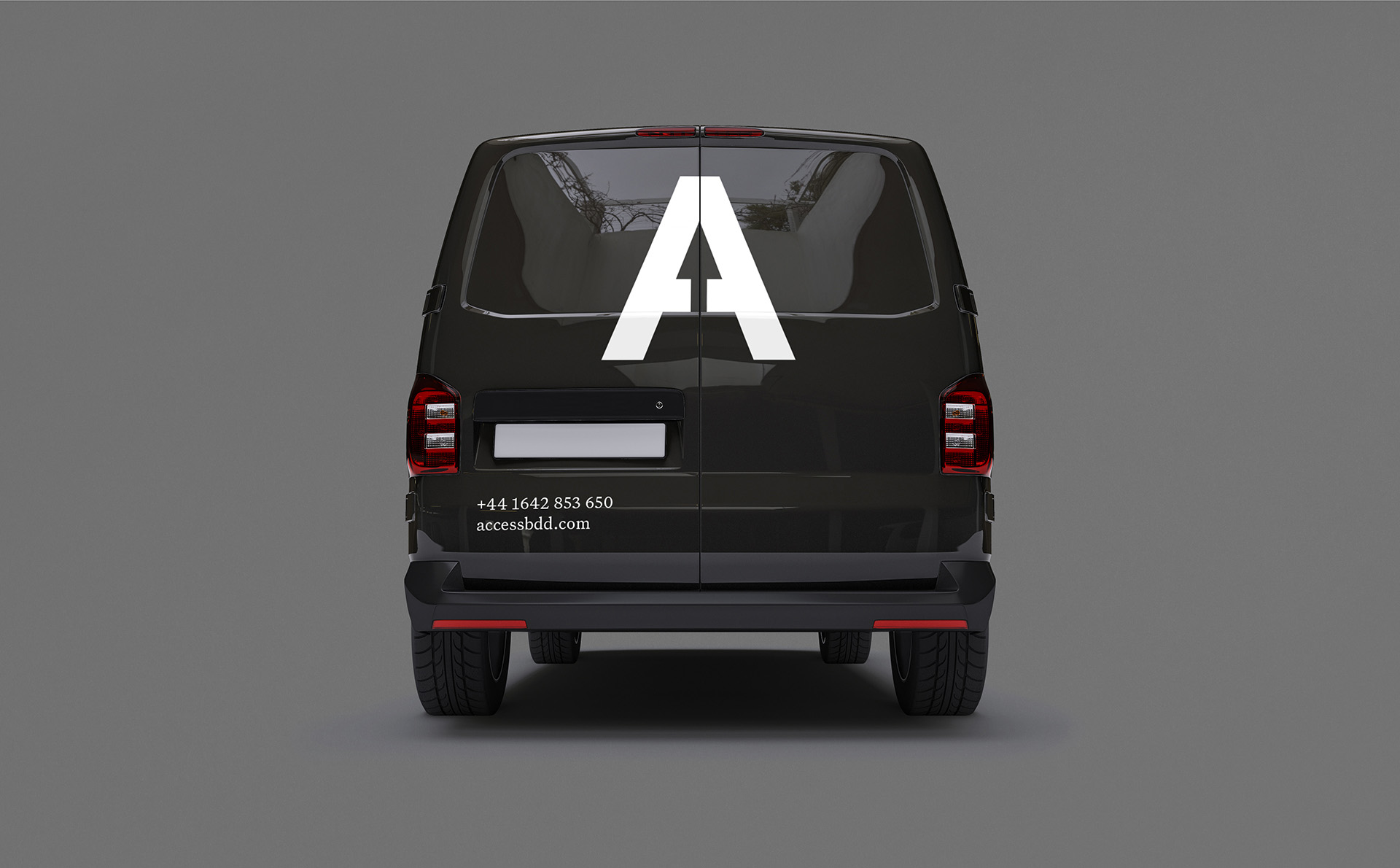
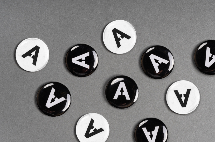
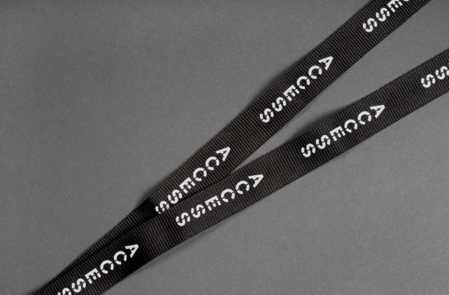
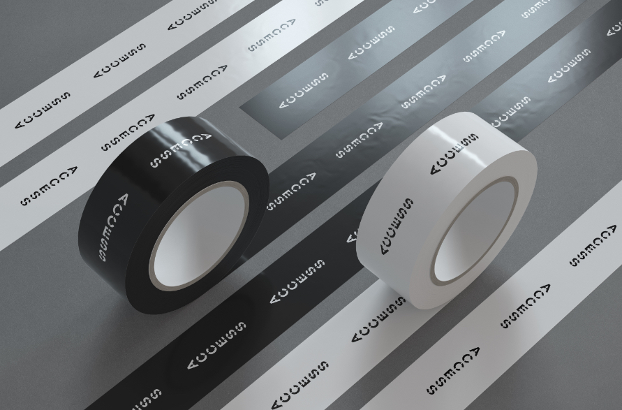
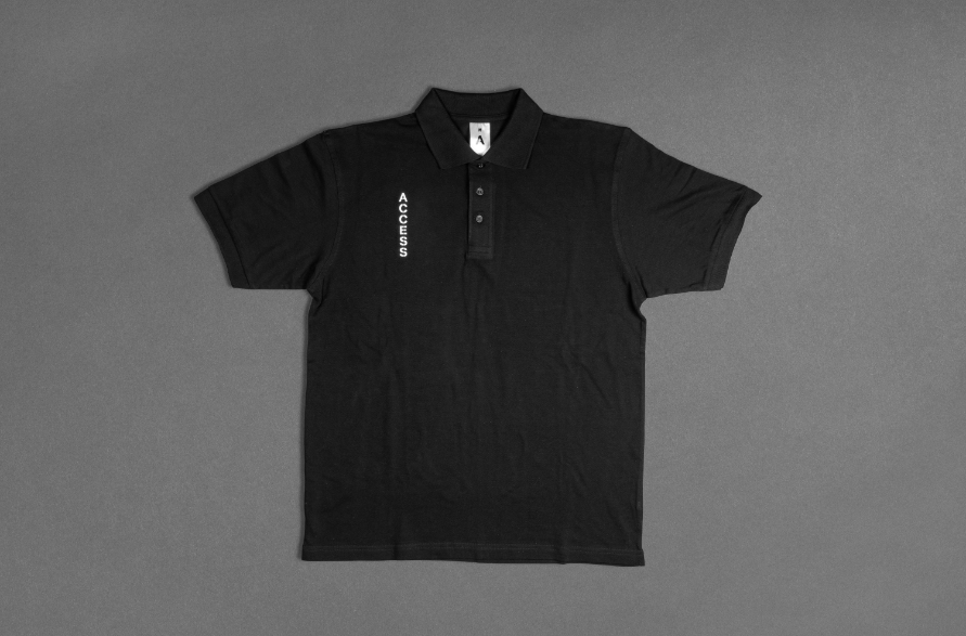
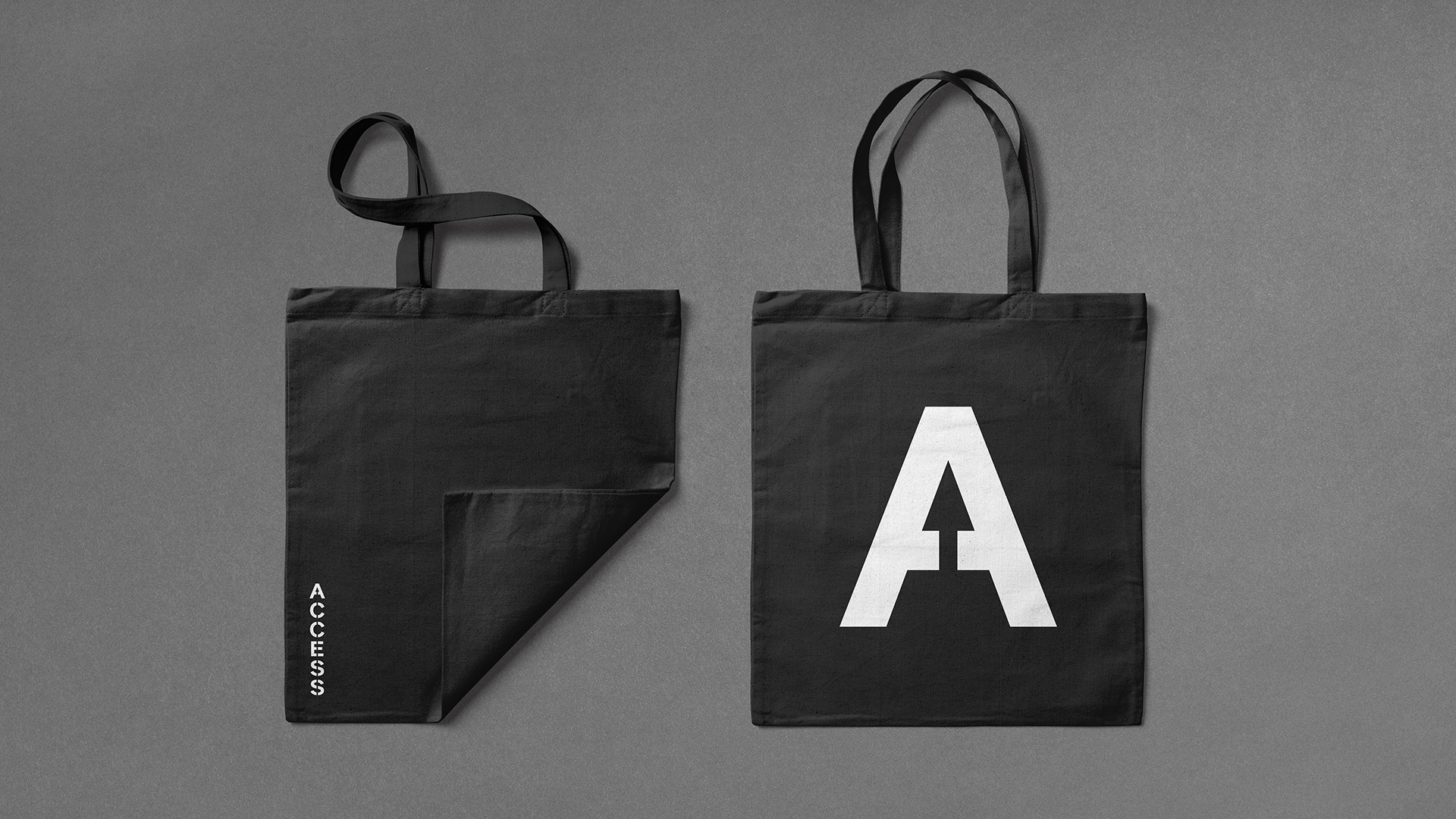
Access previously carried the suffix BDD (business development division). As they are now establishing themselves as a separate personality to TK Elevator this was the first thing to jettison. The simplification continued with a neutral black and white palette, two cuts of a custom designed Access typeface and an elegant integration of the previous arrow logo inside an all new vertical wordmark.
Taking global home mobility to the next level
The Brief
The challenge here was not only to refresh and evolve the brand but to also clearly distinguish it away from the parent brand of TK Elevator. With an award winning product line that reaches from mid-tier to luxury, there was also a clear opportunity to elevate the brand from a potentially clinically feeling mobility look, into a more aspirational lifestyle space.
Access BDD make life easier by supplying stairlifts, homelifts and platform lifts to dealers across Europe, South-East Asia, the Middle East and North Africa. With a mission statement of “Access everywhere, for everyone” their brand is built around a core of empowerment through innovation.
The challenge here was not only to refresh and evolve the brand but to also clearly distinguish it away from the parent brand of TK Elevator. With an award winning product line that reaches from mid-tier to luxury, there was also a clear opportunity to elevate the brand from a potentially clinically feeling mobility look, into a more aspirational lifestyle space.
Access previously carried the suffix BDD (business development division). As they are now establishing themselves as a separate personality to TK Elevator this was the first thing to jettison. The simplification continued with a neutral black and white palette, two cuts of a custom designed Access typeface and an elegant integration of the previous arrow logo inside an all new vertical wordmark.
Access for all
Less is more


“What we’ve created is a fusion of consumer technology brands and luxury interior design, giving us something that we think is really fresh. It's a unique brand for the home mobility market. We were delighted with the reception the new brand received, and we’re excited about what it means for the future of Access BDD and our partner network.”
Adam Wakes
Marketing Manager, Access

Elevating online
Custom-built on WordPress, the platform serves as a hub for dealers and end-users. Hosting downloadable resources such as technical manuals and key documents, the portal is an intrinsic part of Access’ sales and service promise. This enables increased communication and engagement with partners, who can also use the site to order marketing materials and replacement parts.

Taking the brand higher
More cosmetically, the simplified design offers a clean look with an emphasis on media-rich content and immersive layouts. This is complemented by new page slices and contained elements, while extending the colour palette in-line with refined brand guidelines.

“Our long-term partnership with Better has been instrumental in elevating the Access brand, thanks to their deep understanding of our brand, vision and goals. They've skilfully customised the platform to meet our expanding digital needs, offering a platform that's not only flexible but also tailored to our vision. Better's commitment to a solution that meets our present demands while aligning with our future ambitions has been remarkable. Their role as more than a service provider, but as a partner, has been crucial in bringing our digital presence to life.”
Adam Wakes
Head of Marketing, Access