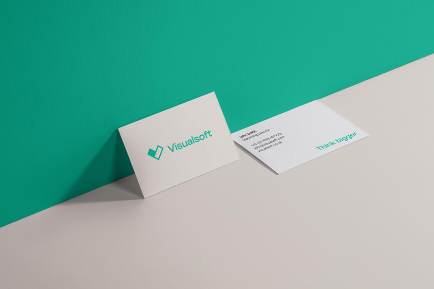
Helping online retailers to think bigger
Client
Visualsoft
Project
The Visualsoft Rebrand
Services
Sectors
The Brief
A client centric approach has always been at the heart of Visualsoft but it was felt that the brand didn't always reflect this. It had to come out of the dark, feel more aspirational and relevant to clients. We wanted to convey the intelligent but down to earth vibe that you get from meeting Visualsoft in person. In amongst all of this Visualsoft wanted to retain the heritage and equity built up in their V icon, so we needed to create a relevant and fresh spin on a familiar logo.
20 years ago, Visualsoft set out to provide an eCommerce solution that would deliver an outstanding experience for clients and customers alike, paving the way for better technology in the industry. Now, as they enter a new era, new offices and adopt a truly client centric approach, Visualsoft needs a brand that accurately depicts the company they are today.
The Solution
During the DISCOVER phase, the old look and feel was almost universally described as one note, dark, dated, overly masculine and unwelcoming. The gritty black and white treatment of photography, which focused only on the inner workings of Visualsoft, simply exacerbated this perception.
One of the key tasks to flip the first impression, from dark and uninviting to bright, light and positive. Turning black to white and introducing a more versatile ‘pastel and pop’ palette felt like we’d literally opened the curtains and let in some fresh air for the brand. Clarifying and simplifying messaging, based around the new core 'engineering effortless ecommerce' proposition and introducing typography with a sense of easy intelligence, amplified this style.
Finally, we took the core of the existing logo and reinvented it as a core brand element. A device that would help us to visually express putting clients at the centre of everything.
Helping online retailers to think bigger
The Brief
A client centric approach has always been at the heart of Visualsoft but it was felt that the brand didn't always reflect this. It had to come out of the dark, feel more aspirational and relevant to clients. We wanted to convey the intelligent but down to earth vibe that you get from meeting Visualsoft in person. In amongst all of this Visualsoft wanted to retain the heritage and equity built up in their V icon, so we needed to create a relevant and fresh spin on a familiar logo.
20 years ago, Visualsoft set out to provide an eCommerce solution that would deliver an outstanding experience for clients and customers alike, paving the way for better technology in the industry. Now, as they enter a new era, new offices and adopt a truly client centric approach, Visualsoft needs a brand that accurately depicts the company they are today.
A client centric approach has always been at the heart of Visualsoft but it was felt that the brand didn't always reflect this. It had to come out of the dark, feel more aspirational and relevant to clients. We wanted to convey the intelligent but down to earth vibe that you get from meeting Visualsoft in person. In amongst all of this Visualsoft wanted to retain the heritage and equity built up in their V icon, so we needed to create a relevant and fresh spin on a familiar logo.
During the DISCOVER phase, the old look and feel was almost universally described as one note, dark, dated, overly masculine and unwelcoming. The gritty black and white treatment of photography, which focused only on the inner workings of Visualsoft, simply exacerbated this perception.
One of the key tasks to flip the first impression, from dark and uninviting to bright, light and positive. Turning black to white and introducing a more versatile ‘pastel and pop’ palette felt like we’d literally opened the curtains and let in some fresh air for the brand. Clarifying and simplifying messaging, based around the new core 'engineering effortless ecommerce' proposition and introducing typography with a sense of easy intelligence, amplified this style.
Finally, we took the core of the existing logo and reinvented it as a core brand element. A device that would help us to visually express putting clients at the centre of everything.

The power of partnership


The photographic journey


Progressive personality


“Last year we celebrated our 21st year in business therefore it was a great time for us as a company to undergo a detailed review of our brand. The brief to Better was simple: we wanted to ensure that we had a brand which was future proof. Better acted as the impartial voice who challenged our thinking. I am delighted with the new Visualsoft brand. It embodies the clear vision we have as a company, plus the 'think bigger' ambitions we have for our clients, partners and employees.”
Dean Benson
Founder and CEO, Visualsoft


