
Establishing Britain’s best-connected trade region
Client
Tees Valley Combined Authority
Project
The Teesside Freeport Brand
Services
Sectors
The Brief
Working alongside the Tees Valley Combined Authority, as well as stakeholders including Redcar & Cleveland Borough Council, PD Ports, AV Dawson and Sembcorp, our job was to create a brand that reflects the ambition, scale and opportunity of Britain’s best-connected trade region. Along with its size and connectivity, the brand needed to both visually and verbally express the freeport’s unique offering and crucial role in the UK’s post-Brexit economy.
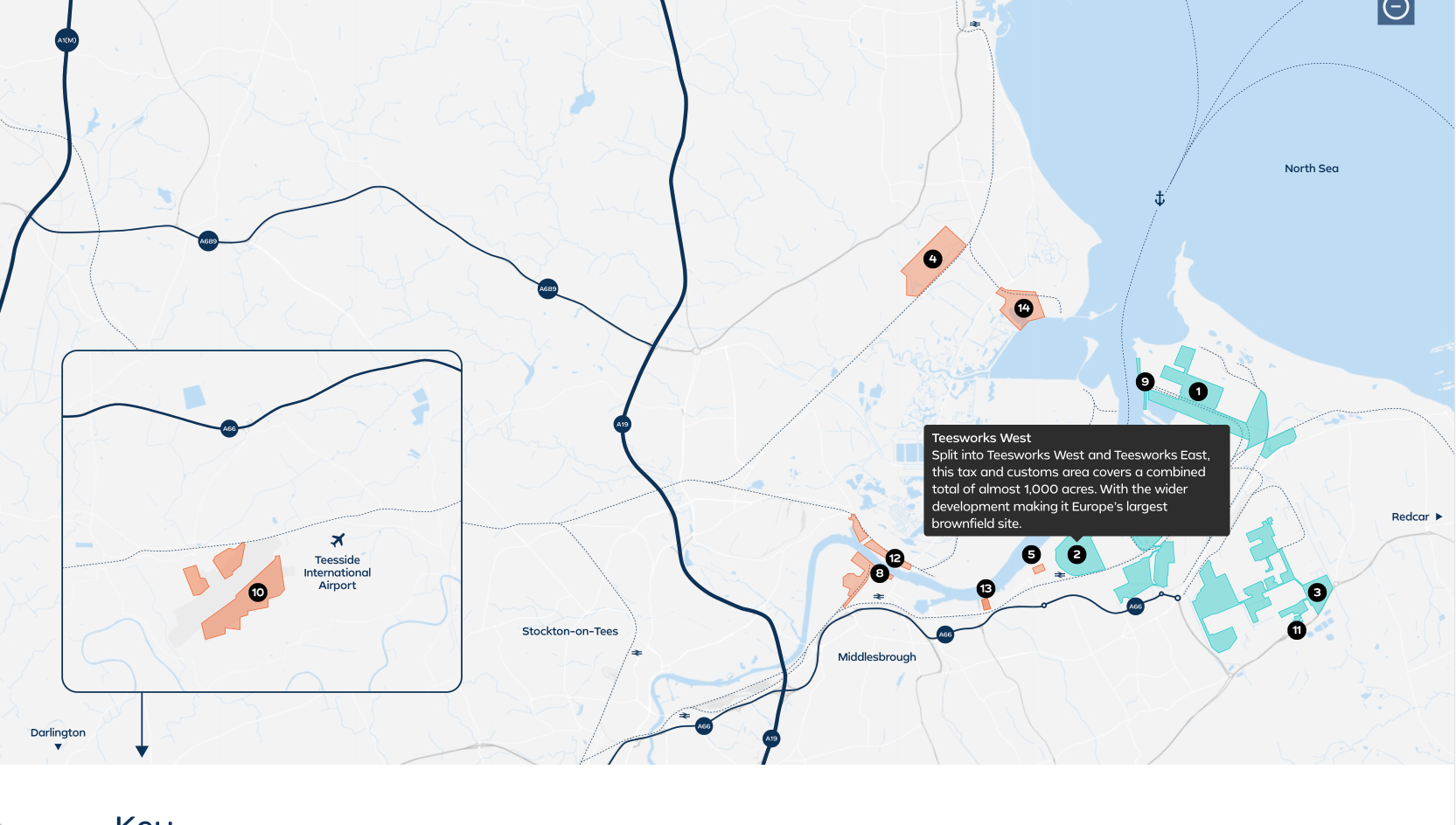
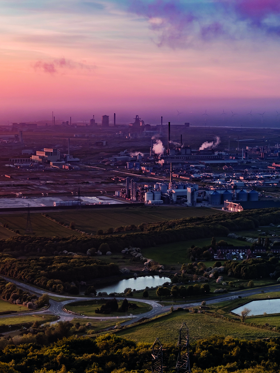
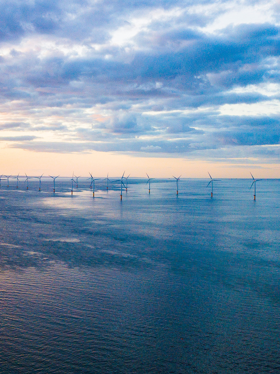
Teesside is set to become the UK’s first and biggest operating freeport. Covering approximately 4,500 acres, the site stretches across Teesworks, Teesport, the Port of Middlesbrough, the Port of Hartlepool, Teesside International Airport and beyond. As one of the nation’s largest integrated industrial economies, the freeport will build on existing manufacturing strengths to create more than 18,000 jobs and provide an economic boost to the region.
The Solution
For a freeport with such scale and potential, the brand needed to feel significant yet industrially progressive, all while retaining a certain air of corporate confidence. Although the identity needed to establish the freeport on the national and international stage, it also needed to work seamlessly alongside the freeport’s partner brands and local authorities. The result is a brand that will play a major role across the region and UK for years to come.
Establishing Britain’s best-connected trade region
The Brief
Working alongside the Tees Valley Combined Authority, as well as stakeholders including Redcar & Cleveland Borough Council, PD Ports, AV Dawson and Sembcorp, our job was to create a brand that reflects the ambition, scale and opportunity of Britain’s best-connected trade region. Along with its size and connectivity, the brand needed to both visually and verbally express the freeport’s unique offering and crucial role in the UK’s post-Brexit economy.
Teesside is set to become the UK’s first and biggest operating freeport. Covering approximately 4,500 acres, the site stretches across Teesworks, Teesport, the Port of Middlesbrough, the Port of Hartlepool, Teesside International Airport and beyond. As one of the nation’s largest integrated industrial economies, the freeport will build on existing manufacturing strengths to create more than 18,000 jobs and provide an economic boost to the region.
Working alongside the Tees Valley Combined Authority, as well as stakeholders including Redcar & Cleveland Borough Council, PD Ports, AV Dawson and Sembcorp, our job was to create a brand that reflects the ambition, scale and opportunity of Britain’s best-connected trade region. Along with its size and connectivity, the brand needed to both visually and verbally express the freeport’s unique offering and crucial role in the UK’s post-Brexit economy.
For a freeport with such scale and potential, the brand needed to feel significant yet industrially progressive, all while retaining a certain air of corporate confidence. Although the identity needed to establish the freeport on the national and international stage, it also needed to work seamlessly alongside the freeport’s partner brands and local authorities. The result is a brand that will play a major role across the region and UK for years to come.

The intersection of sea, land and air
The monogram is formed of three modern abstract shapes, which as well as forming a unique letterform can be used as a brand device to frame content and act as a window into textural photography.

Making patterns
These flexible patterns can be used at small or larger scales to make pages, content and framing more engaging.
Growing awareness beyond policy makers
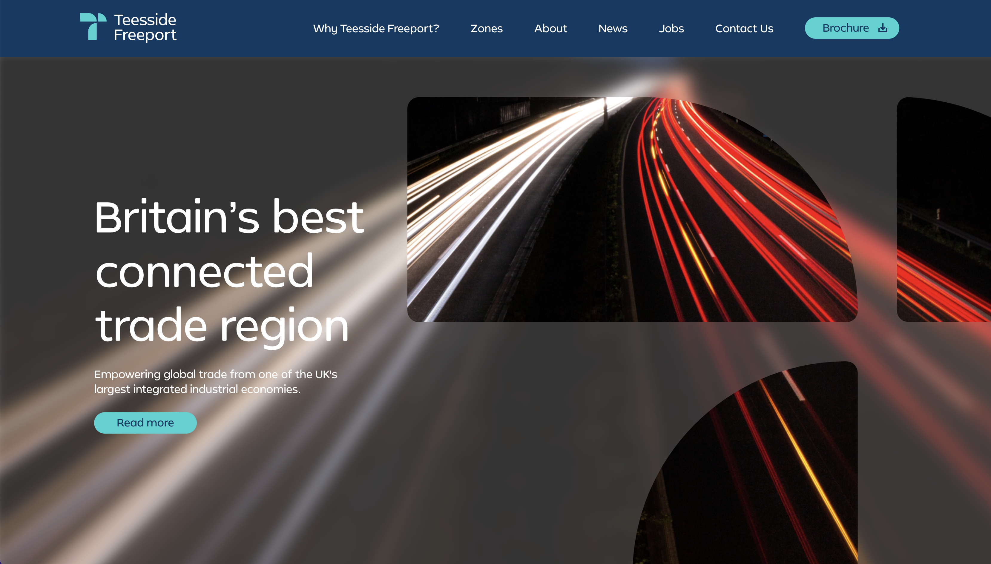
To coincide with the brand launch, we designed and built a new website that served to promote both the region and the freeport itself, including zone information, infrastructure and local skills.
Used by a range of stakeholders ranging from national and international businesses to the general public, the website has helped establish the freeport’s digital presence and grow awareness and understanding beyond politicians and policy makers. An interactive map works alongside a dedicated news section to provide key information and updates as the project progresses.


Fitting seamlessly, packing a punch
Combining this vibrant aqua accent colour alongside more neutral blues and a clean, fresh white, allow both the brand and the logo to work seamlessly alongside the freeport’s partner brands and local authorities.


Brave and bold
Just like the visual identity, the strapline is progressive, sharp and impactful.
