Giving the green light to London regeneration
Client
Guinness Homes
Project
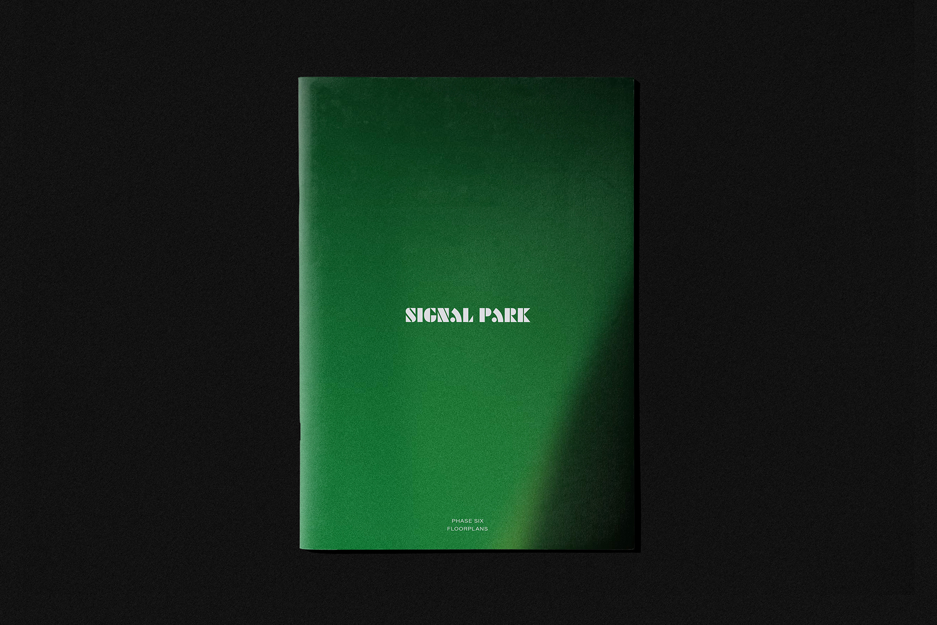
Signal Park Place Brand
Services
Sector
The Brief
This modern, spacious and community-centric development will play a crucial role in the wider area’s exciting regeneration. As a result, an authentic and inclusive identity was needed that empowers and unites new and existing residents alike, drives ownership and remains fiercely optimistic. The brand also needed to build on attributes such as connectivity, open space and aspiration to conjure a sense of movement, discovery and freedom. This is quality living that’s fresh, sustainable and at the heart of Tolworth’s transformation.
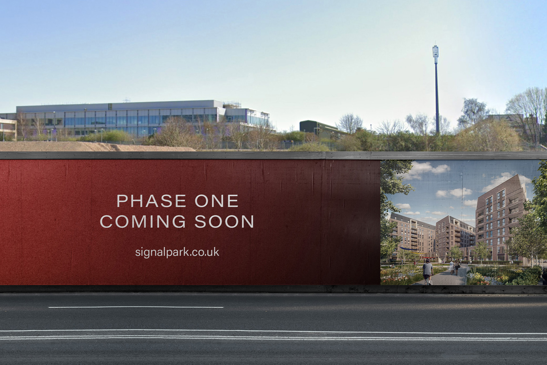
Located in Tolworth, Signal Park is a collection of apartments set within the Royal Borough of Kingston upon Thames, south west London. The site has been identified as a key development within the Borough for a number of years. Armed with a new masterplan that utilises the existing assets of Tolworth while creating a harmonious residential environment, the flagship project is finally reaching fruition.
The Solution
The outcome is a brand that plays on a unique blend of affordable, modern living with the connectivity to explore and the freedom to discover. Visually and verbally, the identity takes inspiration from the vibrancy of the city, while building on key local themes of community and nature. All of these combine to make a unique and enriching brand that reflects much more than a conventional suburban retreat or city-fringe development.
Giving the green light to London regeneration
The Brief
This modern, spacious and community-centric development will play a crucial role in the wider area’s exciting regeneration. As a result, an authentic and inclusive identity was needed that empowers and unites new and existing residents alike, drives ownership and remains fiercely optimistic. The brand also needed to build on attributes such as connectivity, open space and aspiration to conjure a sense of movement, discovery and freedom. This is quality living that’s fresh, sustainable and at the heart of Tolworth’s transformation.
Located in Tolworth, Signal Park is a collection of apartments set within the Royal Borough of Kingston upon Thames, south west London. The site has been identified as a key development within the Borough for a number of years. Armed with a new masterplan that utilises the existing assets of Tolworth while creating a harmonious residential environment, the flagship project is finally reaching fruition.
This modern, spacious and community-centric development will play a crucial role in the wider area’s exciting regeneration. As a result, an authentic and inclusive identity was needed that empowers and unites new and existing residents alike, drives ownership and remains fiercely optimistic. The brand also needed to build on attributes such as connectivity, open space and aspiration to conjure a sense of movement, discovery and freedom. This is quality living that’s fresh, sustainable and at the heart of Tolworth’s transformation.
The outcome is a brand that plays on a unique blend of affordable, modern living with the connectivity to explore and the freedom to discover. Visually and verbally, the identity takes inspiration from the vibrancy of the city, while building on key local themes of community and nature. All of these combine to make a unique and enriching brand that reflects much more than a conventional suburban retreat or city-fringe development.

Signalling a new beginning
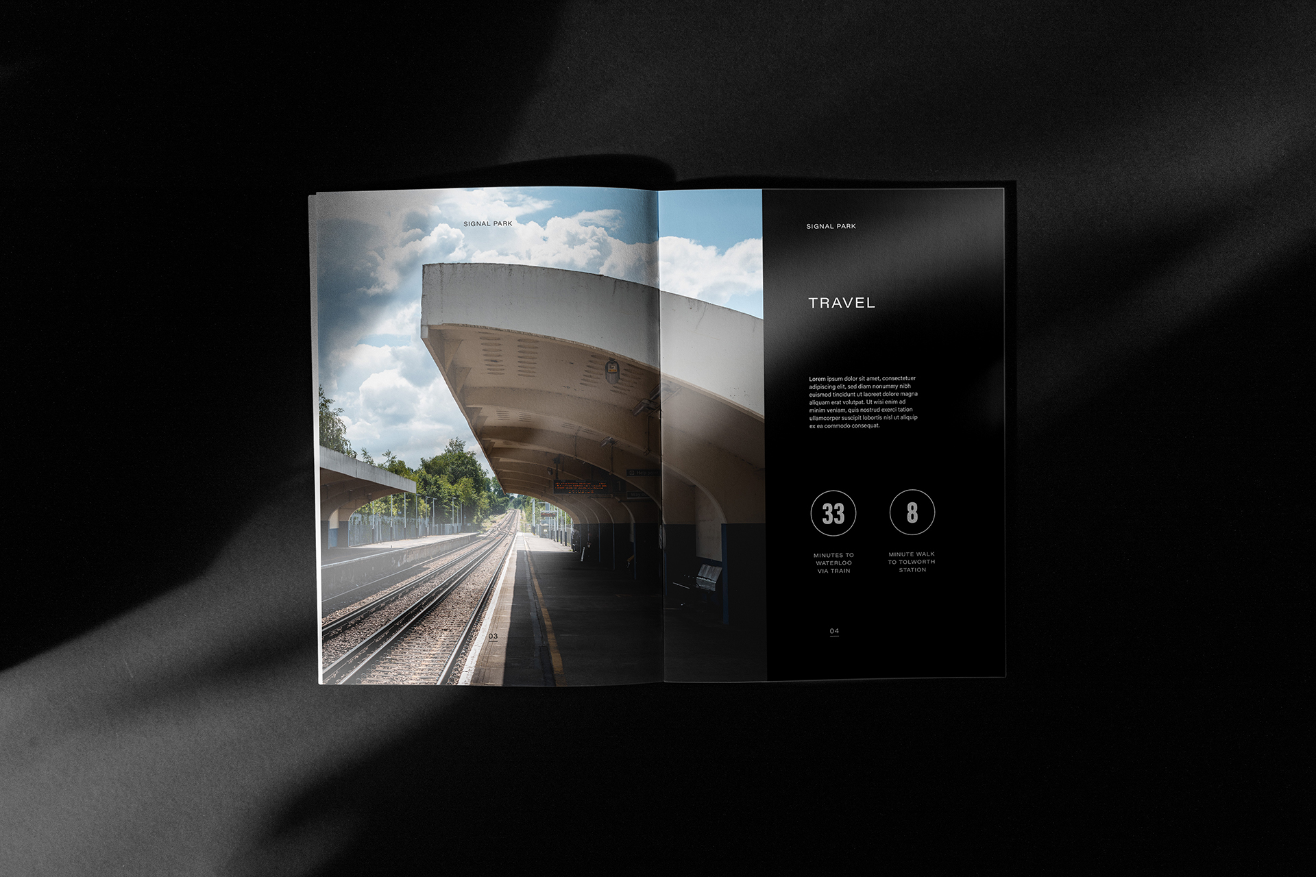
Signal Park was developed from the site’s close proximity to Tolworth Station — offering connections to central London in just 30 minutes — while also hinting at green environments and wide open spaces. At the same time, the name also acted as a metaphor for a new beginning both in a lifestyle and regenerational sense. This is a new chapter for Tolworth and its people to build pride in place; a new chapter for prospective residents where living takes centre stage.
Before we got to this stage, a shortlist of names was tested with a consumer base modelled on the development’s key audience, providing Guinness with the unique opportunity to stress test the name with demographically targeted respondents. Using Attest’s rapid and powerful survey tool, we gauged responses and gained valuable insight that directly informed the key creative and strategic decisions.


Adding curves to straight lines


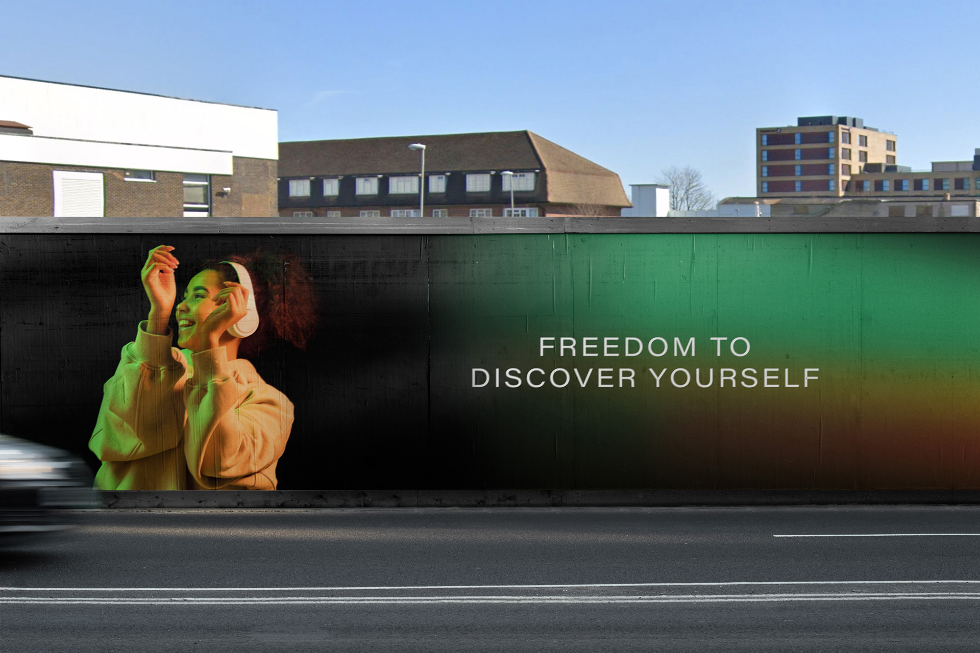
All of the lights
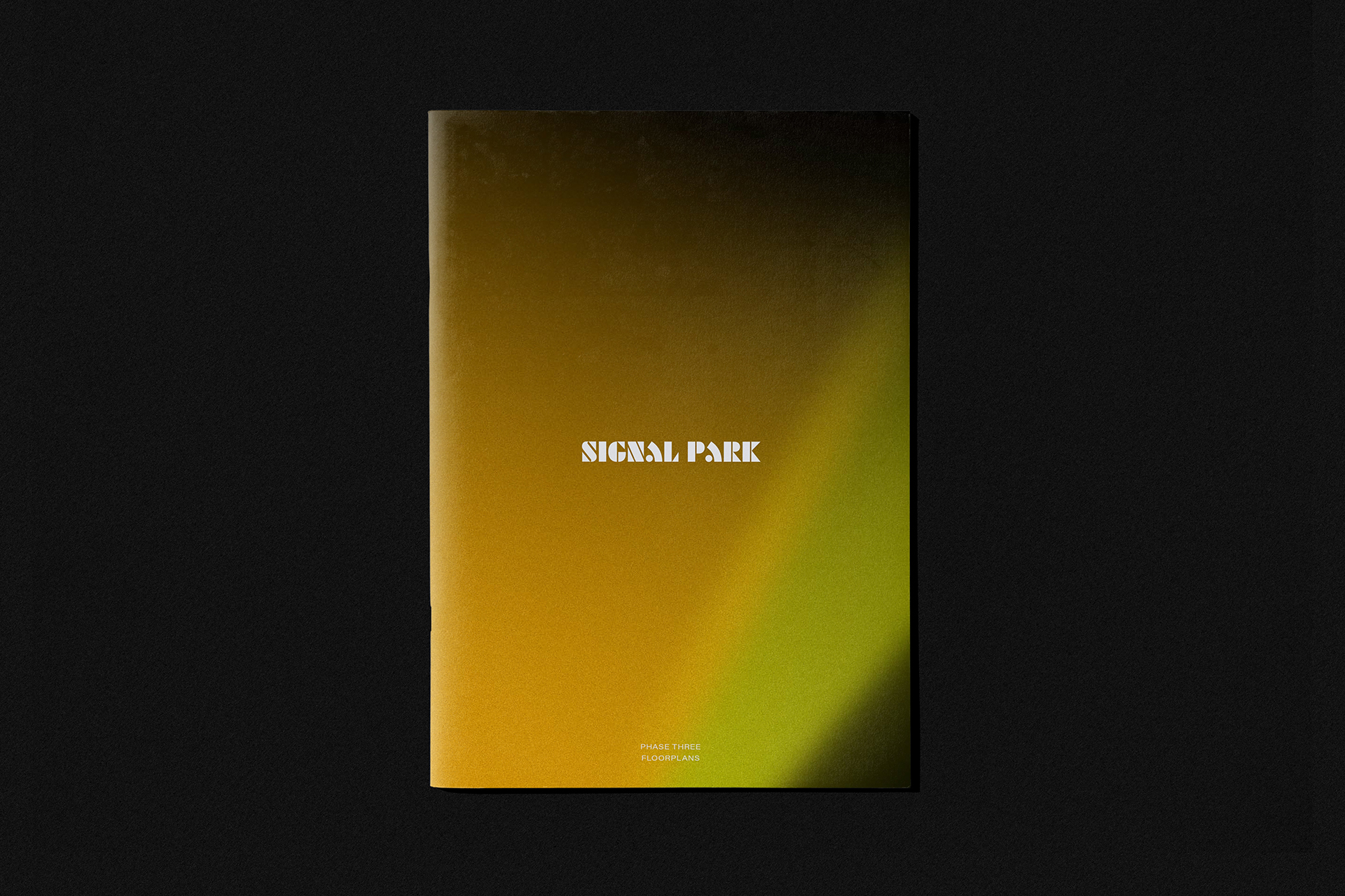
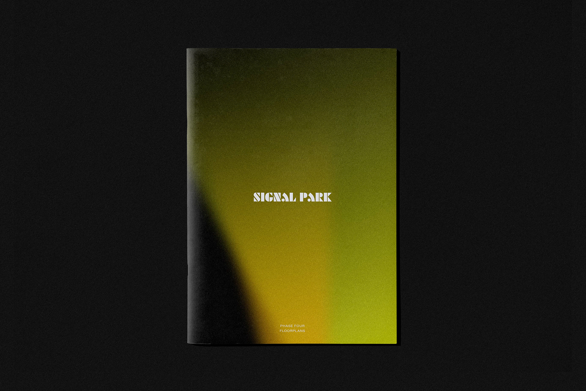
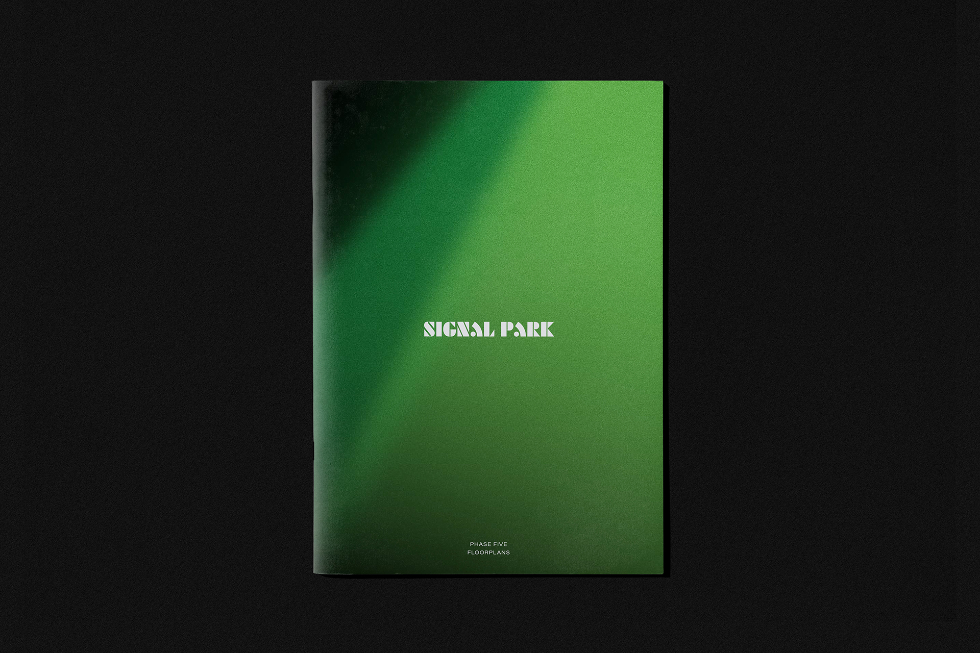
A spectrum of tones are used to denote build phases, starting from reds and ambers to yellows and darker greens. This shines a light on a feeling of progress, with the same gradients also used across hoarding, brochures and top level photography.

Freedom to discover
Its agile nature means it can be adapted across campaigns, key audiences and even the lifespan of the development. At Signal Park you don’t just have attractions to discover, you have the freedom to discover.


“As a flagship project that’s set to play a key role in the wider regeneration of Tolworth, Signal Park needed to empower residents and drive ownership. Better’s process saw them immersed in the development from the outset, understanding the area’s history as well as its future potential. The result is a proposition that’s built on a DNA of community, connectivity, space and discovery — the perfect blend for a unique and enriching brand that reflects much more than a conventional suburban retreat or city-fringe lifestyle.“
Rob Carter
Marketing Manager, Guinness Homes