
Making powerful connections for IT industry leaders
Client
Communicate PLC
Project
The Communicate Rebrand
Services
Sectors
The Brief
Communicate has grown, developed and changed over the years. But these changes haven’t been reflected in their brand or marketing. The company now needs a unified brand, that helps clarify their messaging whilst elevating their visuals in line with industry leaders.
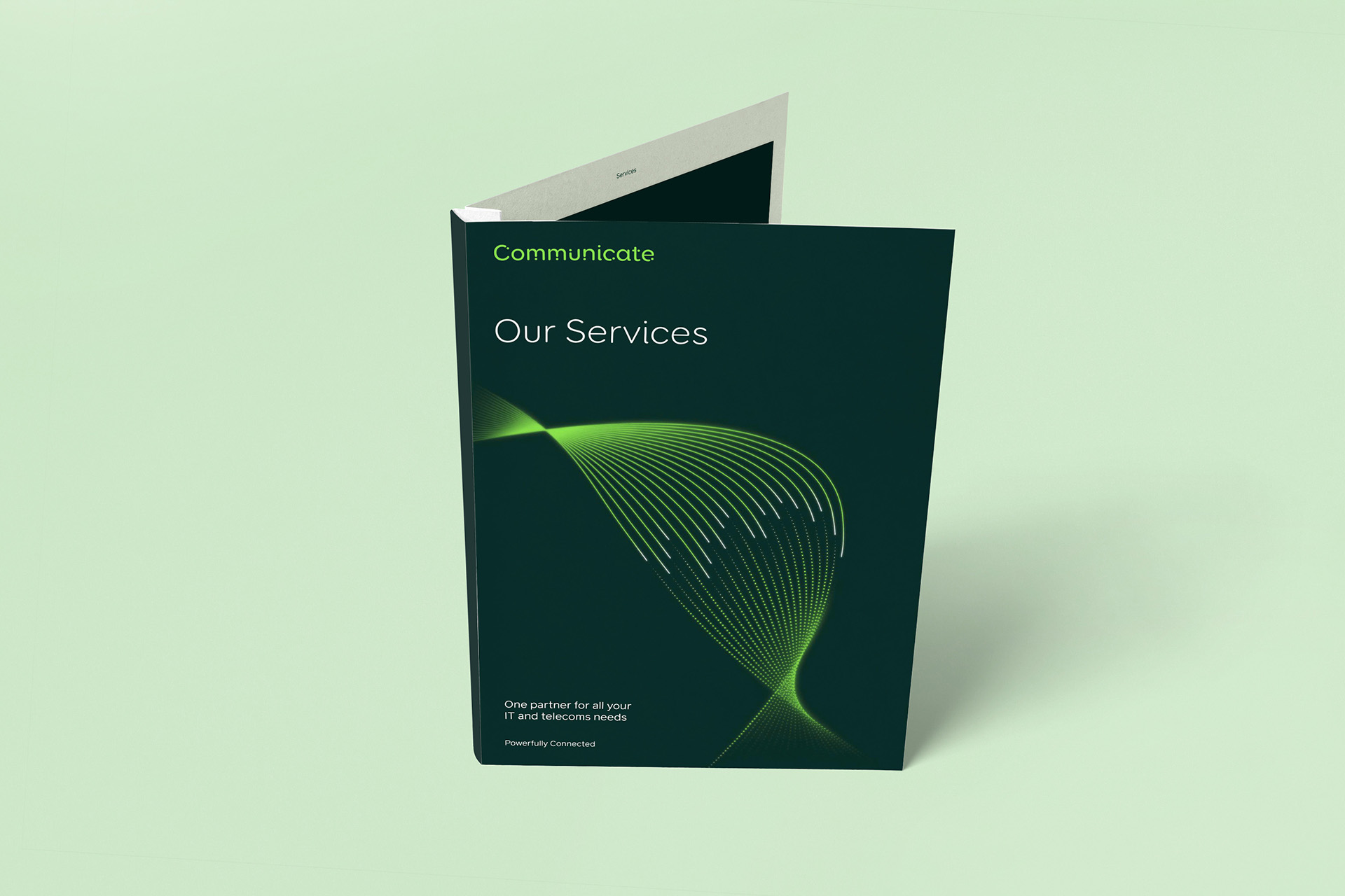
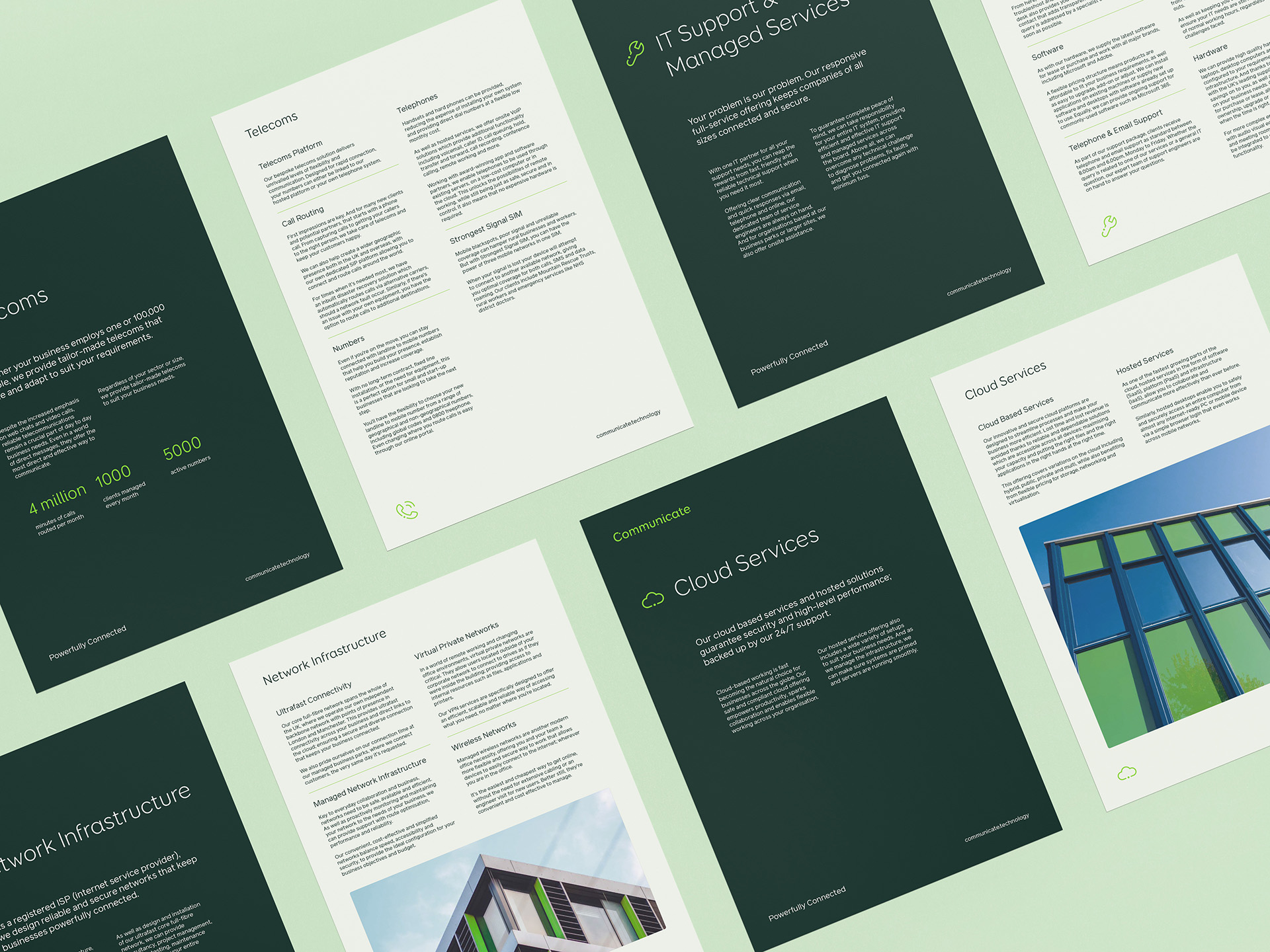
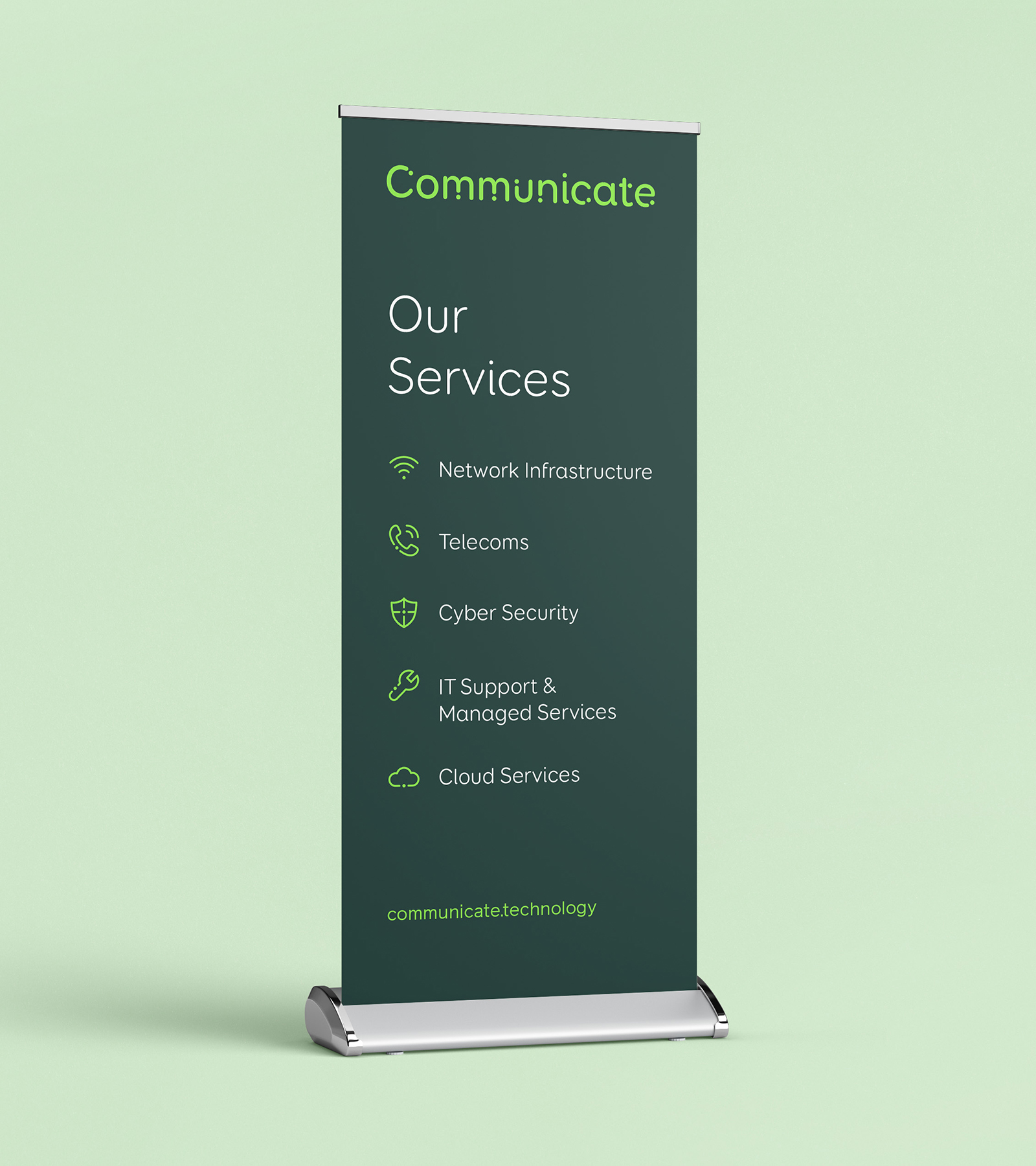
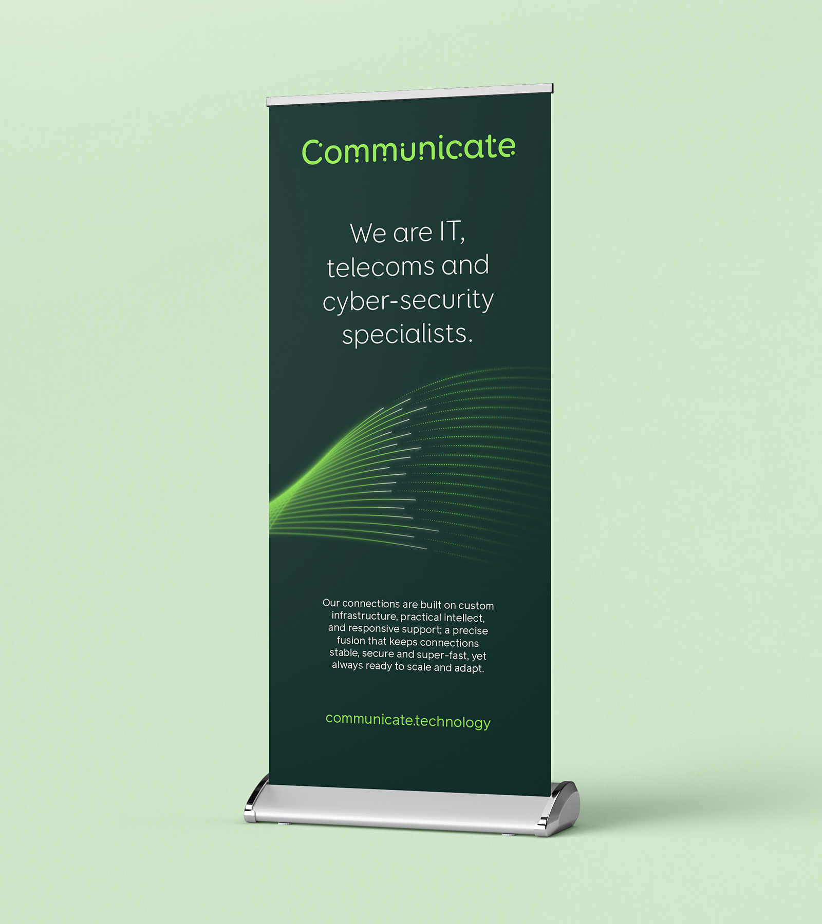
Communicate are IT, telecoms and cyber-security specialists, providing IP Telephone Systems, servers in their onsite data centres, PC’s & laptops on desks, full Backup and Disaster Recovery services, shared printers, remote monitoring services and even software supply and support.
The Solution
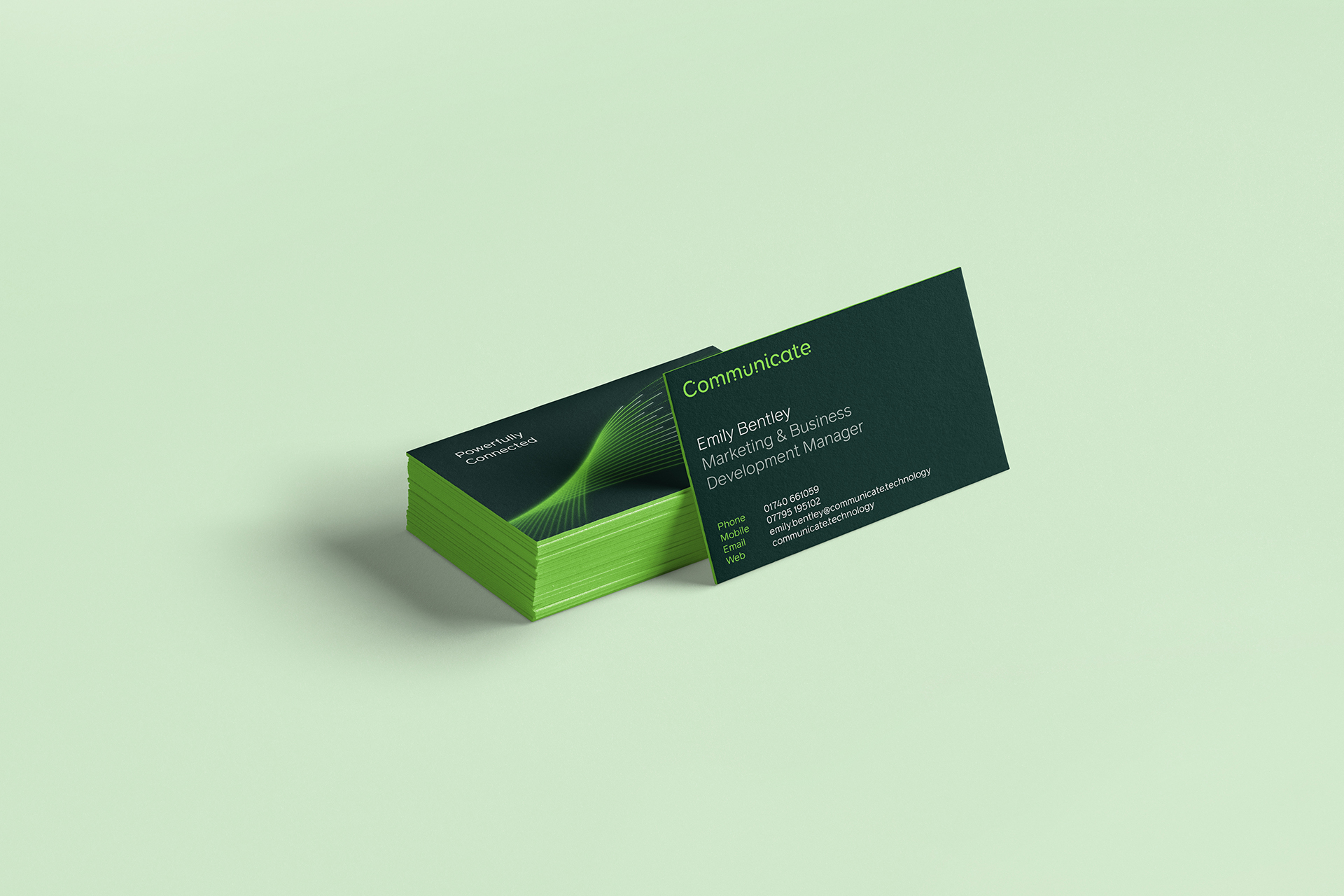
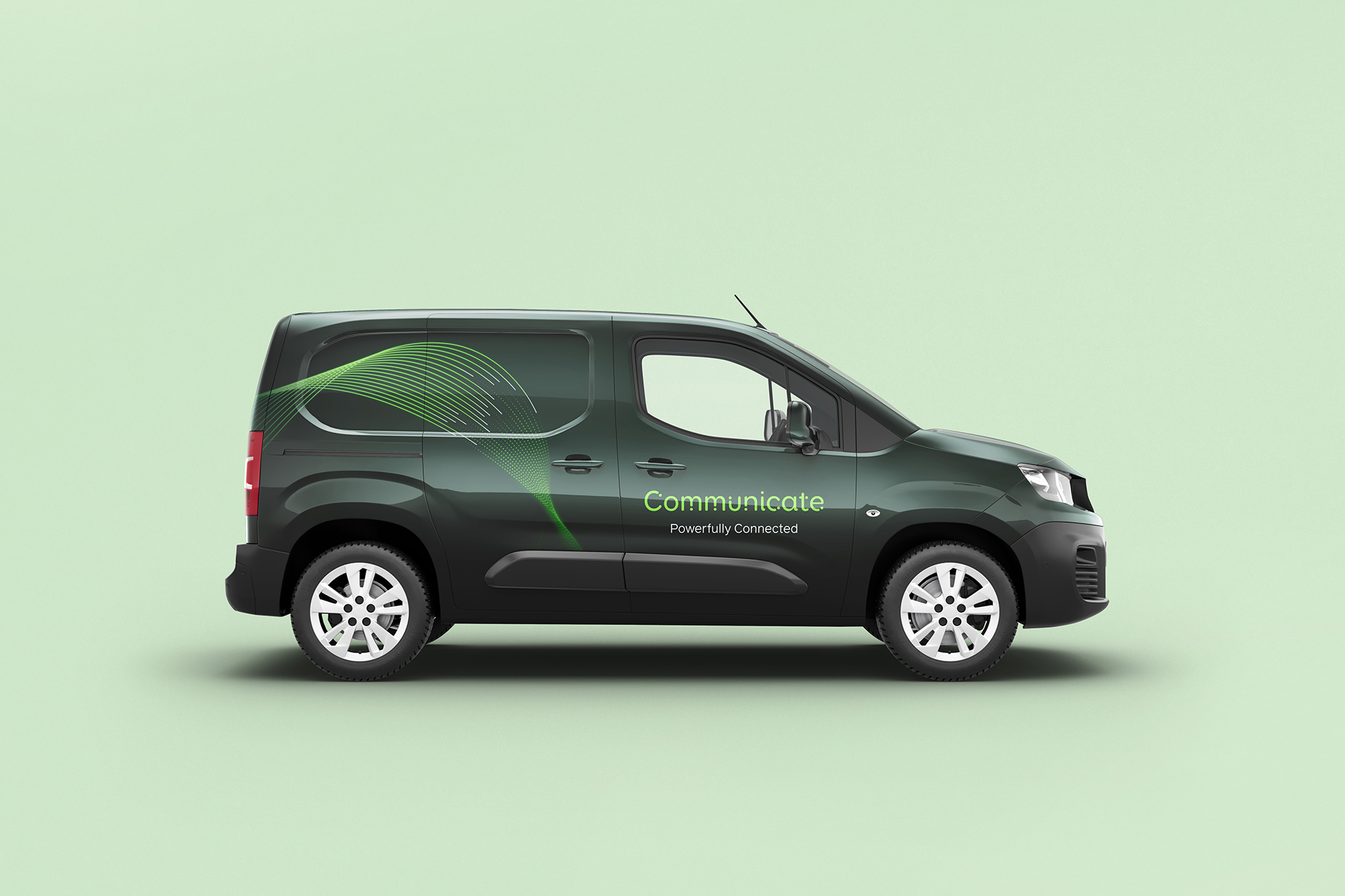
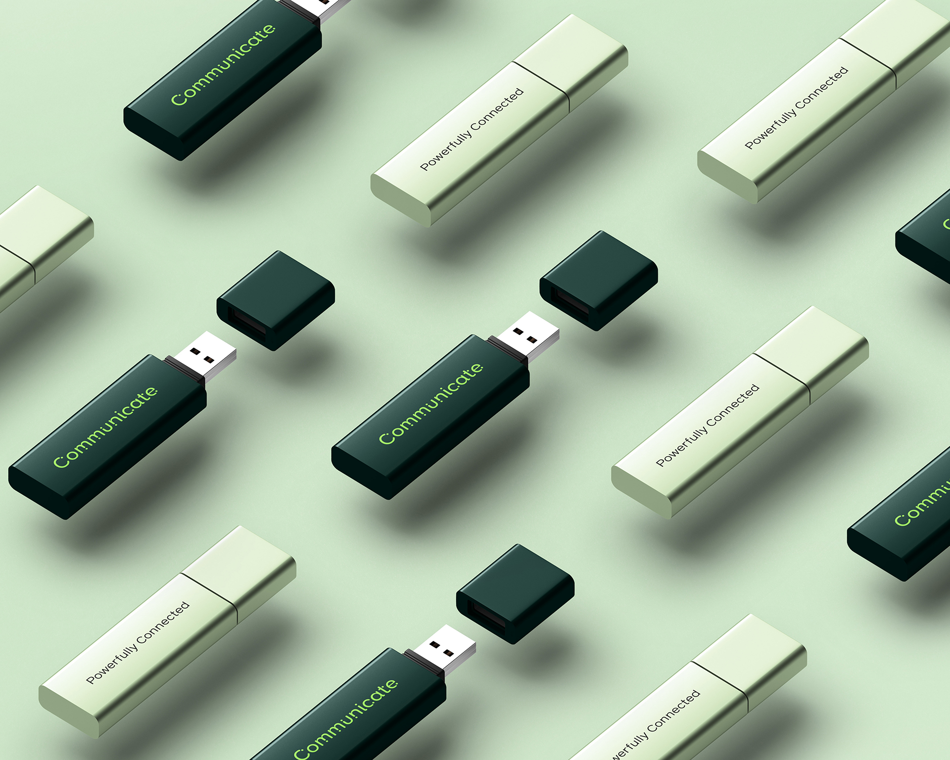
Better crafted a new proposition that encompassed all the services that Communicate provides. ‘Powerfully Connected’ became the key thought to build the brand around with everything from logo and typography to graphic elements and palette being engineered to express clear lines of connection between two points.
Making powerful connections for IT industry leaders
The Brief
Communicate has grown, developed and changed over the years. But these changes haven’t been reflected in their brand or marketing. The company now needs a unified brand, that helps clarify their messaging whilst elevating their visuals in line with industry leaders.
Communicate are IT, telecoms and cyber-security specialists, providing IP Telephone Systems, servers in their onsite data centres, PC’s & laptops on desks, full Backup and Disaster Recovery services, shared printers, remote monitoring services and even software supply and support.
Communicate has grown, developed and changed over the years. But these changes haven’t been reflected in their brand or marketing. The company now needs a unified brand, that helps clarify their messaging whilst elevating their visuals in line with industry leaders.
Better crafted a new proposition that encompassed all the services that Communicate provides. ‘Powerfully Connected’ became the key thought to build the brand around with everything from logo and typography to graphic elements and palette being engineered to express clear lines of connection between two points.
Connecting the dots


Connecting online and offline
While for Communicate, the majority of business starts offline, the website plays an important role in providing reassurance for new and existing customers alike. An updated and interactive design with refreshed content, refocused user journeys and refined service offerings helps elevate the brand. Strategic calls to actions and a refined structure combine to offer a more engaging user experience that integrates with the organisation’s marketing funnels and wider sales strategy. Another role the website plays is to aid the support experience for existing customers; through dedicated portals, service desk, live status pages and cyber incident help

It's not easy being green


“It’s the perfect time for a rebrand as the business has developed significantly over the past ten years. The new brand reflects our vision going forward and our streamlined full service offering. It’s taken time to refine our brand and we’re thrilled to have worked with Better throughout this process to finally bring our vision to life. We are thoroughly looking forward to seeing our new brand out there.”
Tony Snaith
CEO, Communicate