Transforming a modern garden city into a distinctive destination
Client
Countryside Properties & Clarion Housing
Project
Ashmere Place Brand
Services
Sector
The Brief
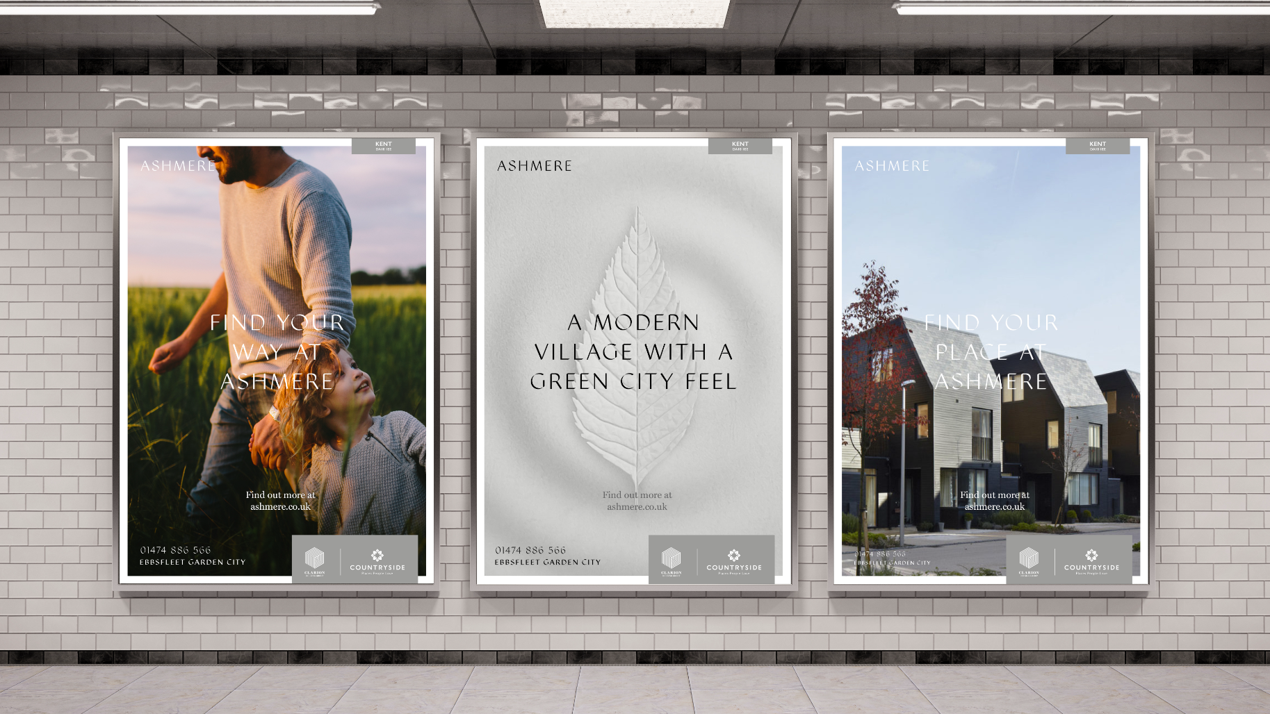
Countryside required a placemaking brand proposition for Ashmere, with a distinctive visual language to clearly stand out from the housebuilding competition at Ebbsfleet Garden City. The identity needed to conjure a sense of peaceful reflection, choice and discovery; rooted in a sophisticated, aspirational feel and its nourishing, natural setting.
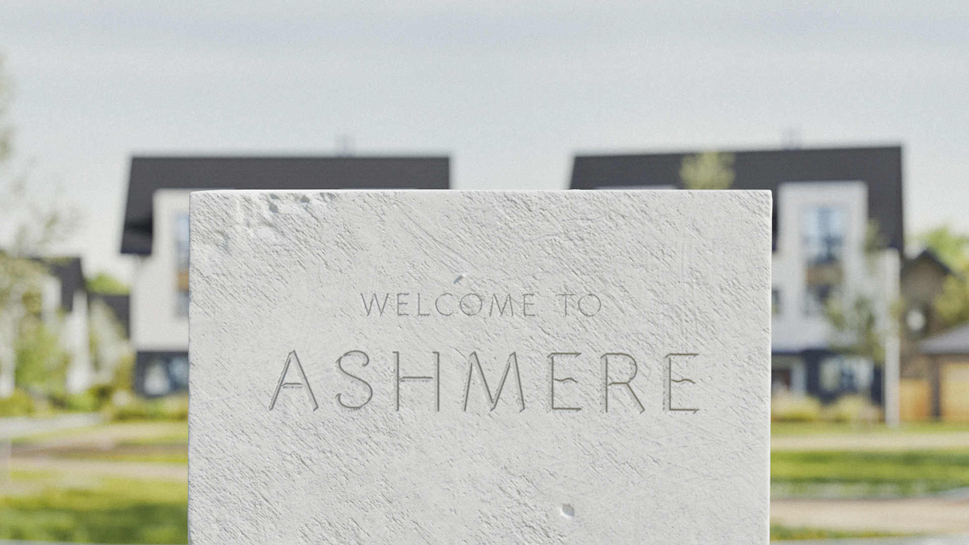
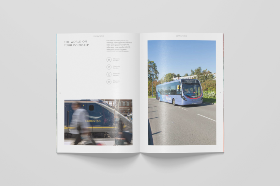
Up to 30,000 people will work in the green, modern and well-connected environment of Ebbsfleet Garden City, with Ashmere destined to be a jewel in the crown of the development. Built into a quarry site, it offers unique landscape features such as white chalk-like cliffs overlooking a manmade lake.
The Solution
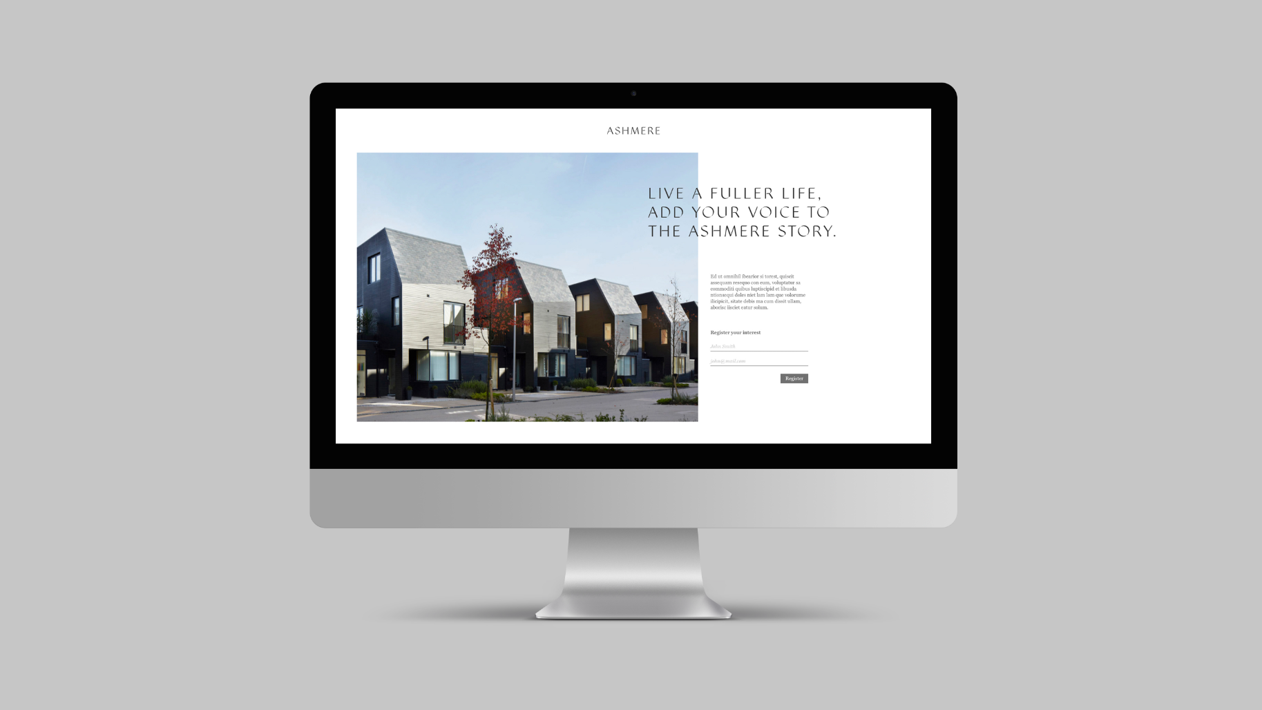
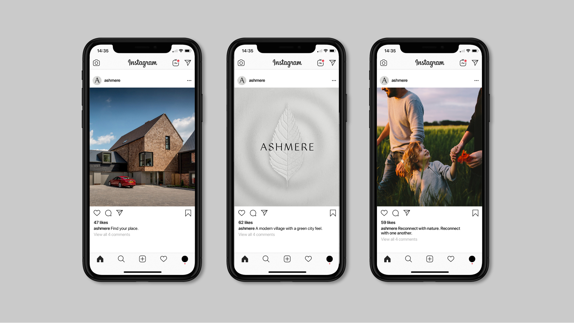
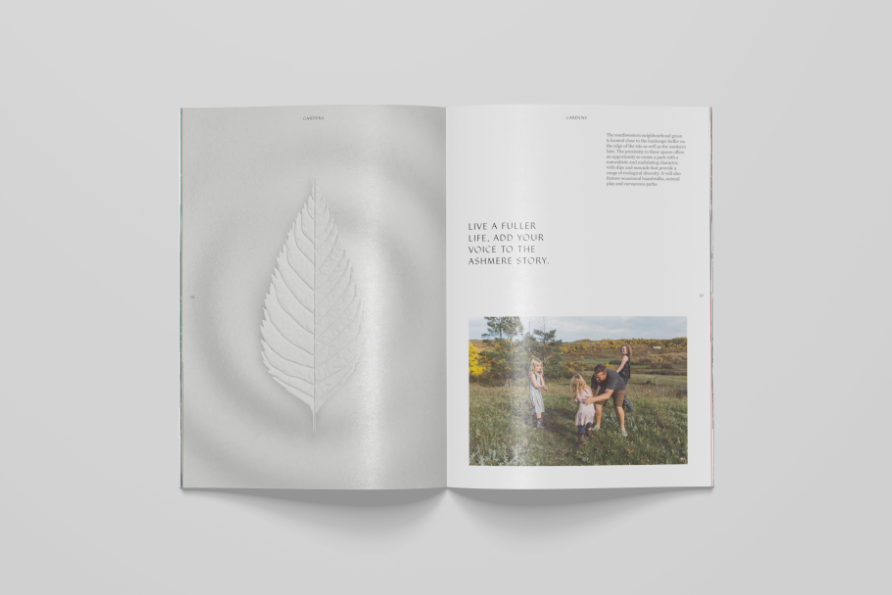
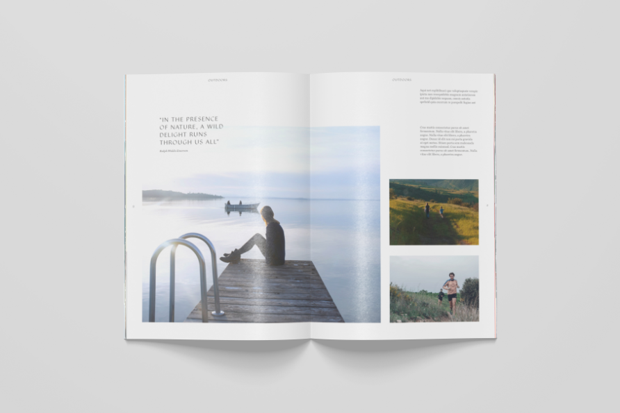
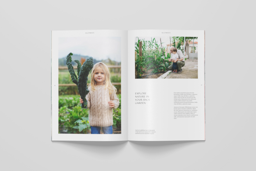
Ashmere is a place that invites you to explore, to shift pace, slow down and notice the details of life. A place to reconnect with nature and reconnect with one another. Working alongside Placemaker, we developed a concept that revealed these details in the same way the site is revealed from the quarry; carved from the very stone itself.
Transforming a modern garden city into a distinctive destination
The Brief
Countryside required a placemaking brand proposition for Ashmere, with a distinctive visual language to clearly stand out from the housebuilding competition at Ebbsfleet Garden City. The identity needed to conjure a sense of peaceful reflection, choice and discovery; rooted in a sophisticated, aspirational feel and its nourishing, natural setting.
Up to 30,000 people will work in the green, modern and well-connected environment of Ebbsfleet Garden City, with Ashmere destined to be a jewel in the crown of the development. Built into a quarry site, it offers unique landscape features such as white chalk-like cliffs overlooking a manmade lake.
Countryside required a placemaking brand proposition for Ashmere, with a distinctive visual language to clearly stand out from the housebuilding competition at Ebbsfleet Garden City. The identity needed to conjure a sense of peaceful reflection, choice and discovery; rooted in a sophisticated, aspirational feel and its nourishing, natural setting.
Ashmere is a place that invites you to explore, to shift pace, slow down and notice the details of life. A place to reconnect with nature and reconnect with one another. Working alongside Placemaker, we developed a concept that revealed these details in the same way the site is revealed from the quarry; carved from the very stone itself.
Clean cut
Find your moment

Find your way


Find your name


Find your place
“As part of a new and vibrant garden city, Ashmere needed to feel aspirational and tranquil in equal measure, while still being distinctive enough to stand out from developments close by. From immersion through to execution, Better’s process and team understood the development and felt empowered by its potential as well as the wider area. The result is a brand that elevates Ashmere as a unique place where your own space and your own pace allow you to reconnect and refresh.”
Victoria Finch
Sales Director, South East Region, Clarion Housing