
30.11.20
Turning the tide
An eco-conscious refresh for the leading US household cleaning and care challenger.
 Written by John Taylor
John Taylor
Written by John Taylor,
Creative Director
Despite all the challenges of 2020, we’ve been busy working on one of our most exciting projects to date; the refresh of America's leading non-toxic, plastic-free detergent company.
Ranked 289 in 2020’s Inc. 5000, Dropps have seen an impressive growth rate of 1553% over the past three years. This is the second time that Dropps have been ranked in the list, marking the culmination of the company’s successful transformation into a direct-to-consumer household cleaning company.
Following a $16 million investment from The Craftory, Better were engaged to evolve their brand and packaging to help them scale, meet growing demand and go head-to-head with major cleaning brands.
The world’s first detergent pod
The Dropps story begins back in the 1980s at a cotton mill just outside of Philadelphia. Making chunky yarn sweaters, the family firm soon realised that harsh detergents and rough laundry routines made their yarn discolored and stretchy. To combat this Dropps Founder, Jonathan Propper and his mother Lenore Propper Schwartz, created a biodegradable, low-sudsing, detergent that was tough on dirt, but gentle on clothing.
Not satisfied with reshaping the industry, they then shook it up by putting all the cleaning power in a simple, convenient, dissolvable parcel. The world’s first laundry detergent pod was born.

Fast-forward to 2020
That same desire to remove anything harmful and unnecessary while amplifying the core still drives the brand today. With pointless innovations and sub-categorisation clogging up the cleaning industry, Dropps saw a real opportunity to ‘eliminate the stupid’ and improve the usability and efficacy of their products.
To take their brand to the next level, Dropps asked us to rethink their packaging along with new visual and verbal product language, an evolved logo and a review of typography. We had to carefully balance a minimal, straight-talking approach with tensions around familiar category codes and the added complexities of creating a flexible minimal-waste packaging solution.
How we helped
Following a rapid immersion phase, we generated multiple brandscape options for how the Dropps brand could evolve. These potential directions were tested with consumers, helping Dropps to not only select the right direction but rethink who their brand was targeting.
Building on this initial work and the analysis of results, we completely redrew the logo. The creative direction of the logo informed a new typographic and iconographic system which was carried forward into extensive packaging redesign.

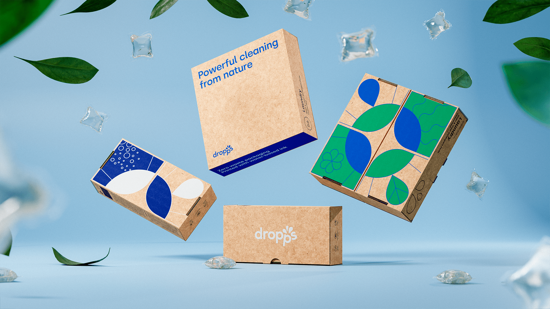
Dropps are on a mission to reduce the industry’s toxic pollution and plastic waste, so we updated their signature box not only to celebrate the fusion between nature and cleaning but to be as intelligently eco-friendly as possible. Using an innovative two-part system using water-based inks, we provided print plates for each product category along with custom product details that will print to order in their warehouse.
The unconventional approach not only future-proofed their packaging, allowing new variants to come and go without redesigning packaging, it also ensured the boxes are fully biodegradable.
Through a smart folding design, the Dropps pods are kept in the same box they are shipped in, eliminating any excess packaging and waste. The refreshed packaging is already making waves and was featured by the global showcase of package design DIELINE less than a week after launch.
With the web go-live rapidly approaching, Dropps also enlisted our help to deliver their online product photography and online iconography; the Better team generated over 80 icons and 34 product images, in-house, during the two weeks running up to dropps.com launch.

Sydney Waldron, Director of Marketing at Dropps, said: “Dropps was first launched back in the mid-2000’s before shopping for household consumables online was commonplace. After 13+ years, it was time to transform Dropps into the digital first company it is today.
“The team at Better has been the ideal partner: they’re thoughtful and intentional in their approach, and landed our brand blade ‘Eliminate the Stupid, Elevate the Core’ perfectly.
“The day after the new brand and website launched, we saw our best sales ever. Our loyal customers expressed joy over the new look and feel, but still recognised it as the same Dropps they know and love.”
Our Creative Director, John Taylor, said: “We had to be careful with this rebrand; it wasn’t a blank slate; it was about amplifying what is already working for Dropps. It’s been a six-month journey to get us to launch, but every ounce of work shows in the results.
“Balancing eco-concerns, unique packaging formats, multi-part specialist print, brand equities, huge incumbent competitors, category codes, typography and imagery is a chunky brand challenge at the best of times.
“To tackle it at the height of a global pandemic, working remotely, with a client in a different country and still produce work of this standard highlights the calibre of the team we have and the work we are capable of producing. I’m incredibly proud of what we’ve achieved here. In a year that has done its worst, we’re still making brands better.”
Keep an eye on our projects page for the full case study arriving shortly.


