19.04.21
Supporting communities beyond the pandemic
We love building brands, and those that make a difference can often mean even more.
 Written by James Bolton
James Bolton
Written by James Bolton,
Brand Strategist
It’s been a turbulent 12 months, and as COVID-19 eases and restrictions relax, communities need our support as much as ever.
With that in mind, we continue to place emphasis on building a better place to work and live, as well as building better and more informed brands.
As we’ve said before, we feel that it’s one of our major commitments to support the people closest to us. It’s about balancing purpose with profit and fundamentally delivering both economic and social wellbeing within our communities. As well as our initiatives with High Tide, The Northern School of Art and Teesside University, part of that is supporting purpose-driven organisations who need a helping hand with their brand and identity. And while asking us to pick our favourite brand is like asking us to pick our favourite child, it’s fair to say we always have a soft spot for brands that do the remarkable as well as look remarkable.
This post shines a light on just some of the community centric and social-conscious organisations we’ve supported over the past 18 months.
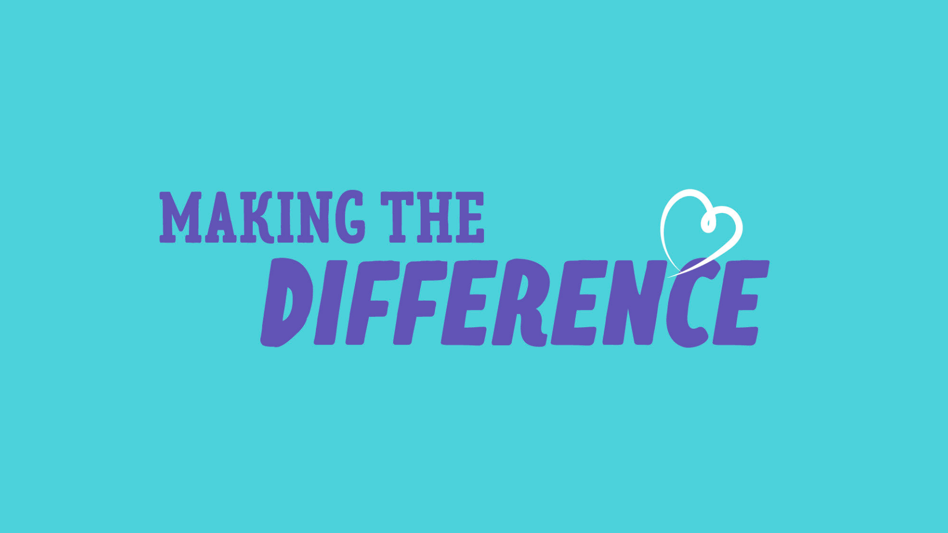
Making the difference
One recent example is South Tees Hospitals Charity; the fundraising arm of South Tees Hospitals NHS Foundation Trust. As the NHS recovers from the height of the pandemic, the charity is supporting frontline staff, improving patient care and keeping hospitals at the vanguard of healthcare across Middlesbrough, Redcar & Cleveland and Hambleton & Richmondshire.

Working alongside the newly appointed Head of Charity, we recognised the need to improve the organisation’s brand communication which had to be intrinsically linked to its fundamental cause. Ultimately, it was about defining their story, raising awareness with the wider public and helping the charity shout loud and proud about the crucial role they play in not only supporting our NHS heroes, but improving the health and wellbeing of over one million people across the region.
We’ve been hard at work taking the organisation through our BetterBrandBuilder™ process, with the resulting brand set to be launched later this month. Armed with a refined story and clarified beliefs, the charity’s new look brand is built around a powerful core purpose to ‘enhance our NHS, for our nearest and dearest’.
We’re also introducing a new name which is more descriptive and explanatory, while bringing a personal and human touch to the fore. Alongside an aligned tone of voice, this helps strategically position the charity within a crowded sector and clearly defines them as an organisation dedicated to local people’s wellbeing and the future of the NHS.
Visually, the brand builds on familiar charity and care themes, while offering a fresh new look that’s warm, welcoming and human. Keep an eye on our site for more as the brand launches in May.
Keeping the elderly on their feet
Steady on Your Feet exists in a similar sector and combines the knowledge and experience of the NHS, local authorities and voluntary sector. Powered by a purpose to ensure that falling is not an inevitable part of ageing, we created a new brand for the integrated, cross-regional campaign.
After unpacking their core brand mission — to keep people active, independent and safe — we built the brand around a clearly defined role, personality and audience. Already established values and territories helped inform decisions around colour palette and illustration style, while also making the brand feel much stronger and refined.
At an overarching level, the new look brand brings a consistent style and presence that helps spread the message, raise awareness and increase understanding of falls prevention. An all-new brand world was created, including a custom wordmark, illustration set, and key messages to help present Steady on Your Feet as a simple but effective resource for advice and guidance.

All of these elements were wrapped up in a soft and welcoming feel that’s essential to encourage engagement. Similarly, an important watchout was accessibility and legibility for older age groups; so too was keeping any creative or messaging clear from being patronising or childlike.
After a successful launch in the North East, the campaign is now being rolled out in Northamptonshire, with plans for other areas of the UK later in the year.
Lighting up the road ahead
Founded in memory of Russ Devereux, the Headlight Project works with children to deliver emotional resilience programmes, one-to-one counselling and equivalent services for adults. With a particularly poignant purpose, the organisation needed to develop a brand world to reflect a sense of hope, guidance and security around their existing lovingly hand-illustrated identity.

The new brand device was created, inspired by a shining headlight. This visually wraps itself around the young people and families the organisation is there to support providing movement and positivity to images, while also illuminating keywords and icons. Equally, the typography and colour palette needed to feel warm, crafted and welcoming, with the overarching purpose to support families, raise awareness and empower people.
We continue to be on hand to help provide ongoing brand and digital support to the team and are very proud to play our part as the organisation grows and develops. This includes supporting the launch of their new website, built in-house by our digital team, which has become an important hub of information and sits centrally to their social media and digital communication activity.
As is the case with many care or charity organisations, images were a particular challenge. It can be difficult to tackle issues around privacy and protection when dealing with such a delicate subject. And unlike product-led businesses, there’s also the barrier of illustrating services that are simply intangible. The solution was a refined image style that focused on the ultimate impact of mental health interventions, particularly amongst children.
Helping people live happy
As part of Middlesbrough & Stockton Mind, Realise! is a bespoke mental health service offering private counselling to help people live a fuller and happier life. As an all new service, we were tasked with creating a completely new verbal and visual brand, including their name.

On the back of the Discover phase, we developed a unique brand story covering their point of difference, personality and most importantly their WHY. This was before we even considered naming strategies, colour palettes or typography.
The core of their character centred around an ‘empowering activist’ personality, which was backed up by an intrinsically powerful WHY — ‘To help people live happy’. With this in mind, the foundations were set to build a well-informed and well-positioned visual brand.

The result is an identity that’s welcoming and friendly. While its typeface feels mature and refined, the palette adds pops of colour that radiate a certain serenity and positivity; something essential to a brand that ultimately needs to bring calm to chaos.
Committed to the future
Whether it’s helping to build better brands for those doing social good or playing our part in the digital transformation of High Tide and it’s programme delivery, we’re doing all we can to keep our communities strong, resilient and future-ready.
And as the UK finally gets back to some form normality, the brands that are re-energised and re-focussed will be those best placed to serve those who need it most as well as deliver long-term sustainable impact.
If your organisation needs support, please get in touch.


