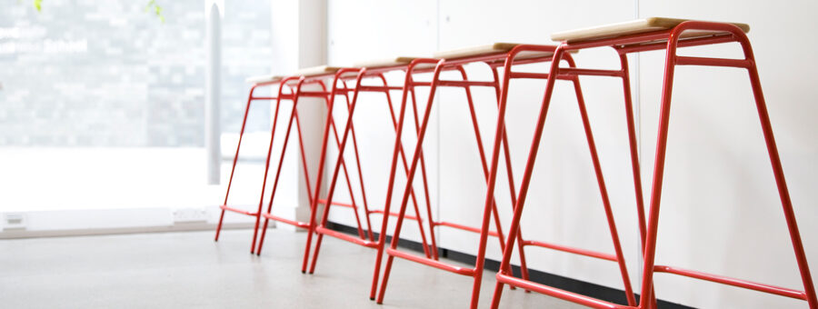
An occasional reflection on the regional brands we admire. This month designer, Ryan Crawford, tells us what he loves about one of his favourite local brands – ‘Deadgood’.
This is a lovely brand. I first came across their printed material whilst on placement in Newcastle during my second year of University. They use one of my favorite typefaces (ITC souvenir) and they have adopted a wonderfully simple and clear language that ties in well with their brand identity – in fact, that’s what I enjoy most about them, that their brand is basically typography coupled with clever language.
When it comes to design, that’s what I appreciate most – simplicity, not screaming for attention, the whisper is louder than the shout. They’re understated which works to their advantage; that’s what gets them noticed.
I just love people and brands that want to be different – not just for the sake of being different, but because that approach is considered to work to their advantage.
Their mission statement says it all: “At Deadgood our mission is to create a cutting edge collection of furniture, lighting and interior products produced with a clear and uncompromising commitment to quality and united by an unmistakably British sense of fun and eccentricity.”
I love the fact that they continually aim towards something new, never settling for what’s considered to be cool now. I love the name too. Even though they’re selling expensive pieces of furniture and high-end design consultancy, their name is fun, cheeky and simple.
It’s not trying too hard. It is what it is. Nothing less.


