
05.04.23
Flowers that leave a lasting impression
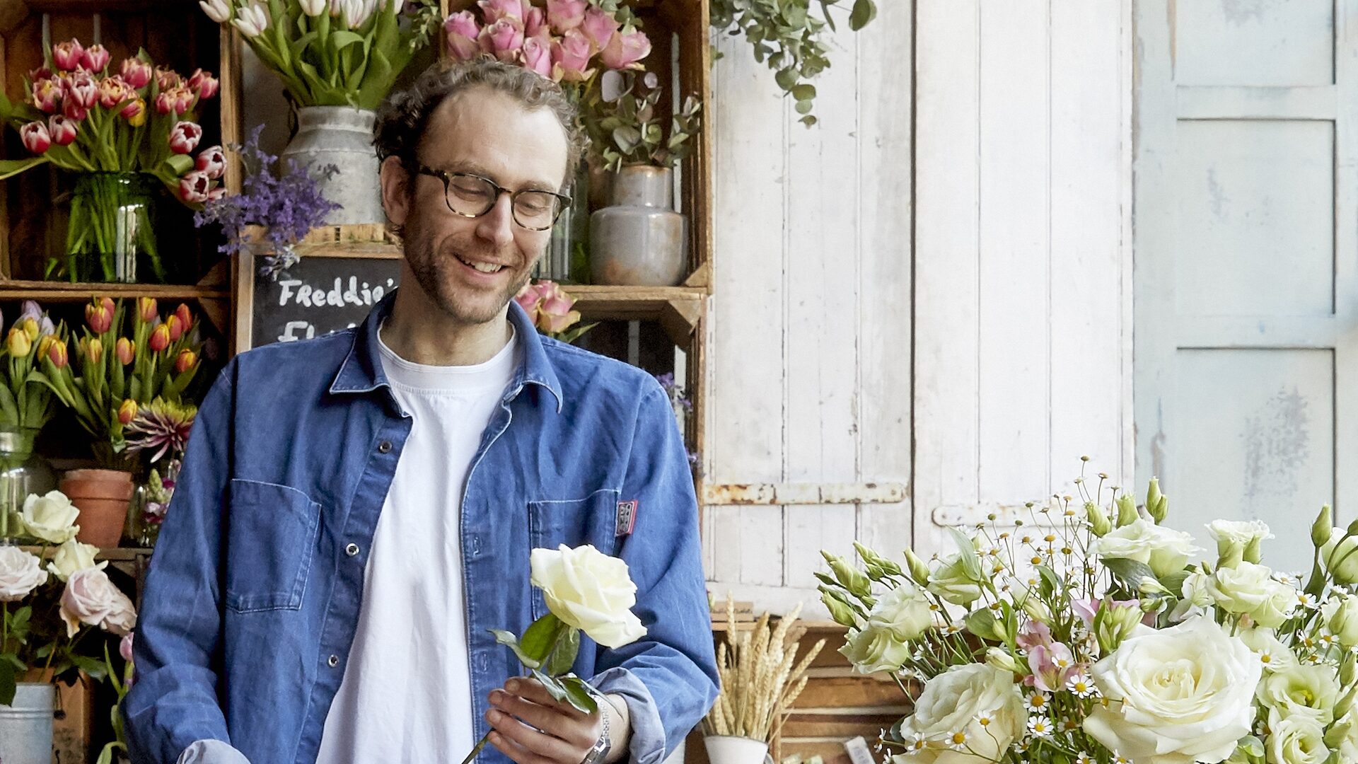
Freddie’s Flowers has grown from surprising a few neighbours to delighting over 130,000 customers every week; our strategic and visual overhaul prepared them for their next stage of growth.
 Written by John Taylor
John Taylor
Written by John Taylor,
Creative Director
In today's fast-paced, tech-saturated world, people crave a connection with nature more than ever. And the cut flower industry has always been a popular way to bring nature into the home.
Still, it has become lazy, lacking in creativity and less palatable for today’s sustainable tastes. The industry has lost touch with the essence of flowers and the meaningful experiences they can bring, turning nature into a disposable commodity.
Freddie’s Flowers, a premium DTC cut flower subscription service, want to change the script. Following a $60m investment from The Craftory, Freddie’s enlisted our help to define, clarify and broaden their brand strategy and brand codes, preparing them for new features like gifting and growth into new territories.
Flower power
We started by rewriting Freddie’s brand strategy from the ground up. Collaborative workshops with the team at Freddie’s helped us shape a new Big Idea – “Freddie’s flowers brighten more than just rooms.” This idea represented the transformative power of flowers, extending their impact beyond just surface visual value.

Our Creative Director, John, explained: “Our idea was to position Freddie’s as more than just flowers, or rather flowers that fulfil their full potential. Freddie’s supply chain only cuts flowers to order, massively reducing the wastage so common in the category.
“Their flowers travel from field to front door in 48 hours, ensuring long-lasting fresh flowers, and they are always sent unarranged with expert guidance included. This forces members to take time out to engage with the flowers.
“It creates a cumulative hands-on experience with nature, learning about the stems and their forgotten meanings.”
Expertly curated and responsibly sourced, empowering self-expression, delivering a restorative well-being ritual, and genuinely leaving a long-lasting impression? That’s real flower power.
A vibrant voice
As part of the strategic work, we also developed a clear verbal identity for Freddie’s, drawing inspiration in part from the creative floral figurehead that creates the arrangements – Freddie Garland himself. In 2015, Freddie started delivering weekly flowers in “a knackered old milk float” to his Mum & Dad’s neighbours. Since then, the business has grown to over 130,000 happy customers nationwide. It was our job to take his voice and mesh it with the brand strategy to create guidelines that can be written to by any content creator in the organisation. We defined an energising brand voice that stays natural and friendly. A voice full of vibrance, life, and quintessentially English expertise. The tone of voice is never elitist or superior. However, it’s not afraid to throw around the correct Latin names for stems or the odd historical reference either; we want members to feel Freddie’s enthusiasm for flowers. We’d never just call a daffodil a daffodil; no, they are the yellow trumpets of spring! And we’re dancing with delphiniums against a backdrop of roaring red snapdragons.
Alongside the brand strategy and verbal identity, we conducted an extensive brand code audit to discover gaps and areas for improvement in the Freddie’s brand toolkit. The audit covered everything from the logo, fonts, colour palettes, and packaging to new iconic brand elements like Freddie’s shed and even staff uniforms.

Elevating the expertise
This phase revealed that Freddie’s wasn’t living up to their promise or our new brand strategy, particularly on prime assets like the delivery box. For subscribers, Freddie’s is technically a luxury product costing them a substantial amount each year. It’s also an expert brand led by an expert florist. Freddie’s current brand system failed to express both of these qualities adequately.
“Better fully coded the brand, defined the masterbrand story bringing forward Freddie’s master florist expertise and the quintessential Englishness of his artisanship.”
JP Thurlow
Craft Partner, The Craftory
Our new design direction adopted a far more accurate illustration of the stems, while a deep green rebalances the colour palette replacing the harsh black. The logo redraw maintains the established brand equity yet tidies up some of the eccentric sloppiness of the wordmark by expressing the same attention to detail expected from an expert brand.


Overall, our work for Freddie’s Flowers makes them more than just a cut-flower delivery service. We’re positioning them as a floral fuelled antidote to modern life; a well-being lifestyle brand representing an experience; a connection to nature; and a journey of knowledge and creativity. From the supply chain and the quality of stems to the arranging guides, Freddie’s videos and arrangement concepts, everything is designed to make flowers last longer – always leaving a genuinely lasting impression. We helped ensure all these qualities were communicated on first impressions.
Watch out for the full case study coming soon. To find out more about our work across CPGs and challenger brands, head to our projects.


