Making 500 years of history ready for tomorrow
Client
Trinity House
Project
The Trinity House Rebrand
Services
Sectors
The Brief
Trinity House needed to refresh its existing 'heraldic' identity system and supporting wordmark to meet modern communication requirements.
Key issues included a lack of brand consistency across departments and problems stemming from the complexity of their current heraldic logo. This brief was a careful balancing act, a huge weight of heritage and tradition that must be respected but also a modern, high tech and forward-thinking organisation, operating in the here and now. Our job was to balance past and present and create a visual language to carry them into their next 500 years.
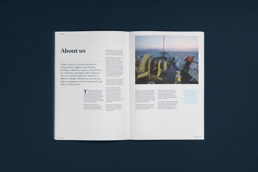
Trinity House is a charity dedicated to safeguarding shipping and seafarers, providing education, support and welfare to the seafaring community with a statutory duty as a General Lighthouse Authority.
As the UK’s largest endowed maritime charity, Trinity House also works to improve the state of navigation in our waters and provide support and training for mariners. That means maintaining every lighthouse in the United Kingdom as well as training cadets or helping many other maritime charities.
The Solution
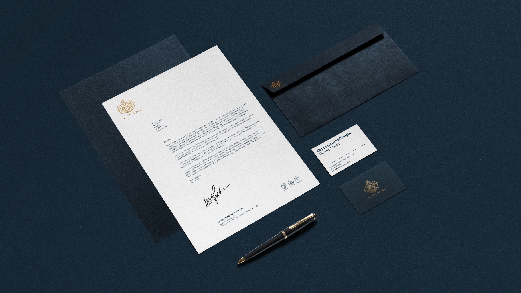
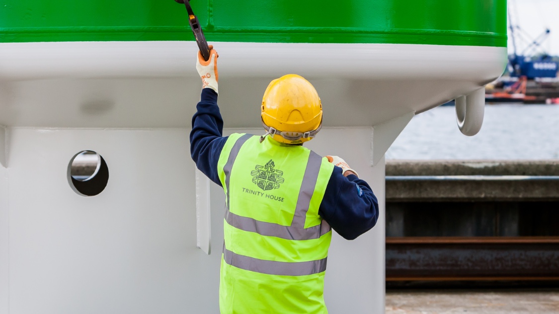
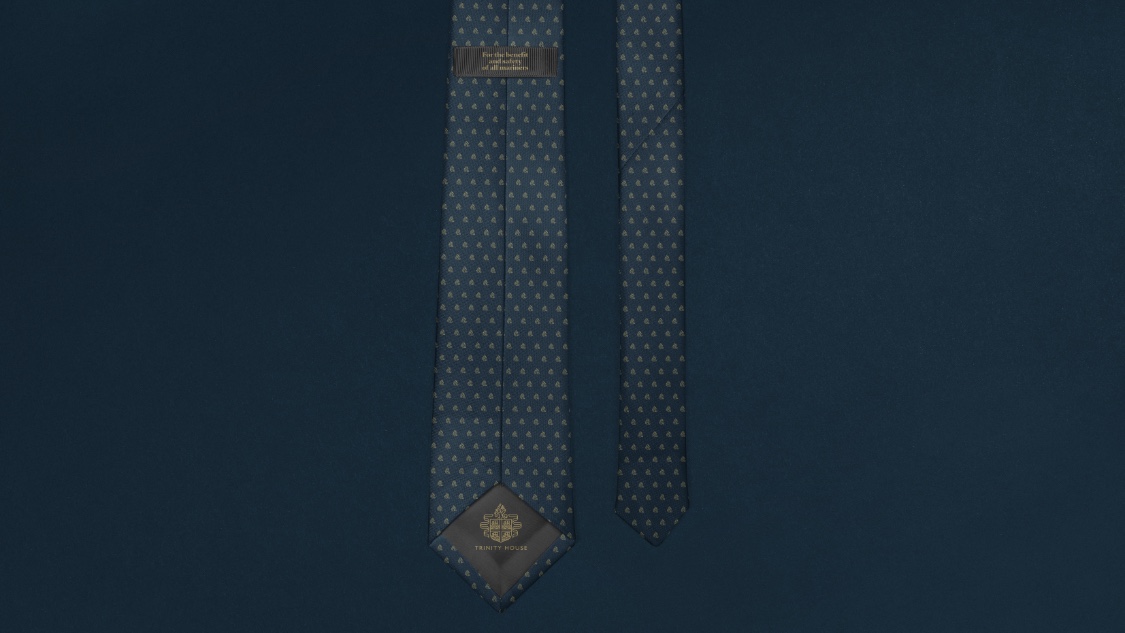
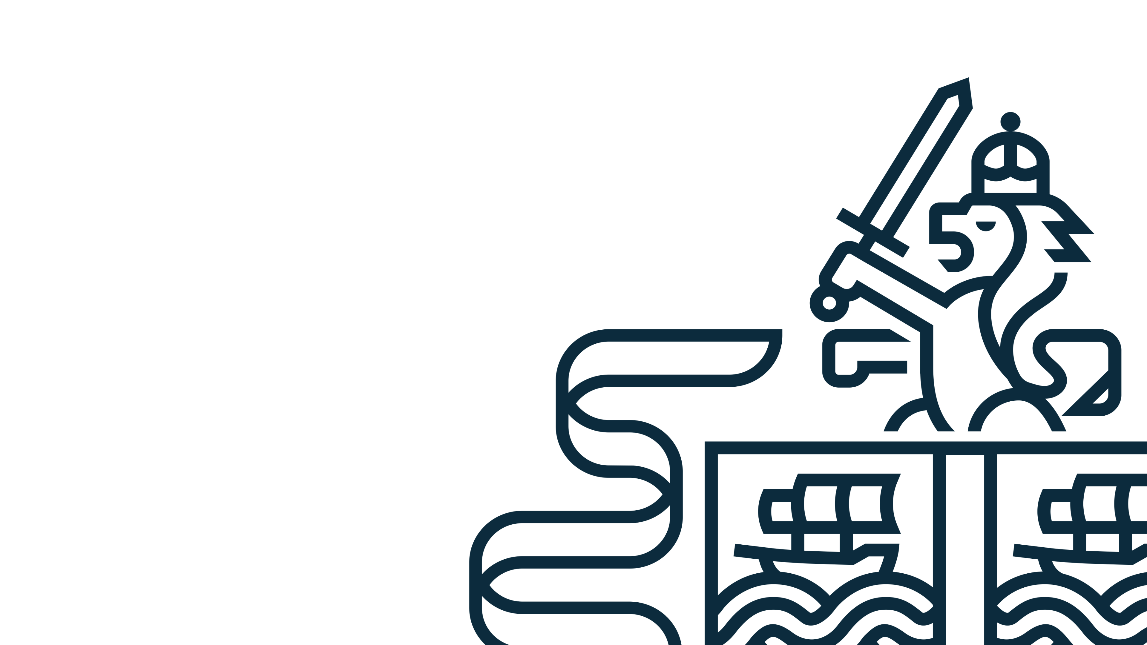
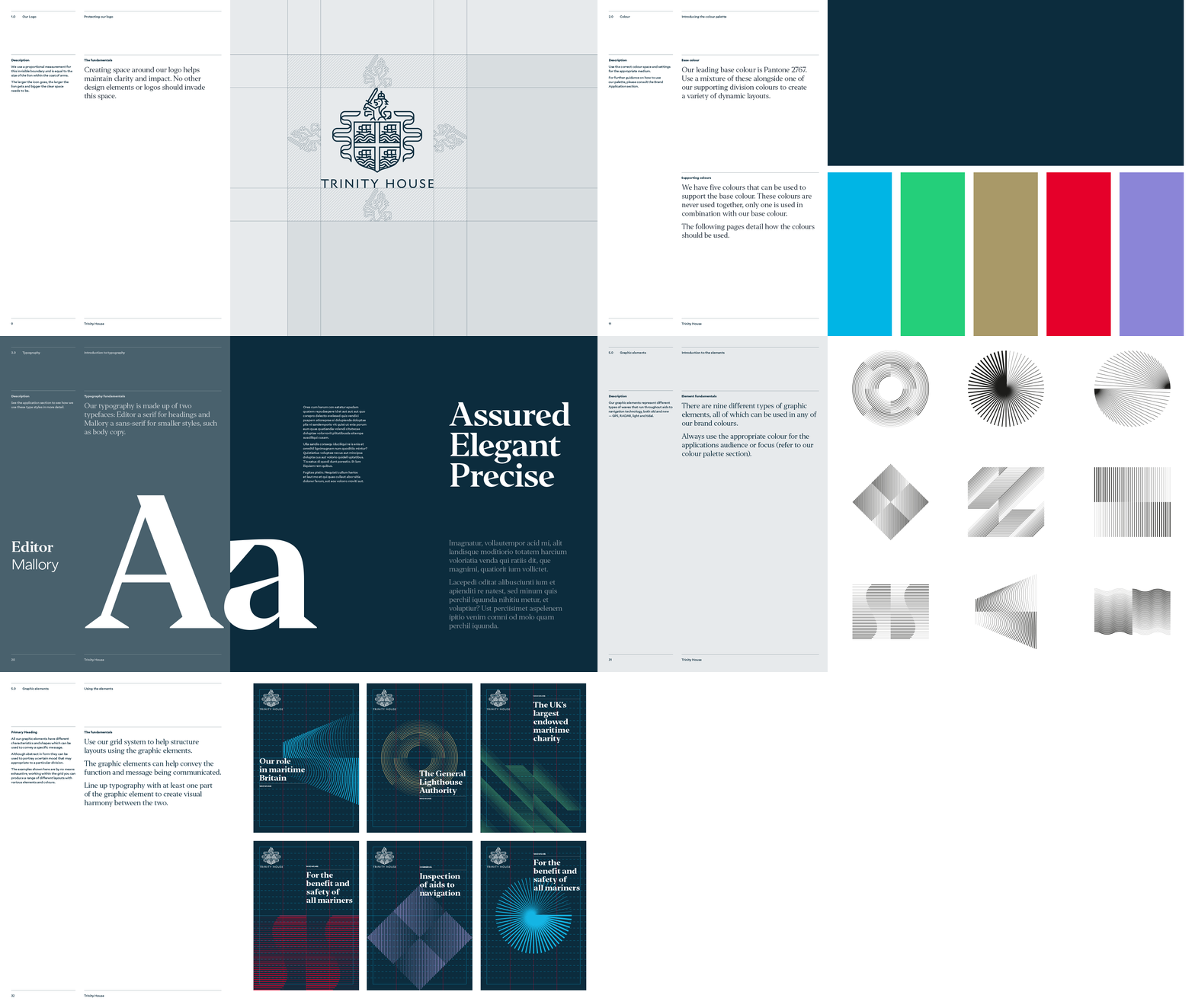
The logo was sympathetically simplified and re-rendered, without sacrificing any of its crucial historical symbolism or stature.
The core colour palette of blue and white was retained but refined, while a complementary secondary palette was added to give different departments and roles of Trinity House their own personality.
A new wordmark was crafted and accompanying typefaces selected and finely balanced to reflect the modern organisation while still referencing and respecting its vast heritage.
Making 500 years of history ready for tomorrow
The Brief
Trinity House needed to refresh its existing 'heraldic' identity system and supporting wordmark to meet modern communication requirements.
Key issues included a lack of brand consistency across departments and problems stemming from the complexity of their current heraldic logo. This brief was a careful balancing act, a huge weight of heritage and tradition that must be respected but also a modern, high tech and forward-thinking organisation, operating in the here and now. Our job was to balance past and present and create a visual language to carry them into their next 500 years.
Trinity House is a charity dedicated to safeguarding shipping and seafarers, providing education, support and welfare to the seafaring community with a statutory duty as a General Lighthouse Authority.
As the UK’s largest endowed maritime charity, Trinity House also works to improve the state of navigation in our waters and provide support and training for mariners. That means maintaining every lighthouse in the United Kingdom as well as training cadets or helping many other maritime charities.
Trinity House needed to refresh its existing 'heraldic' identity system and supporting wordmark to meet modern communication requirements.
Key issues included a lack of brand consistency across departments and problems stemming from the complexity of their current heraldic logo. This brief was a careful balancing act, a huge weight of heritage and tradition that must be respected but also a modern, high tech and forward-thinking organisation, operating in the here and now. Our job was to balance past and present and create a visual language to carry them into their next 500 years.
The logo was sympathetically simplified and re-rendered, without sacrificing any of its crucial historical symbolism or stature.
The core colour palette of blue and white was retained but refined, while a complementary secondary palette was added to give different departments and roles of Trinity House their own personality.
A new wordmark was crafted and accompanying typefaces selected and finely balanced to reflect the modern organisation while still referencing and respecting its vast heritage.
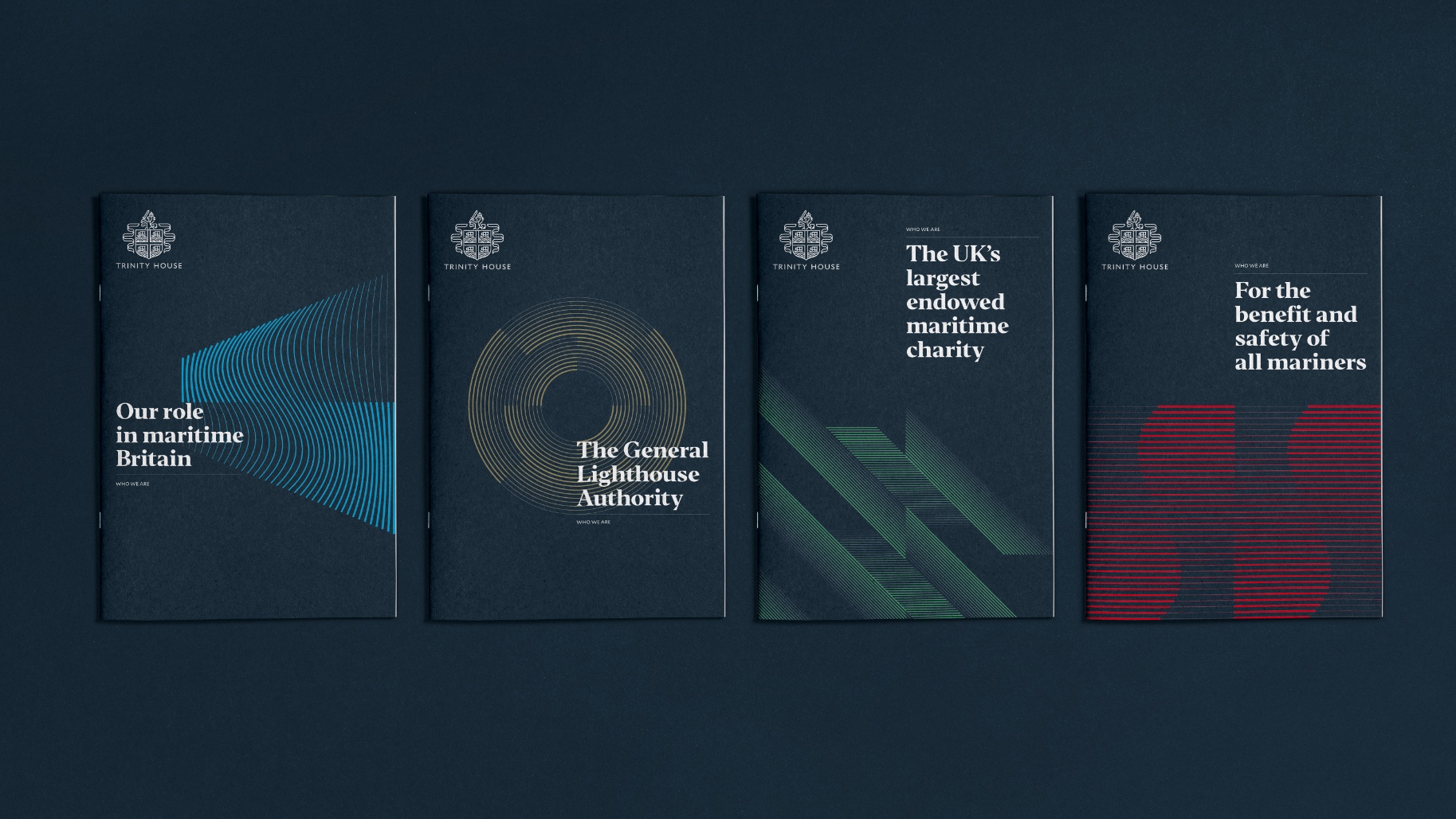
Departmental personality with brand consistency

“One of the most important outcomes of the rebranding project is enhanced clarity and understanding of the corporation’s overall mission and vision by internal and external stakeholders. Additionally the new visual brand identity now represents the organisation and is supported by clear guidelines providing the foundation for our modern communication requirements.”
Neil Jones
PR and Records Manager, Trinity House
