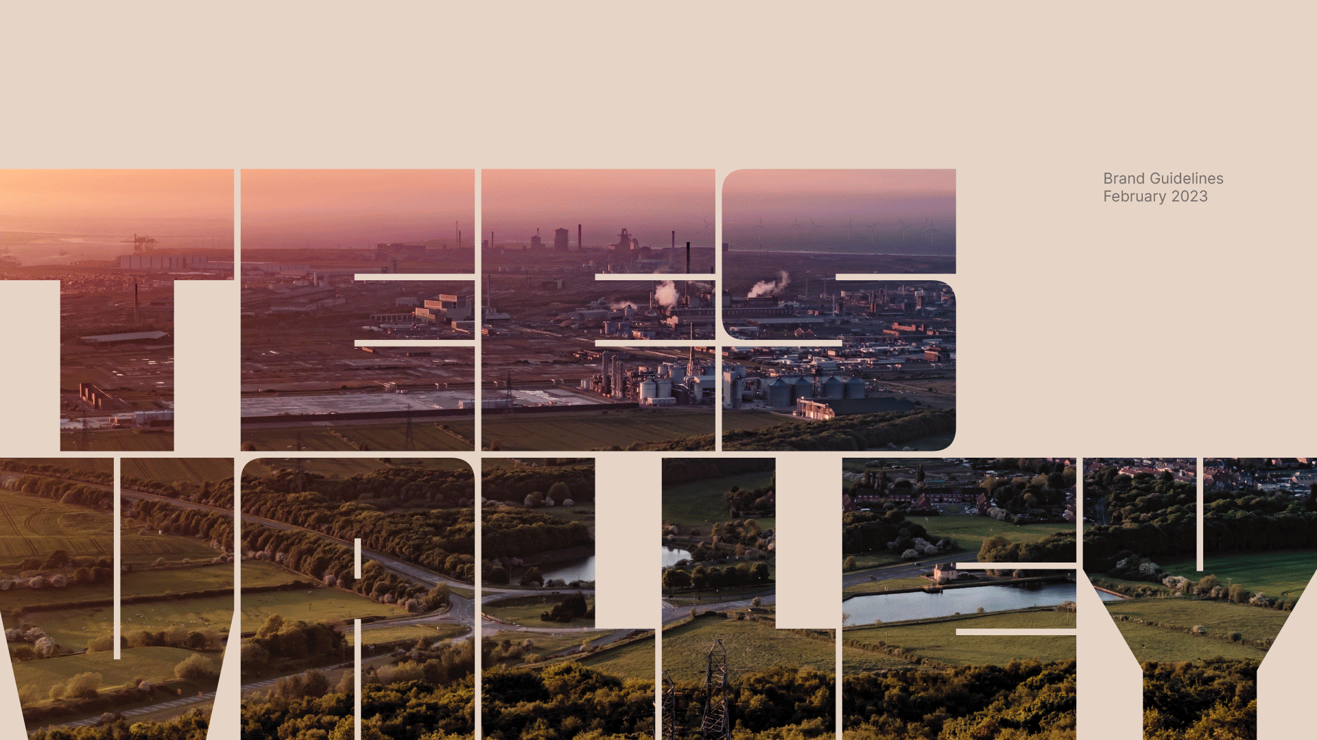
Branding a bold future for our region
Client
Tees Valley Combined Authority
Project
Tees Valley Rebrand
Services
Sectors
The Brief
TVCA has grown significantly since 2016, resulting in confusion due to multiple brands and a lack of clear guidance. An over complicated brand structure made it hard for audiences to understand what TVCA is and what it does. We were engaged to clarify the brand architecture and create visual cohesion and increased recognition across all TVCA activity.
Tees Valley Combined Authority (TVCA) is a public sector body covering the five local authority areas in the Tees Valley and approximately 700,000 people. It’s responsible for driving economic growth and increasing prosperity across the region. Decisions about budgets, strategies and services are made at meetings of the cabinet, comprised of the elected mayor and local authority leaders.
The Solution
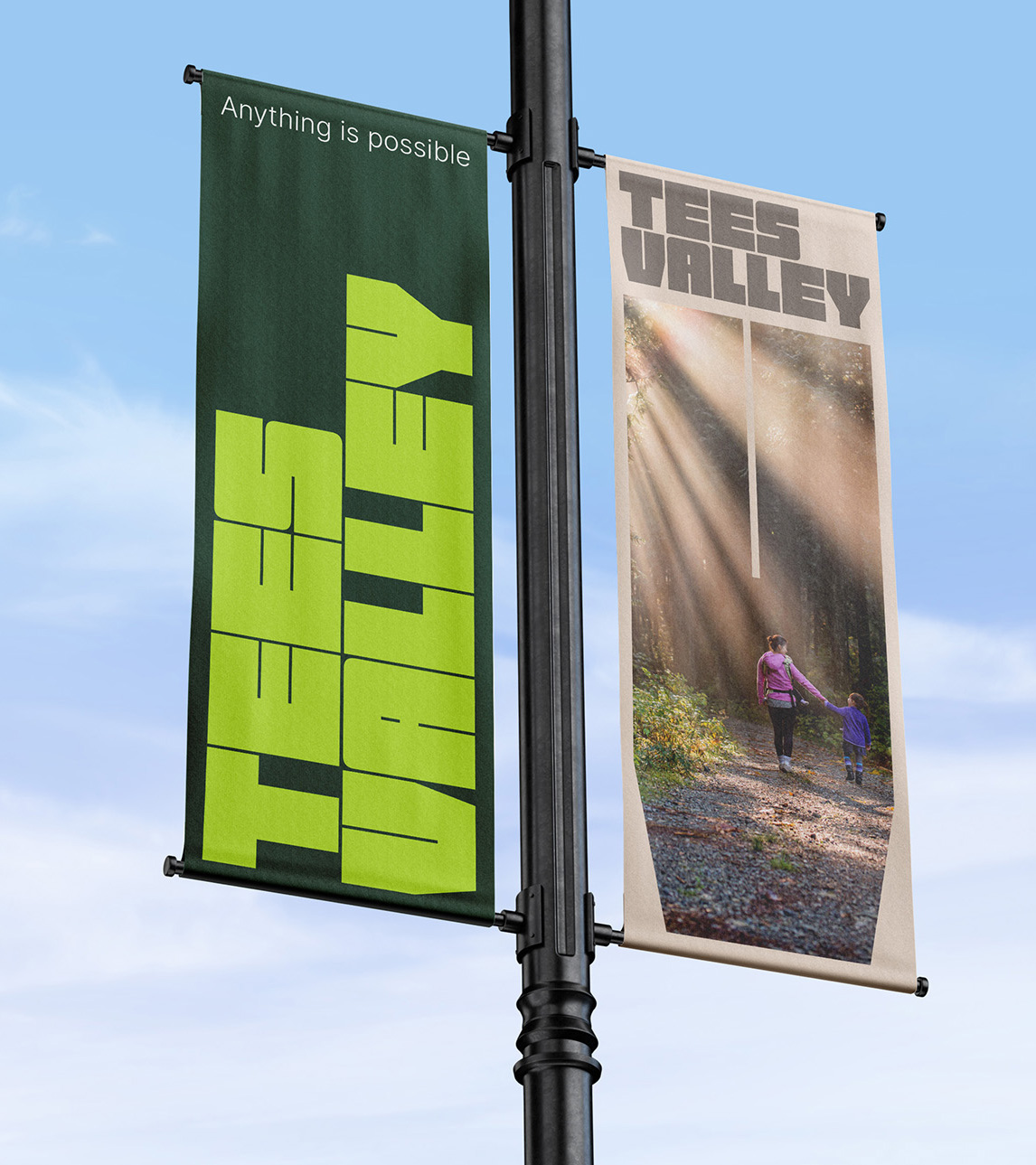
We turned the brief on its head. Rather than re-creating multiple logos for multiple sub-brands and trying to make them all feel cohesive, we moved away from siloed thinking to develop a single yet highly flexible brand system. And because TVCA is intrinsically linked to the area, we took the opportunity to brand the region, not just the authority.
Branding a bold future for our region
The Brief
TVCA has grown significantly since 2016, resulting in confusion due to multiple brands and a lack of clear guidance. An over complicated brand structure made it hard for audiences to understand what TVCA is and what it does. We were engaged to clarify the brand architecture and create visual cohesion and increased recognition across all TVCA activity.
Tees Valley Combined Authority (TVCA) is a public sector body covering the five local authority areas in the Tees Valley and approximately 700,000 people. It’s responsible for driving economic growth and increasing prosperity across the region. Decisions about budgets, strategies and services are made at meetings of the cabinet, comprised of the elected mayor and local authority leaders.
TVCA has grown significantly since 2016, resulting in confusion due to multiple brands and a lack of clear guidance. An over complicated brand structure made it hard for audiences to understand what TVCA is and what it does. We were engaged to clarify the brand architecture and create visual cohesion and increased recognition across all TVCA activity.
We turned the brief on its head. Rather than re-creating multiple logos for multiple sub-brands and trying to make them all feel cohesive, we moved away from siloed thinking to develop a single yet highly flexible brand system. And because TVCA is intrinsically linked to the area, we took the opportunity to brand the region, not just the authority.

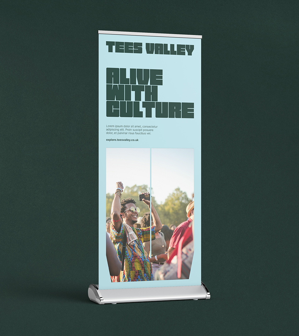
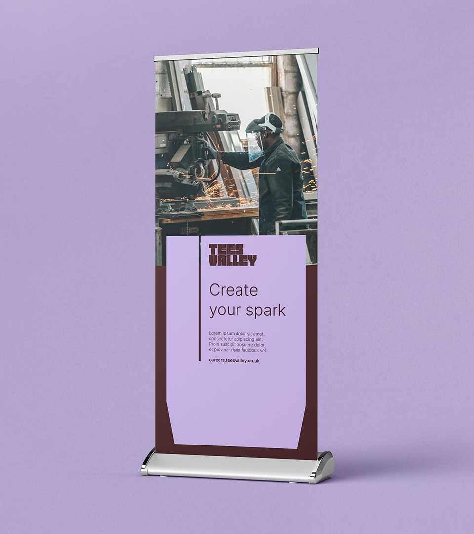
Go big or go home

Local hero

Bold, energising, clarity

The champion of change
The Tees Valley voice wants you to go where it’s going, to do whatever it’s doing today. It’s enthusiastic. It’s positive. It believes in the region and it wants you to believe in it too.
This is a corner of the North East that’s shaping its own future. Where the next generation of creators, makers and doers are defining tomorrow. A land of hard grafters, fine crafters and good laughers. A region that’s surprising, inventive, and unstoppable all at once. Five unique boroughs. One remarkable region. This is Tees Valley, where anything is possible.

Peace in the Valley
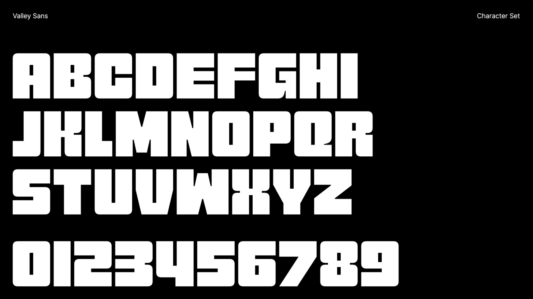
Valley Sans is designed to have minimal negative space, allowing it to act as a container for brand imagery. Built from scratch, in-house at Better, it comes complete with an expansive range of variable settings ensuring clarity at any size.

Pillars of the community

The dynamic valley
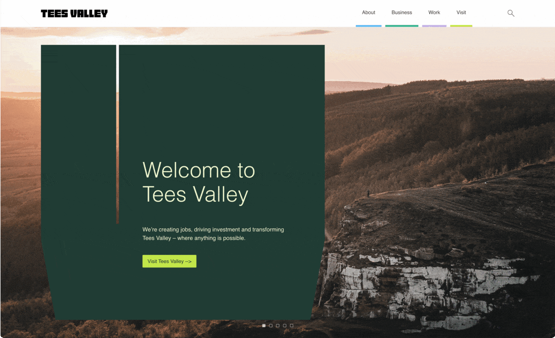
A unified digital hub

"TVCA has changed a lot in scope and remit since it first came into being and it was clear a refresh was needed. It was great to work with a local company that is as passionate about the area as we are to simplify the brand. In this new-look Tees Valley, we are able to communicate clearly with people about who we are, what we’re doing, and what we’re aiming to achieve, and that Anything is Possible – whether that be for those visiting, investing, working or travelling in our area."
Craig Peacock
Head of Marketing and Communications, Tees Valley Combined Authority