
Taking the right steps for falls prevention
Client
South Tees Hospitals NHS Foundation Trust
Project
Steady on Your Feet Brand and Website Development
Services
Sectors
The Brief
We needed to create a visual identity and brand world that brought a consistent style and presence to the campaign. As well as needing to feel soft and welcoming, any visual and verbal identity had to be both legible and straightforward to understand for older age groups, while not becoming patronising or childlike.
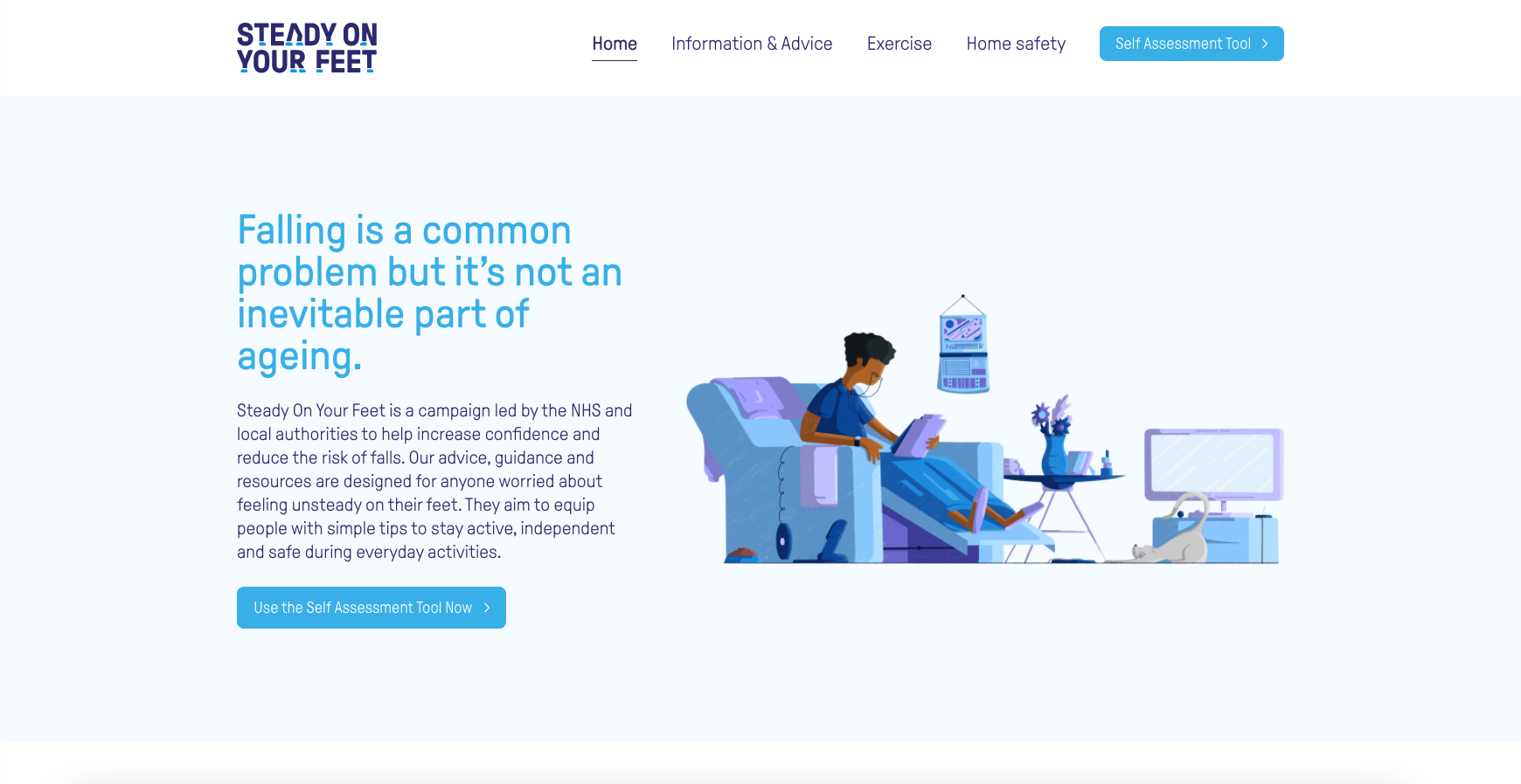
For many people over 65, falling is a common problem. Delivered in partnership with NHS trusts, local authorities and the voluntary agencies, Steady on Your Feet is an integrated strategy that reduces risks and ensures that falling is not an inevitable part of ageing. Through advice and resources, it equips people with simple tips to stay active, independent and safe.
The Solution
An all-new brand world was created, including a custom wordmark, illustration set, graphic icons and colour palette, to help present Steady on Your Feet as a simple but effective resource for falls advice and guidance. It was also vital to raise awareness and understanding of the issue by offering a fresh and engaging identity.
Taking the right steps for falls prevention
The Brief
We needed to create a visual identity and brand world that brought a consistent style and presence to the campaign. As well as needing to feel soft and welcoming, any visual and verbal identity had to be both legible and straightforward to understand for older age groups, while not becoming patronising or childlike.
For many people over 65, falling is a common problem. Delivered in partnership with NHS trusts, local authorities and the voluntary agencies, Steady on Your Feet is an integrated strategy that reduces risks and ensures that falling is not an inevitable part of ageing. Through advice and resources, it equips people with simple tips to stay active, independent and safe.
We needed to create a visual identity and brand world that brought a consistent style and presence to the campaign. As well as needing to feel soft and welcoming, any visual and verbal identity had to be both legible and straightforward to understand for older age groups, while not becoming patronising or childlike.
An all-new brand world was created, including a custom wordmark, illustration set, graphic icons and colour palette, to help present Steady on Your Feet as a simple but effective resource for falls advice and guidance. It was also vital to raise awareness and understanding of the issue by offering a fresh and engaging identity.
Best foot forward


Staying on the right lines

Accessible and simple to navigate
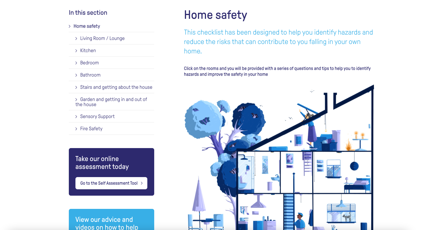
To help roll out the initiative online, we created an immersive website that built awareness of how to avoid falls both generally and within the home environment. Key advice is highlighted through bold type and page positioning, while intuitive interactive elements and an easy to use self assessment tool allow visitors to learn as they explore.
With a wide target audience of varying ages and computer literacy, consideration had to be given to designing a site that was both accessible and simple to navigate. Clear call to actions combine with a simple menu structure to make navigation effortless.

Power to the OAPeople


