Branding the UK’s fastest growing insurtech disruptor
Client
Send Technology
Project
The Send Rebrand
Services
Sectors
The Brief
As a relatively young company spearheaded by time-served techies, Send holds the unique position of intelligent disruptors with the expertise of an industry-leader; something which was essential to retain and reflect. While it was crucial their look and feel positioned them comfortably in the corporate world of insurance, we didn't want to lose the down to earth personality or ingenuity that sets them apart. Their identity needed to look intriguing, stimulating and completely fresh for the insurtech sector.
Send are London-based insurtech innovators. In their short lifespan, the exciting start-up disruptors have transformed some of the biggest names in insurance, thanks to their unique blend of composable SaaS platform, deep industry knowledge and open-minded collaboration. Following recent growth and business evolution, they needed to establish a clear and distinctive brand presence.
The Solution
The core challenge was expressing a niche and abstract concept — Send’s modular platform, their flexible approach and their core brand purpose. While there are existing visual metaphors in the category, it was important to reflect Send’s difference by coming up with a new and fresh way to express their unique offering. The solution came in expressing the platform and their purpose, not as rigid blocks or functional pieces, but as a flexible, fluid entity.
Branding the UK’s fastest growing insurtech disruptor
The Brief
As a relatively young company spearheaded by time-served techies, Send holds the unique position of intelligent disruptors with the expertise of an industry-leader; something which was essential to retain and reflect. While it was crucial their look and feel positioned them comfortably in the corporate world of insurance, we didn't want to lose the down to earth personality or ingenuity that sets them apart. Their identity needed to look intriguing, stimulating and completely fresh for the insurtech sector.
Send are London-based insurtech innovators. In their short lifespan, the exciting start-up disruptors have transformed some of the biggest names in insurance, thanks to their unique blend of composable SaaS platform, deep industry knowledge and open-minded collaboration. Following recent growth and business evolution, they needed to establish a clear and distinctive brand presence.
As a relatively young company spearheaded by time-served techies, Send holds the unique position of intelligent disruptors with the expertise of an industry-leader; something which was essential to retain and reflect. While it was crucial their look and feel positioned them comfortably in the corporate world of insurance, we didn't want to lose the down to earth personality or ingenuity that sets them apart. Their identity needed to look intriguing, stimulating and completely fresh for the insurtech sector.
The core challenge was expressing a niche and abstract concept — Send’s modular platform, their flexible approach and their core brand purpose. While there are existing visual metaphors in the category, it was important to reflect Send’s difference by coming up with a new and fresh way to express their unique offering. The solution came in expressing the platform and their purpose, not as rigid blocks or functional pieces, but as a flexible, fluid entity.


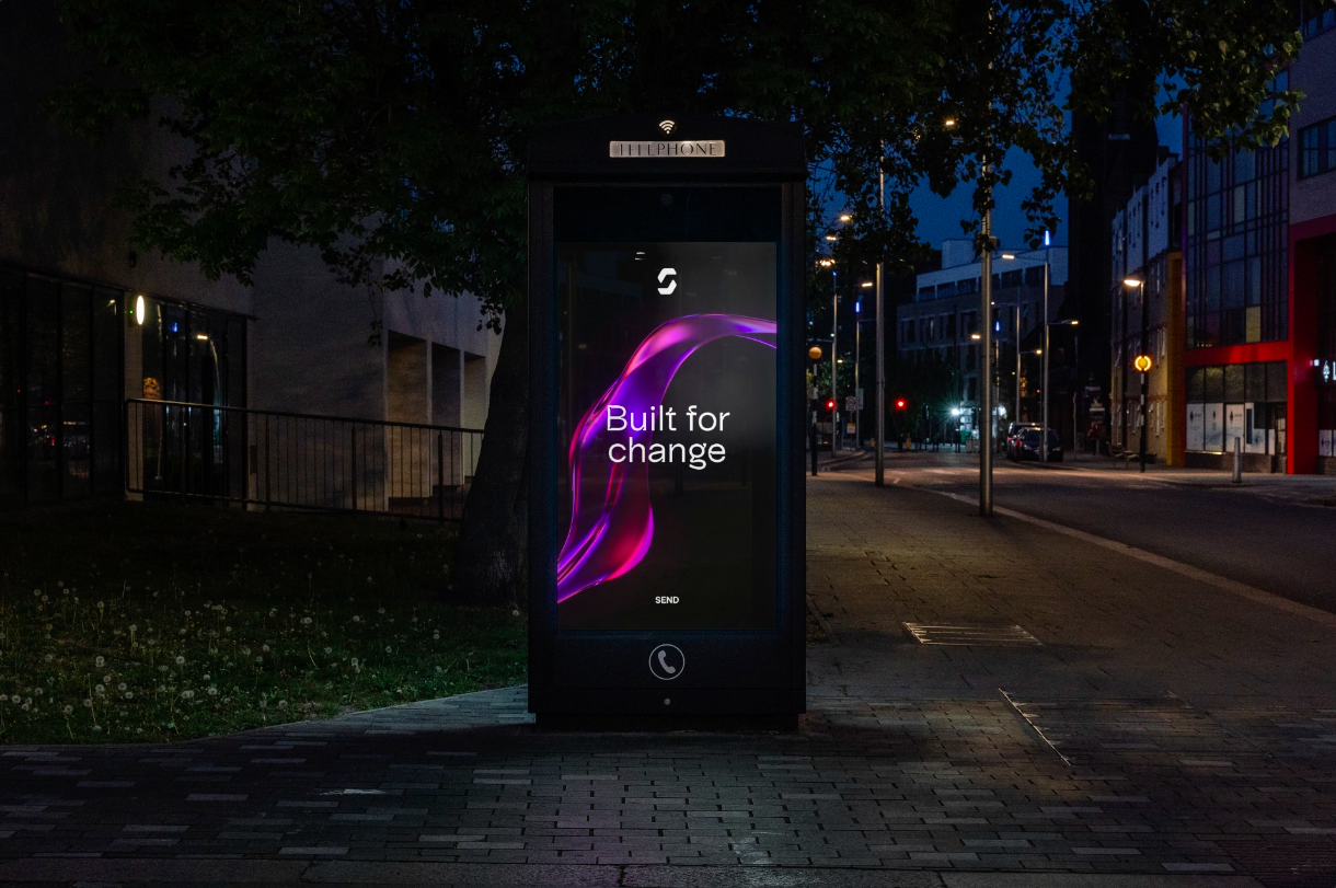
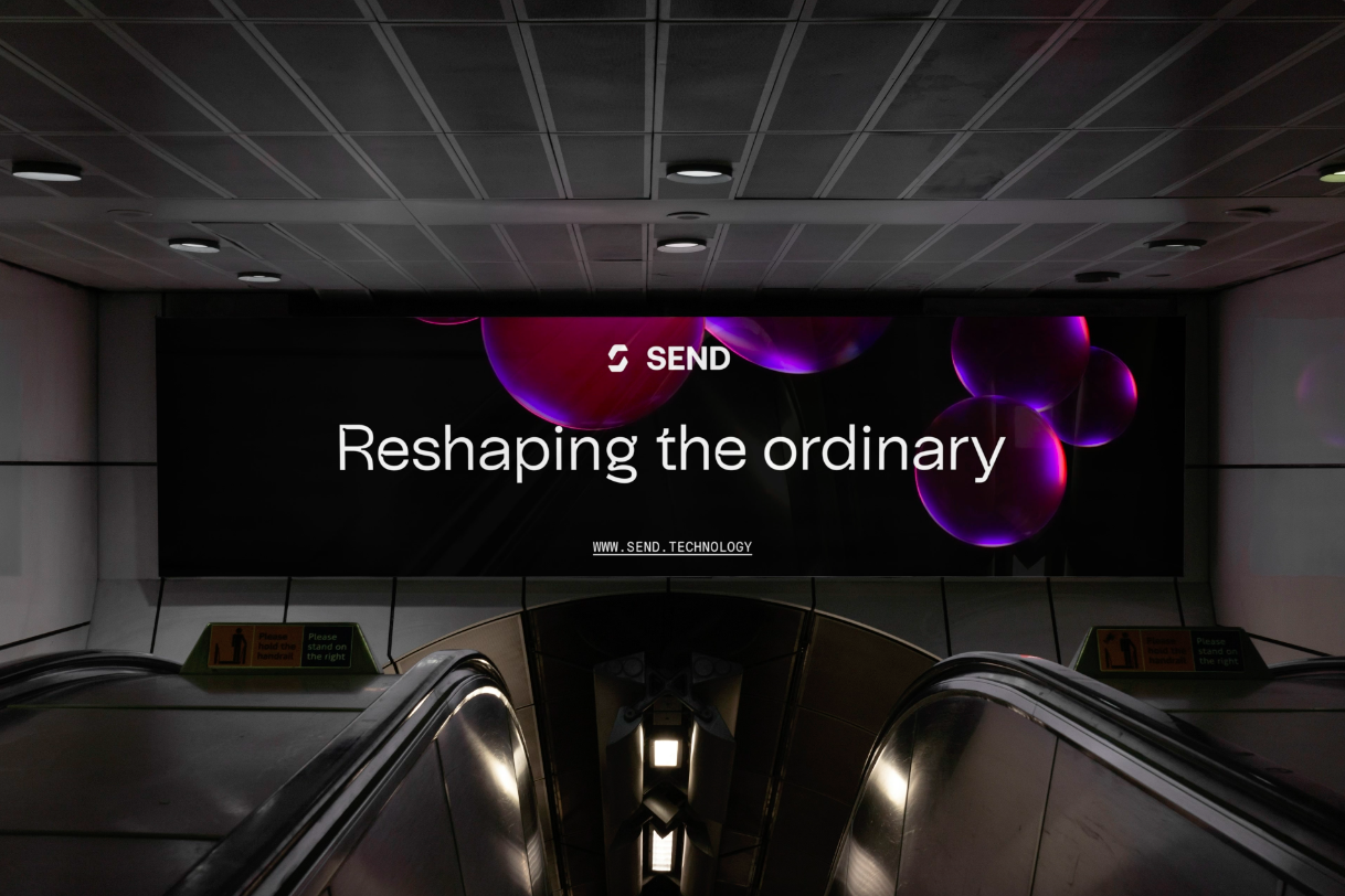
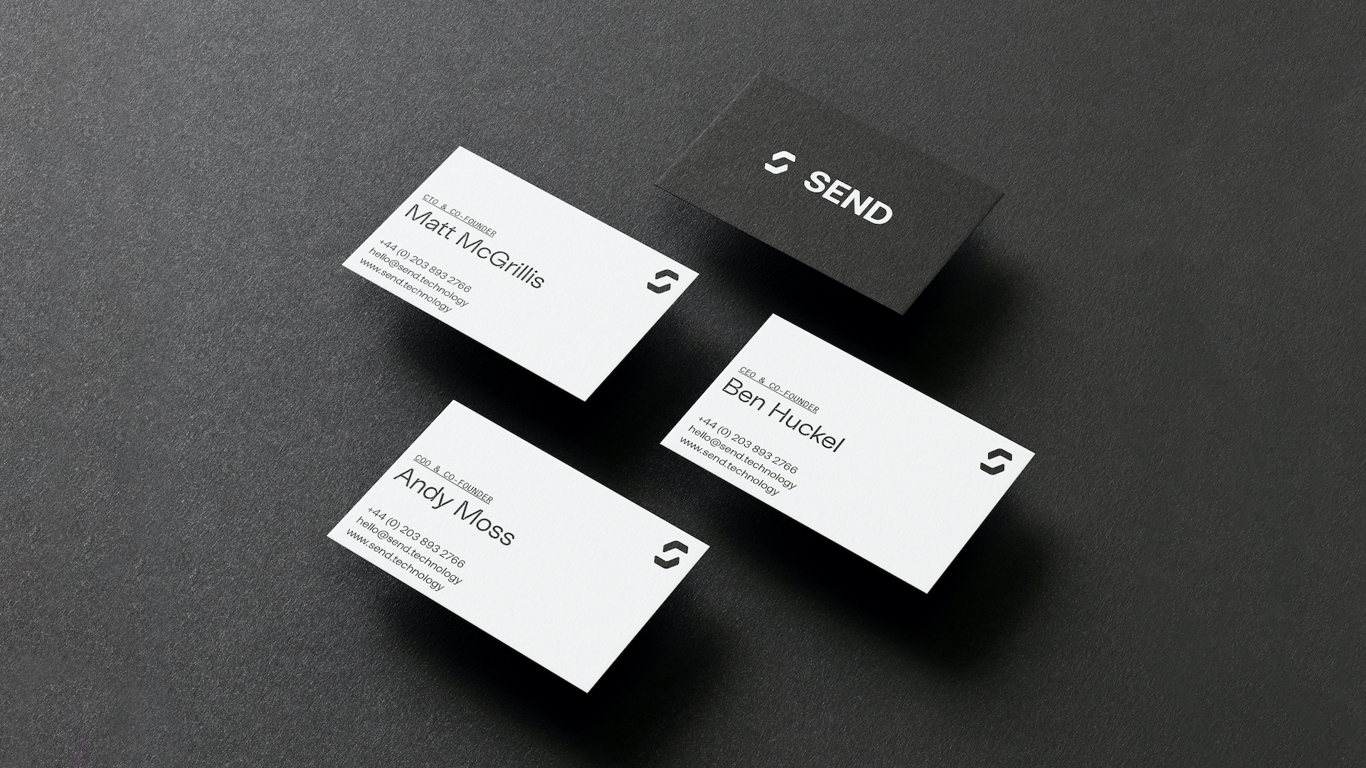
Send and receive


A fluid identity for a fluid platform
Sending the right online message
By establishing key personas through our Discover and website scoping sessions, focused user journeys were identified to help create the perfect immersive and intuitive online experience.
A key part of this was a bespoke configurator tool, which allows users to find the best blend of components based completely on their unique needs. This is supported by primary call to actions throughout the site that allow customers to book a demo.
In addition, the use of custom created iconography and variations of the fluid brand device also bring animation and flare to the fore, helping elevate the experience further.
Making components iconic


Talk the talk
“We found the process incredibly structured and insightful; not only from a brand outcome perspective but also because it really helped us focus on how we wanted to sell and market the platform and components we had built. In terms of the end result; the brand and website have more than exceeded our expectation, and the feedback from our customers has been really positive.”
Matt McGrillis
CTO & Co-Founder, Send