A new online experience for best-selling author
Client
Philippa Gregory
Project
Website Design & Development
Services
Sector
The Brief
We were challenged with following footsteps of the content streaming giants and craft a website experience that felt intuitive and informative as well as being fit for the future. Despite her traditional hardcopy past, many of Philippa’s readers are now consuming her books digitally through audiobooks, e-readers, tablets and phones. The new website needed to reflect this.
Philippa Gregory is a best selling international author with work such as The White Queen which was turned into a Golden Globe nominated series by the BBC. Cementing our 10 year digital partnership and building on the success of the previous website, we were challenged with creating a new updated website for Philippa's readers.
The Solution
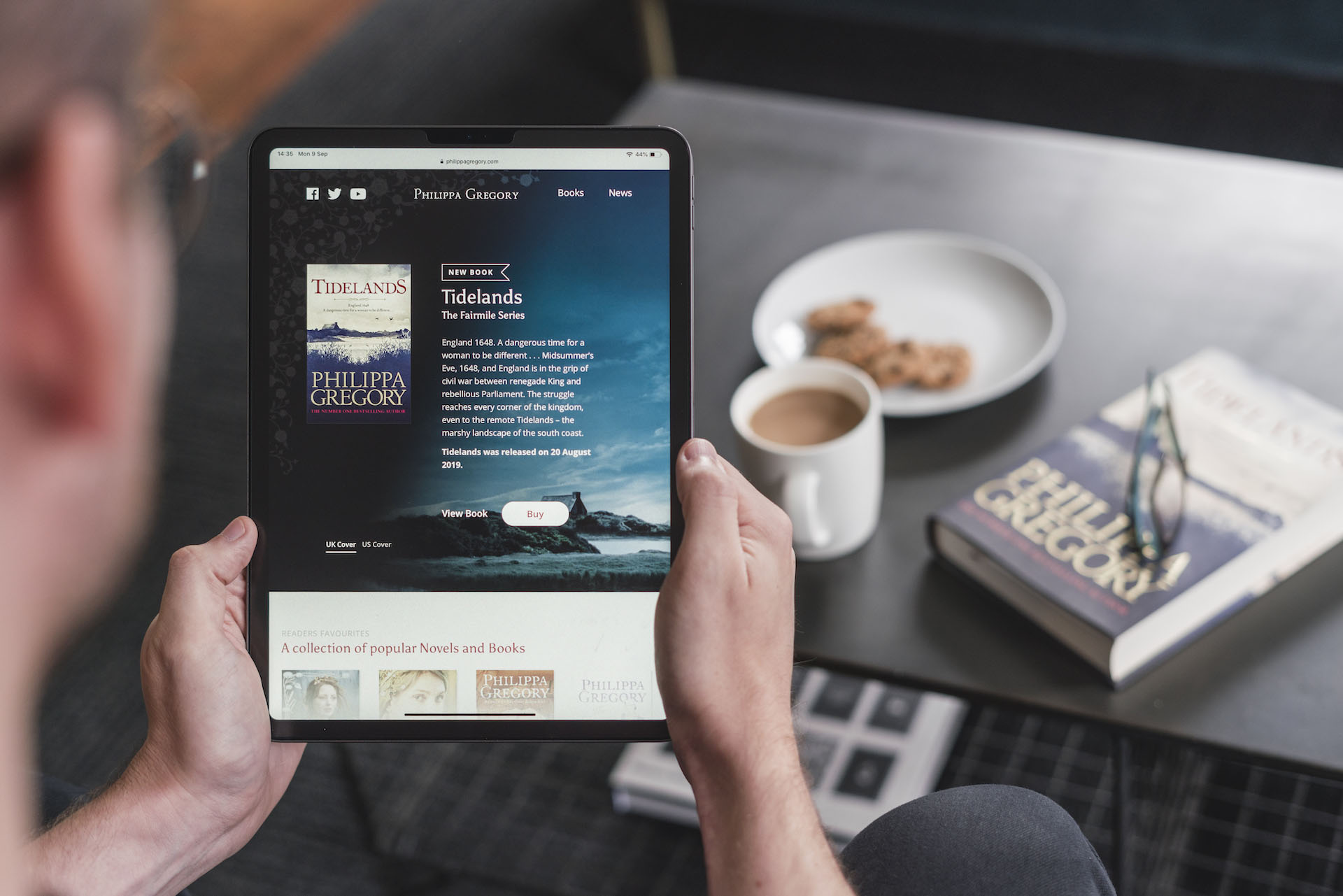
Through the exploration of different layouts we agreed upon a design approach aligned to that of streaming services such as Netflix and Amazon Prime. With a new timeline approach for her books grouped by book series, and simple interactions to show key information helped create a useful and engaging experience which felt familiar and easy to navigate. It was also important to make buy links more prominent, including options for different territories, means that users everywhere could find exactly what they were looking for.
A new online experience for best-selling author
The Brief
We were challenged with following footsteps of the content streaming giants and craft a website experience that felt intuitive and informative as well as being fit for the future. Despite her traditional hardcopy past, many of Philippa’s readers are now consuming her books digitally through audiobooks, e-readers, tablets and phones. The new website needed to reflect this.
Philippa Gregory is a best selling international author with work such as The White Queen which was turned into a Golden Globe nominated series by the BBC. Cementing our 10 year digital partnership and building on the success of the previous website, we were challenged with creating a new updated website for Philippa's readers.
We were challenged with following footsteps of the content streaming giants and craft a website experience that felt intuitive and informative as well as being fit for the future. Despite her traditional hardcopy past, many of Philippa’s readers are now consuming her books digitally through audiobooks, e-readers, tablets and phones. The new website needed to reflect this.
Through the exploration of different layouts we agreed upon a design approach aligned to that of streaming services such as Netflix and Amazon Prime. With a new timeline approach for her books grouped by book series, and simple interactions to show key information helped create a useful and engaging experience which felt familiar and easy to navigate. It was also important to make buy links more prominent, including options for different territories, means that users everywhere could find exactly what they were looking for.
A new chapter
Bringing books alive on the web with limited assets was a challenge. With the consumption and familiarity of streaming services being so familiar with people, there was a natural fit to organising Philippa’s series of books into groups and making best use of the artwork and graphical assets to differentiate them.
A tailored mobile experience
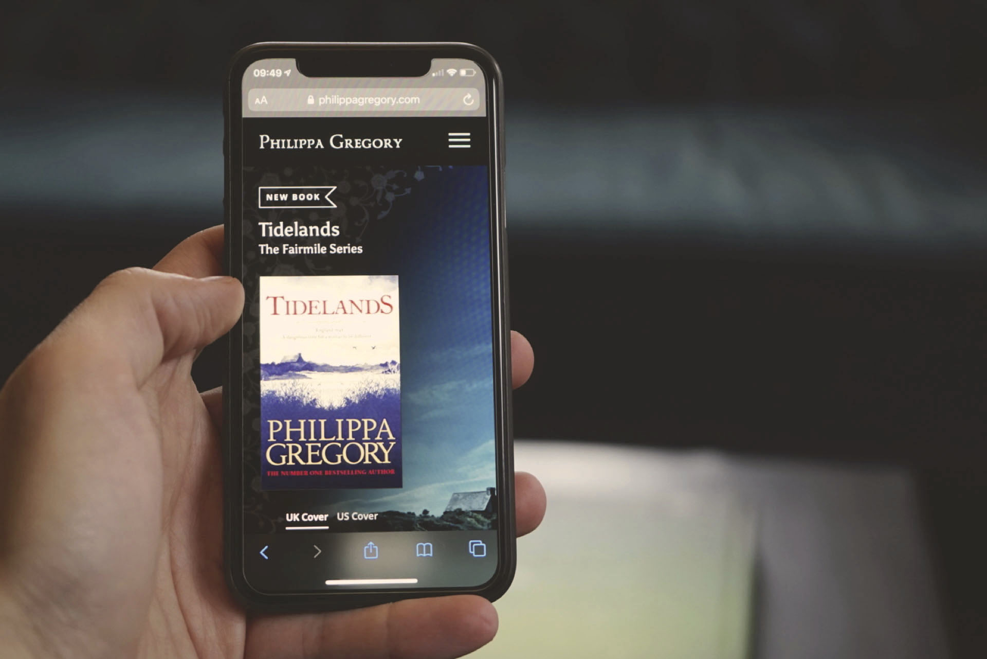
With mobile visits accounting for 60% of all traffic to the website alone, we took a mobile first approach to the design of the website and the priority of information. We made use of both horizontal and vertical space making the book timeline an intuitive way of finding a series or book, and a simple tap to quickly gain insight into a specific book. This, along with clear navigation options and calls to action has improved the mobile experience for users compared to the previous website, having a positive impact on engagement.


Through a click or a tap, further information of a book is shown without leaving the page. This includes a synopsis and an indication to the year written and year set, along with the option to hear an audio snippet of a book. With the increased popularity of audiobooks it was important that Philippa's audience has this option, along with the associated options to buy.
There's a wealth of information to supplement each book, including authors notes, translations, videos, download and reviews. Housed behind tabs, this information is easily accessible, along with prominent links to buy for different territories.
“We're thrilled with the site's new design. There's a huge amount of content but with some clever design elements, the team at Better has been able to balance the needs of our publishers and our readers, making a site which is simple, intuitive, and very beautiful.“
Zahra Glibbery
CEO, Levon Publishing

