
Forging a future facing place brand
Client
Middlesbrough Council
Project
Middlesbrough Place Brand
Services
Sectors
The Brief
The previous ‘can do’ strapline failed to resonate or inspire, with the visual style falling flat, and the brand guidelines proving unworkable; in short, the project had stalled. Middlesbrough’s brand needed a more meaningful story, a more consistent style and most importantly, comprehensive guidance to make it easier to implement. Crucially the story, hierarchy and design system needed to be versatile enough to resonate with everyone from residents and locals to international investors.
With a five-year strategic vision to be recognised as an exciting, optimistic and successful place, Middlesbrough Council needed to communicate the reality of the people, place and businesses of the town. However, the previous brand wasn’t working hard enough to change perceptions and represent the significant regeneration of those three pillars of investment.
The Solution
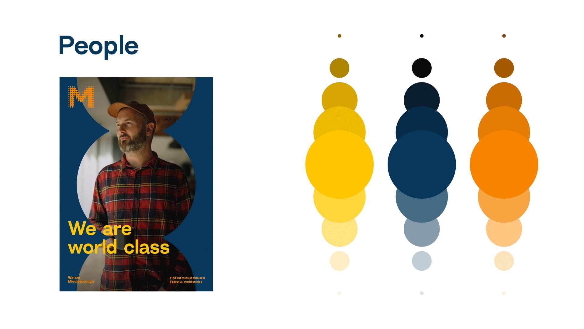
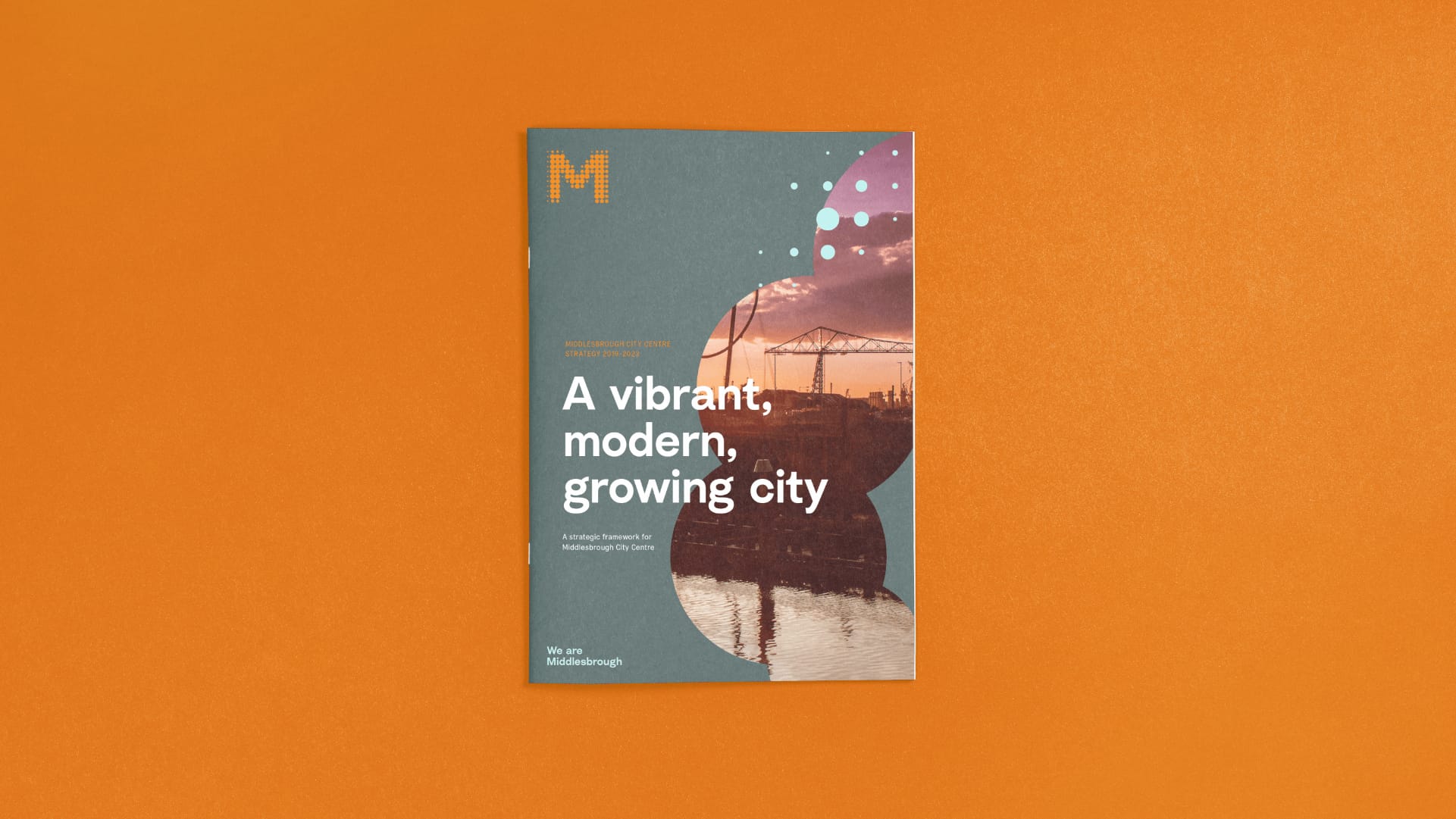
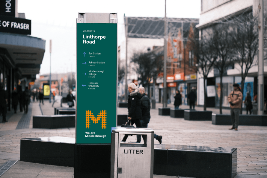
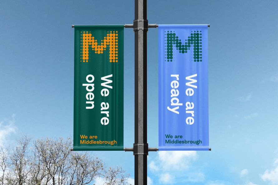
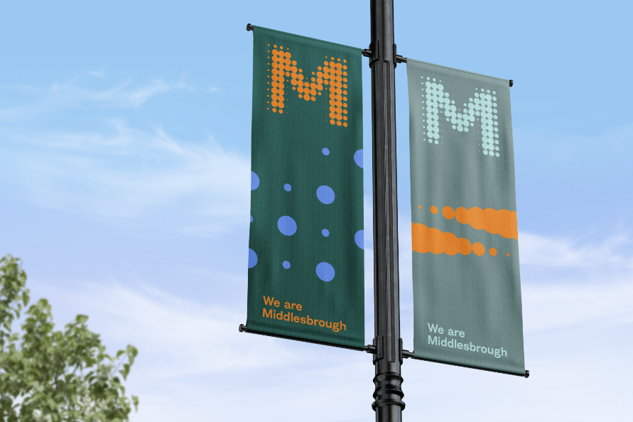
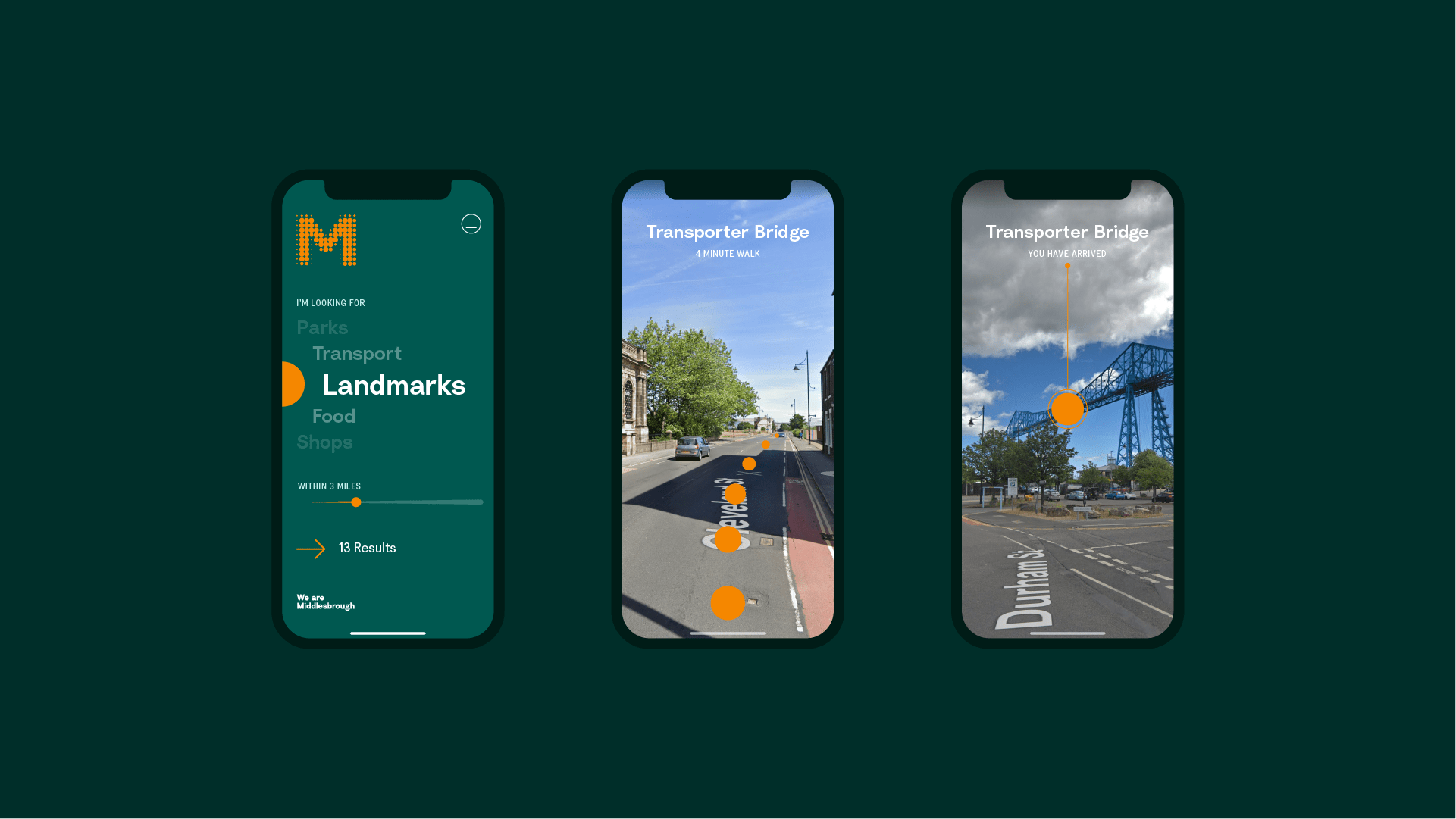
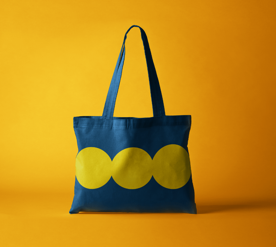
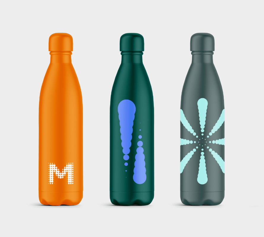
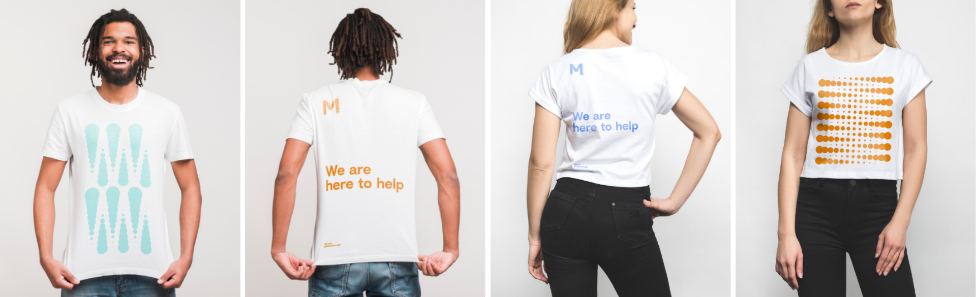
The existing logo suggested unity, diversity and strength — many things coming together as one. We built on this concept to offer a cohesive and meaningful brand system. Verbally we introduced the idea of ownership and flexibility, creating a dynamic strapline that can resonate at every level. Visually we expanded on the logo by creating an underlying grid, drawn from the M, to bring cohesion and structure.
Forging a future facing place brand
The Brief
The previous ‘can do’ strapline failed to resonate or inspire, with the visual style falling flat, and the brand guidelines proving unworkable; in short, the project had stalled. Middlesbrough’s brand needed a more meaningful story, a more consistent style and most importantly, comprehensive guidance to make it easier to implement. Crucially the story, hierarchy and design system needed to be versatile enough to resonate with everyone from residents and locals to international investors.
With a five-year strategic vision to be recognised as an exciting, optimistic and successful place, Middlesbrough Council needed to communicate the reality of the people, place and businesses of the town. However, the previous brand wasn’t working hard enough to change perceptions and represent the significant regeneration of those three pillars of investment.
The previous ‘can do’ strapline failed to resonate or inspire, with the visual style falling flat, and the brand guidelines proving unworkable; in short, the project had stalled. Middlesbrough’s brand needed a more meaningful story, a more consistent style and most importantly, comprehensive guidance to make it easier to implement. Crucially the story, hierarchy and design system needed to be versatile enough to resonate with everyone from residents and locals to international investors.
The existing logo suggested unity, diversity and strength — many things coming together as one. We built on this concept to offer a cohesive and meaningful brand system. Verbally we introduced the idea of ownership and flexibility, creating a dynamic strapline that can resonate at every level. Visually we expanded on the logo by creating an underlying grid, drawn from the M, to bring cohesion and structure.
We are joining the dots

We are dynamic and flexible
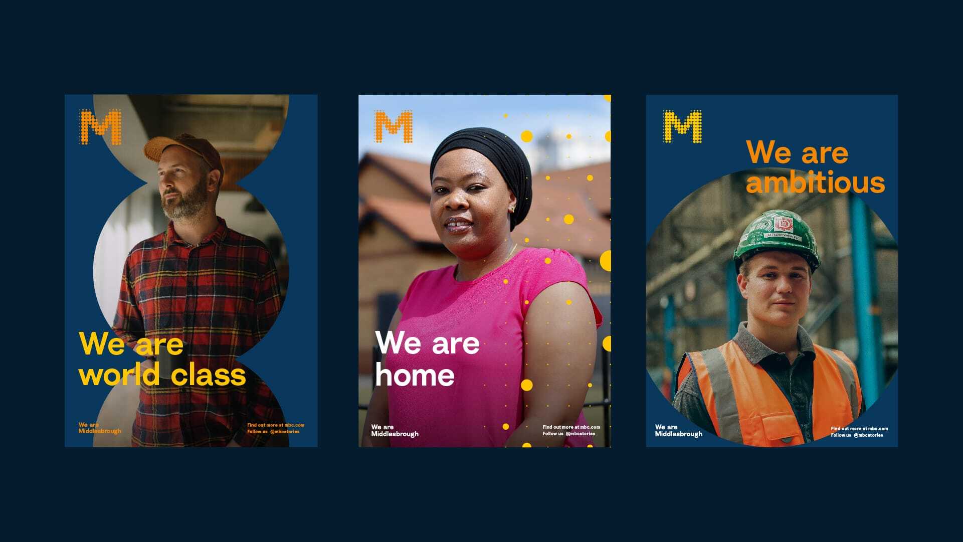
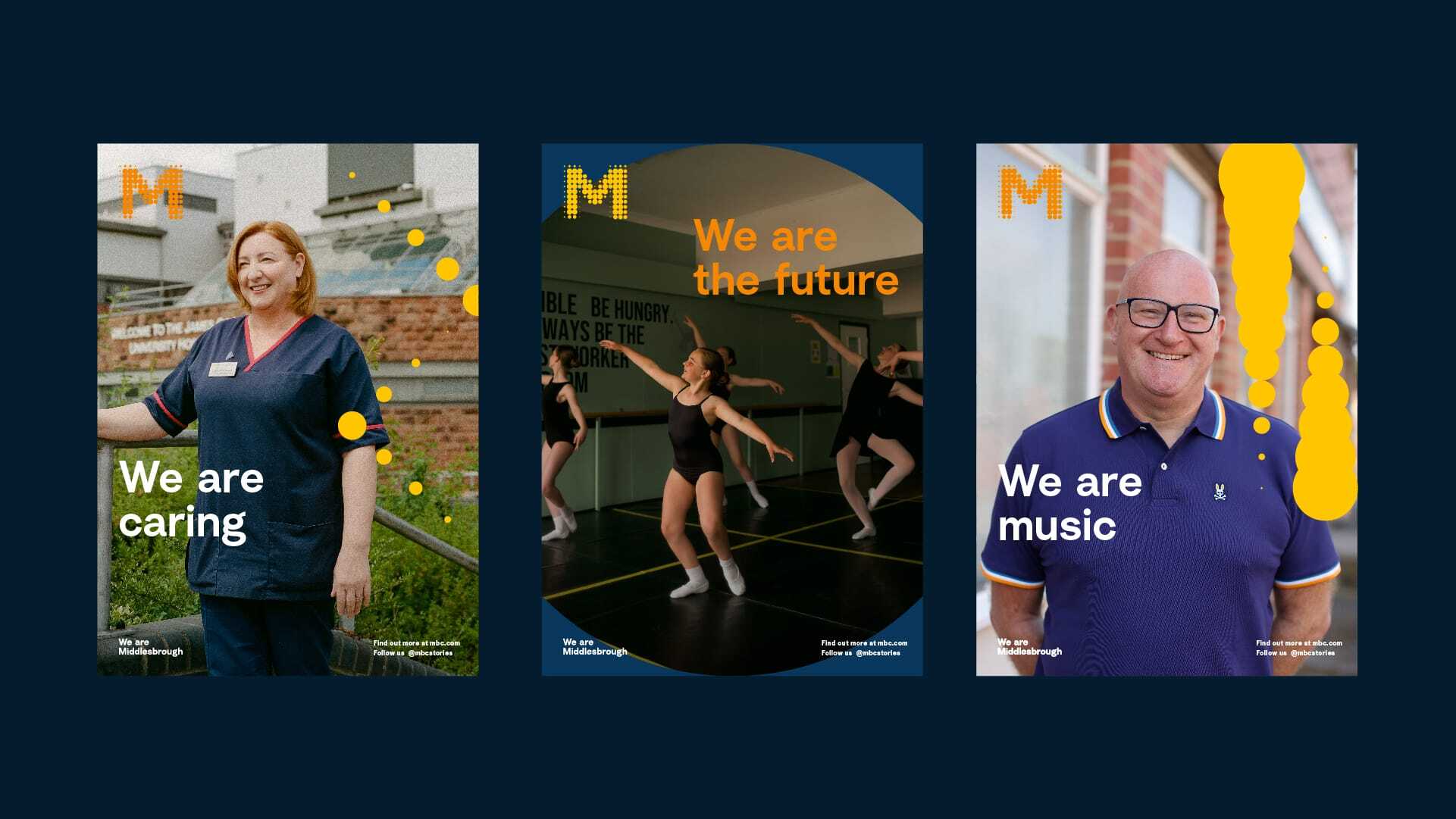
We wanted to create a dynamic and inclusive strapline that reflects this and builds on powerful themes like ambition, invention, determination and unity. It can be adapted across people, places and business, and used as a campaign alongside supporting adjectives to truly represent what makes Middlesbrough great — its people.
This new dynamic strapline not only invites ownership but also has the flexibility to last the duration of the council’s five-year vision. Most importantly, it speaks to everyone, from local people to international investors and about everything from parmos to Picassos.

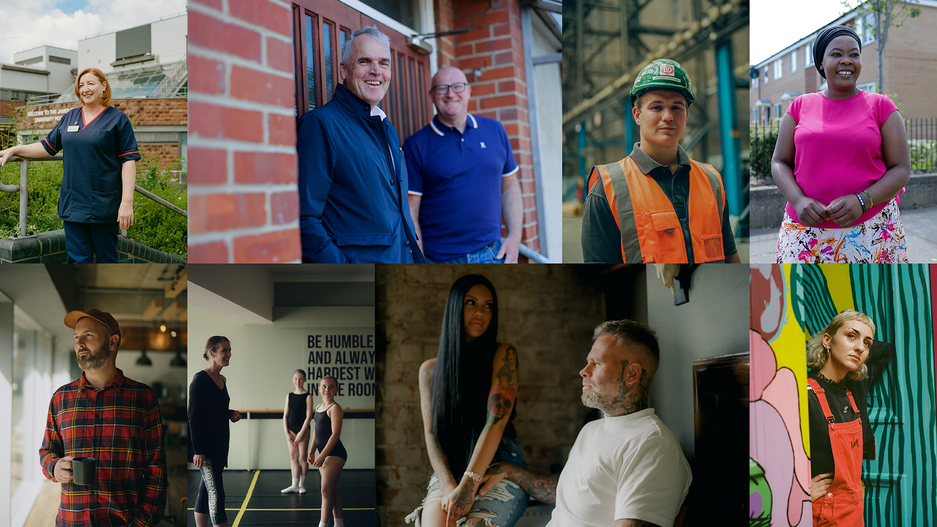
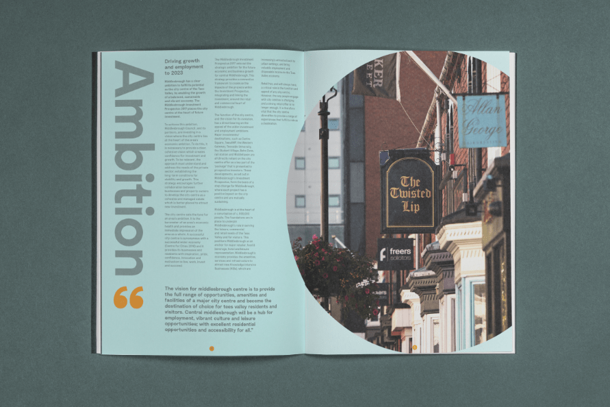
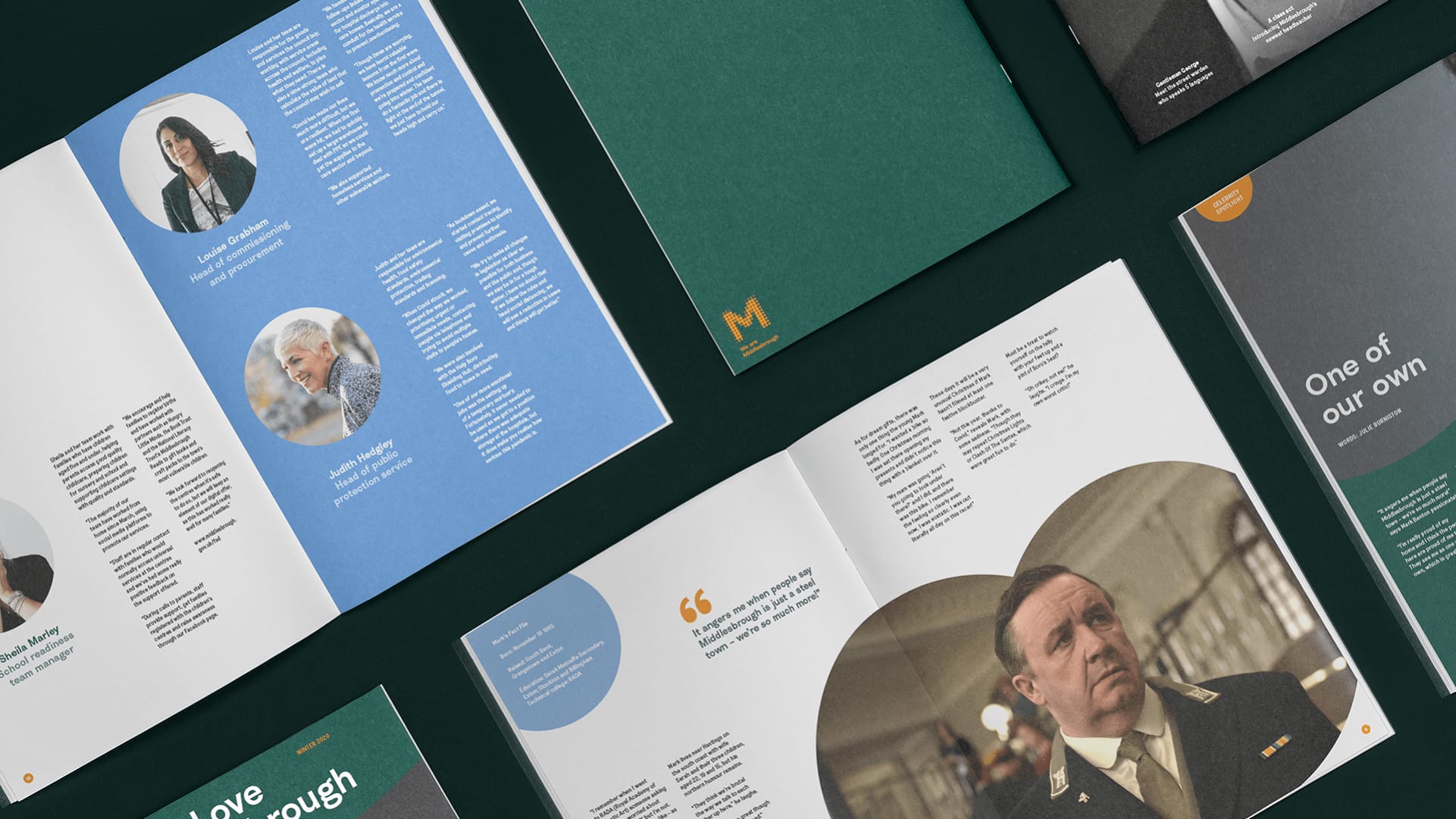
We are one town, with many stories
We heard stories that charm, stories that surprise, stories that make people think again. Stories that would make visitors, locals, investors and businesses see Middlesbrough in a new light.
We make this place... and this place makes us
Once upon a time Middlesbrough built the world; now it’s shaping the future in ways that most people are unaware of. As a place it’s adaptive, agile, down to earth and proud. It’s people are good laughers, hard grafters and fine crafters. They’re creators and entrepreneurs, key workers and volunteers. They’re artists and musicians, designers and engineers. They’re family, friends, community and a place to call home.
We needed to create a brand system that would allow us to tell all the stories of Middlesbrough’s people, places and businesses by leveraging the collective pride of the people who make Middlesbrough.
We are engaging at every level
The combination of our dynamic strapline, grid system and palette ensured that messaging could be appropriate to its context and audience while still feeling like part of a cohesive Middlesbrough brand.
“We are Middlesbrough is designed to build local pride and support businesses all around town. We’re going to tell the stories of our thriving businesses, community stalwarts and fearless young people. The team at the council that worked alongside Better care passionately about Middlesbrough. We love it for what it is and are excited for what the future holds.”
Andrew Glover
Head of Marketing and Communications, Middlesbrough Council
“Having the space to tell uplifting stories from all walks of life is brilliant for us. One of wearemiddlesbrough.com’s biggest strengths is the exposure it gives to businesses. We want people to feel positive about our town. Ultimately that will help put money in the pockets of local families. I’m dead proud that this brand is made in Middlesbrough. Better’s design and development work has been top class.”
Andrew Glover
Head of Marketing and Communications, Middlesbrough Council