
Helping sustainable superflowers bloom
Client
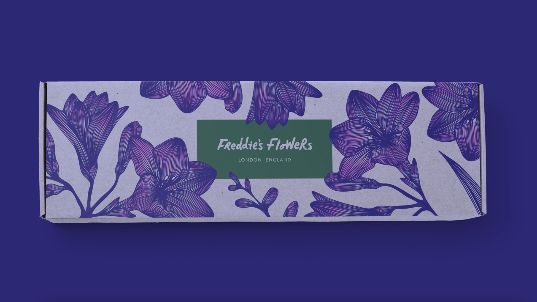
Freddie's Flowers
Project
Freddie's Flowers Brand Codes & Strategy
Services
Sector
The Brief
Because Freddie’s Flowers had grown so organically, the brand needed a little pruning. A new round of investment felt like the ideal time to properly codify Freddie’s brand strategy and identity, readying it for new territories and innovations like gifting. It also served as an opportunity to set Freddie’s apart in a category that had grown somewhat predictable and disposable.
Back in 2015, Freddie Garland started delivering weekly flowers in “a knackered old milk float” to his mum and dad’s neighbours. Since then, the business has grown to over 130,000 happy customers nationwide. Following a $60m investment from The Craftory, Freddie’s enlisted our help to define, clarify and broaden their brand strategy and brand codes.
The Solution
A full brand code audit allowed us to see where the existing brand was failing to live up to its price point and audience, while a strategic overhaul established a clearer point of difference. A new Big Idea and verbal identity along with visual identity refinements and art direction, all established Freddie’s as a premium expert and champion for the restorative power of flowers.
Helping sustainable superflowers bloom
The Brief
Because Freddie’s Flowers had grown so organically, the brand needed a little pruning. A new round of investment felt like the ideal time to properly codify Freddie’s brand strategy and identity, readying it for new territories and innovations like gifting. It also served as an opportunity to set Freddie’s apart in a category that had grown somewhat predictable and disposable.
Back in 2015, Freddie Garland started delivering weekly flowers in “a knackered old milk float” to his mum and dad’s neighbours. Since then, the business has grown to over 130,000 happy customers nationwide. Following a $60m investment from The Craftory, Freddie’s enlisted our help to define, clarify and broaden their brand strategy and brand codes.
Because Freddie’s Flowers had grown so organically, the brand needed a little pruning. A new round of investment felt like the ideal time to properly codify Freddie’s brand strategy and identity, readying it for new territories and innovations like gifting. It also served as an opportunity to set Freddie’s apart in a category that had grown somewhat predictable and disposable.
A full brand code audit allowed us to see where the existing brand was failing to live up to its price point and audience, while a strategic overhaul established a clearer point of difference. A new Big Idea and verbal identity along with visual identity refinements and art direction, all established Freddie’s as a premium expert and champion for the restorative power of flowers.

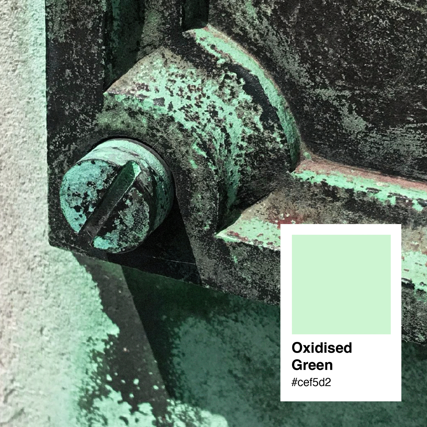
Superflowers
As a guiding principle, it positions Freddie’s not just as a conscious, expert floral creator but as a teacher; an organisation that wants to see flowers reach their maximum potential. This deeper well-being focus for flowers gives Freddie’s a clear point of difference that makes their cut flowers less ephemeral and more enriching. Flowers that leave an impression even after they’re gone? That’s true flower power.

A restorative and rebellious creator
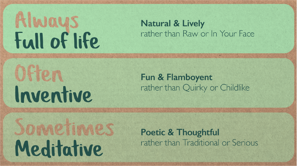
Lively, fun and poetic
Bursting with colour, steeped in knowledge
The Freddie’s voice is full of verve and positivity. It wants you to feel Freddie’s enthusiasm for flowers. It lives in the moment, it's encouraging, celebratory, always amazed by the beauty of nature and it'll often use words that stir the senses.
We never just call a daffodil a daffodil, no, they are the yellow trumpets of spring! And we’re dancing with delphiniums against a backdrop of roaring red snapdragons.
Back to the fuchsias
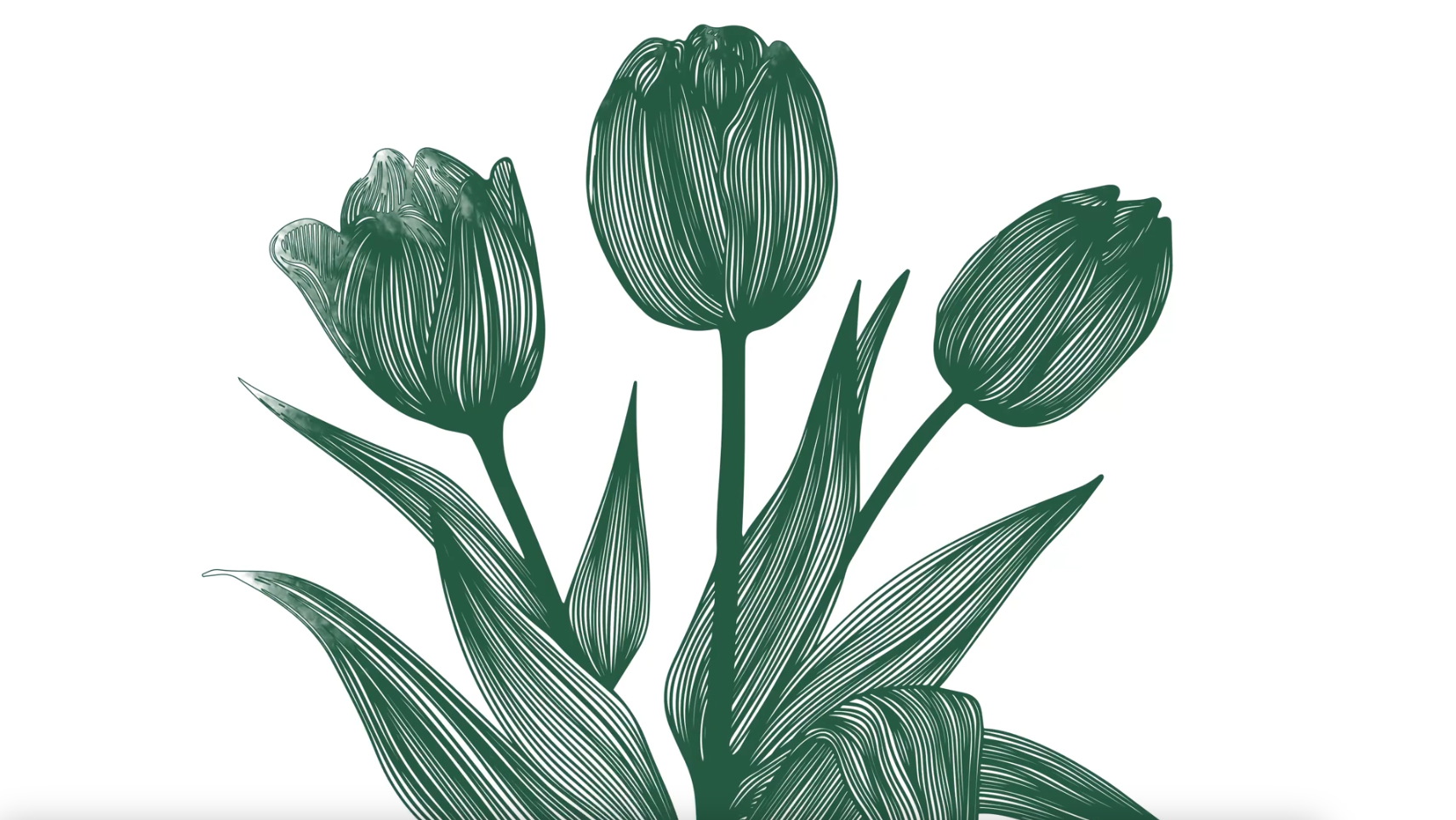
First we recommended far more detailed botanical style illustrations, deliberately cropped close-up in to show the detail of the flowers. The hand of the illustrator here becomes far more expert, it directly references Victorian botanical illustrations which again nods to forgotten meaning and detail about flowers that Freddie’s can reveal.
Evergreen
A touch of seasoning
Every rose has its thorns

“Better fully coded the brand, defined the masterbrand story bringing forward Freddie’s master florist expertise and the quintessential Englishness of his artisanship.”
JP Thurlow
Craft Partner, The Craftory