Redefining kind for the world’s most sustainable diaper
Client
DYPER
Project
DYPER Brand Refinement
Services
Sector
The Brief
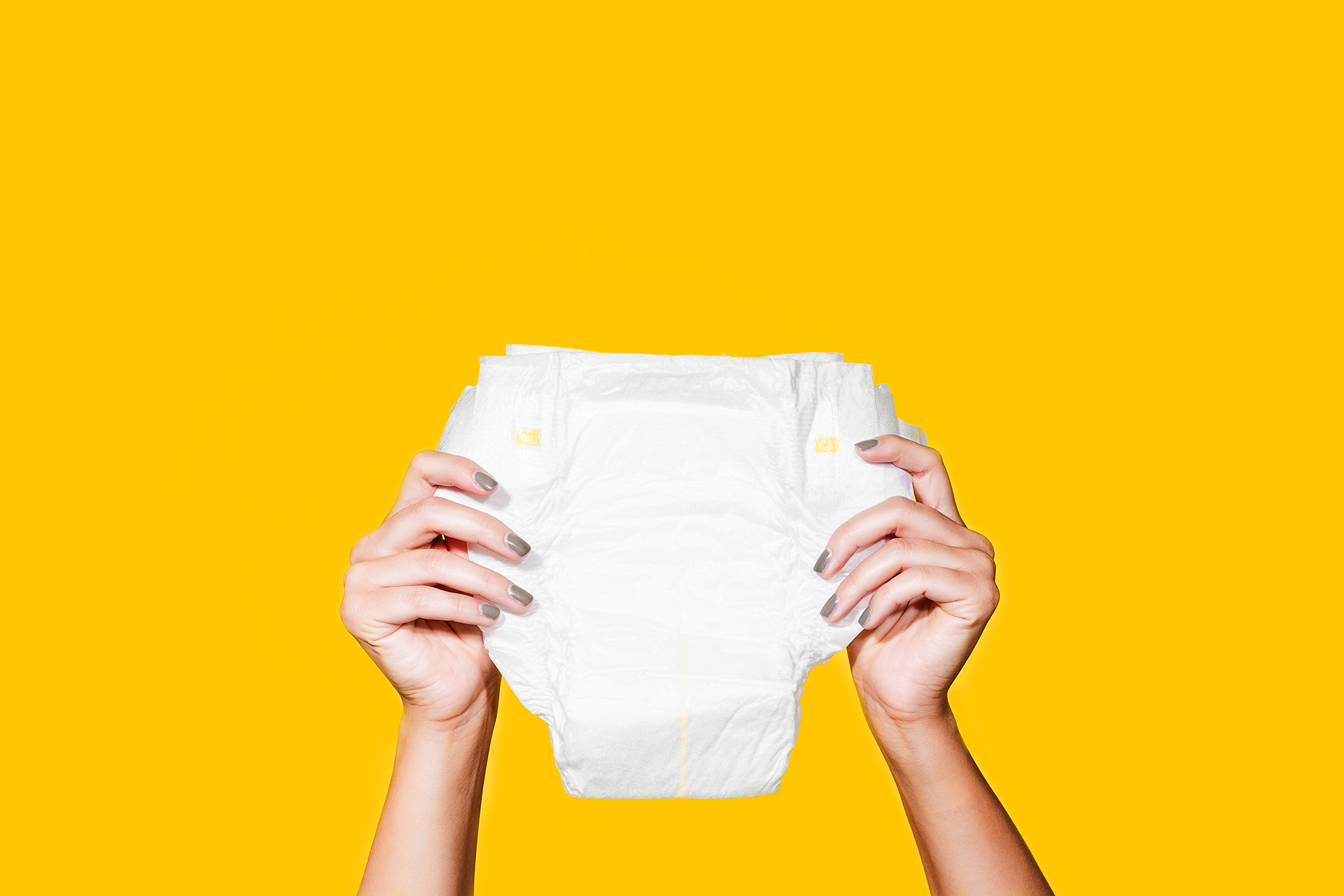
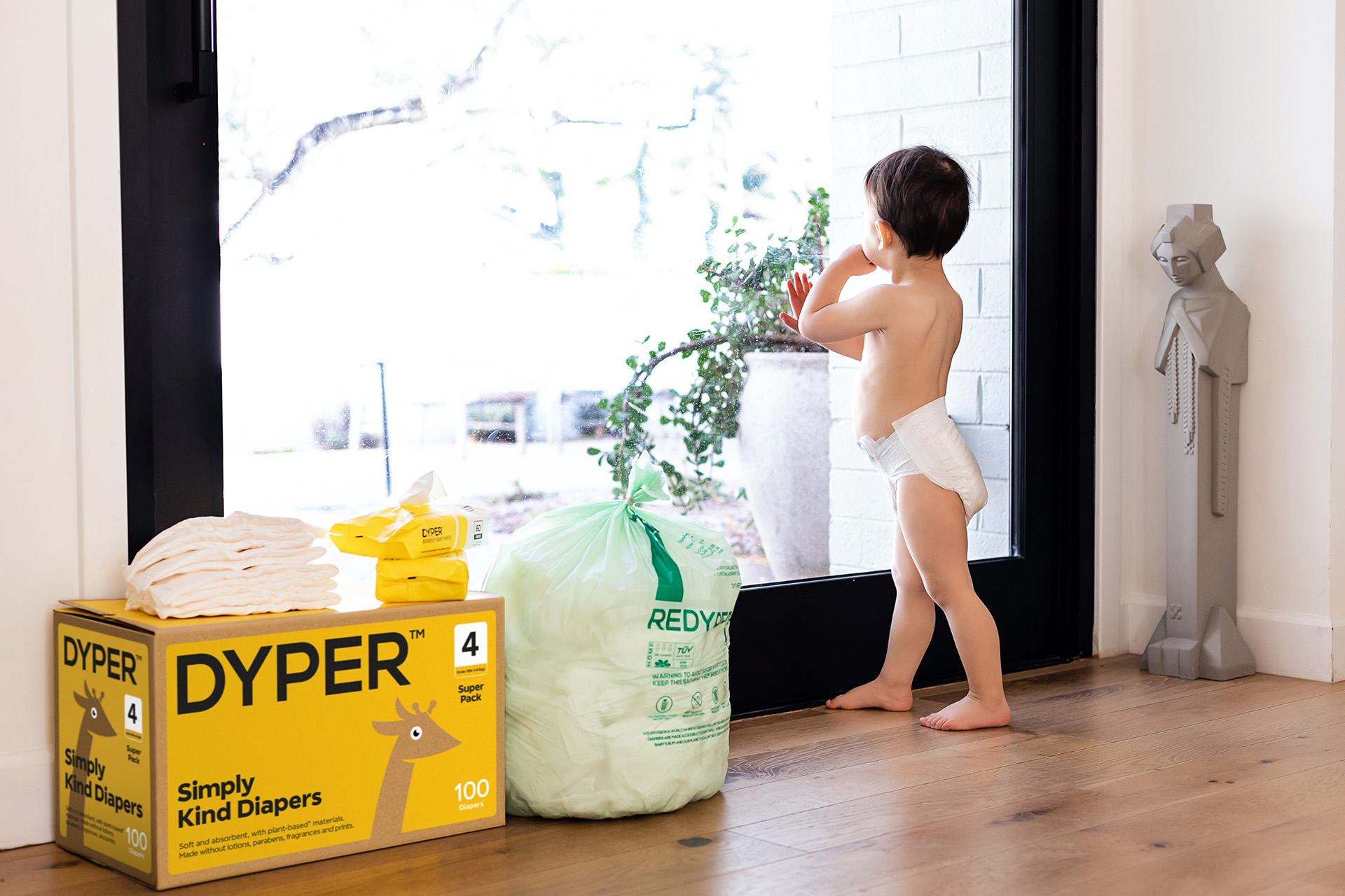
With DYPER taking its first steps from a direct-to-consumer model towards the real-world retail space of Walmart, the baby care specialists engaged Better to refine its strategic brand position, define its most iconic brand codes and evolve its visual system for clarity and on-shelf impact.
Following a new round of investment, DYPER approached Better to help retell its brand story and optimise its visual identity and packaging. With some great foundations in place, this was very much a job of evolution; not only in the way things look but in clarifying the meaning behind those elements and how they could be used.
The Solution
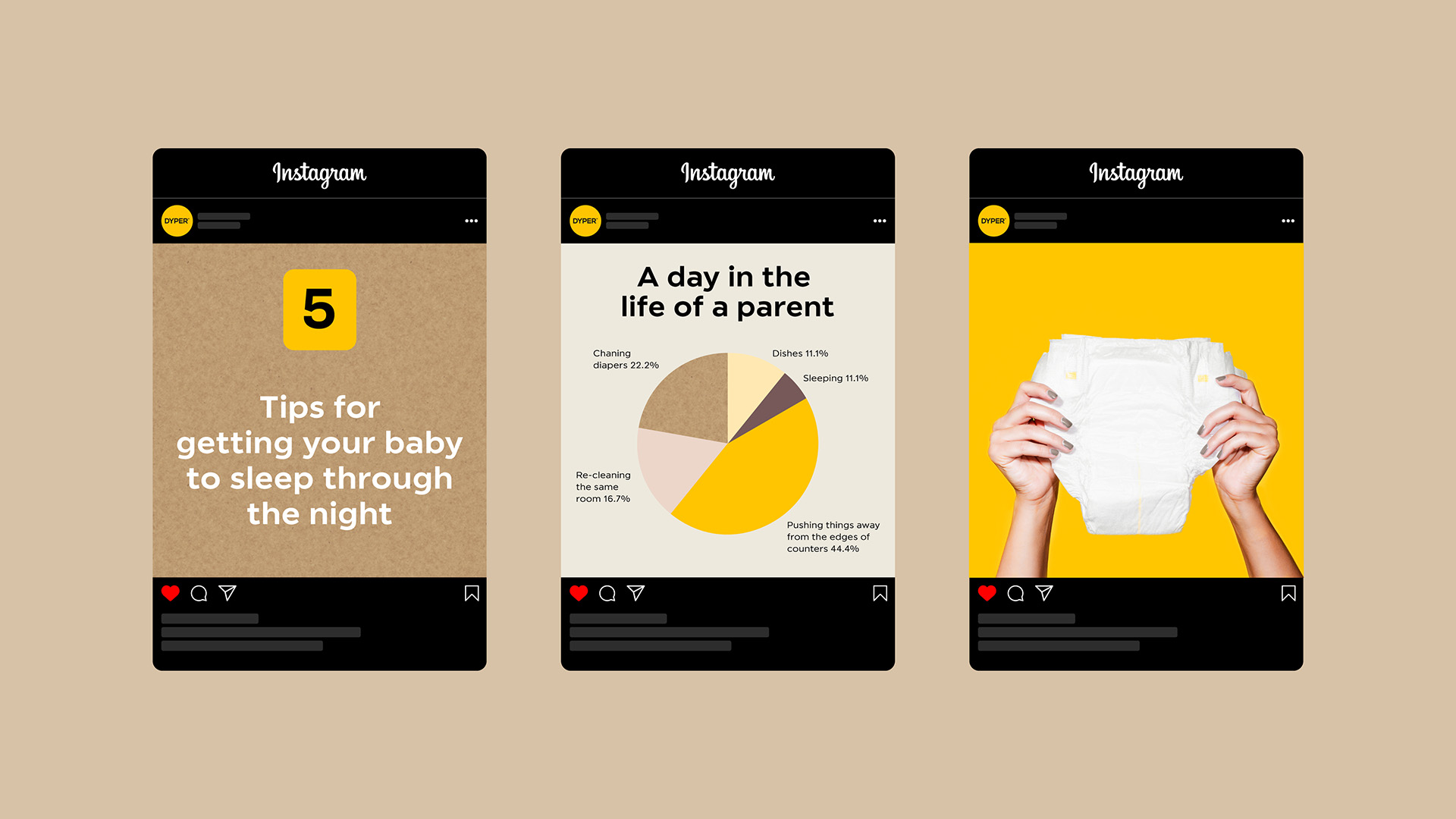
A new brand blade formed the jumping-off point, allowing DYPER to question the concept of kindness in their category. This new thinking allowed us to explore a more meaningful rationale and role for their giraffe mascot, and craft new brand pillars and tone of voice. This work manifested as bold packaging refinements, alongside extensive visual guidelines.
Redefining kind for the world’s most sustainable diaper
The Brief
With DYPER taking its first steps from a direct-to-consumer model towards the real-world retail space of Walmart, the baby care specialists engaged Better to refine its strategic brand position, define its most iconic brand codes and evolve its visual system for clarity and on-shelf impact.
Following a new round of investment, DYPER approached Better to help retell its brand story and optimise its visual identity and packaging. With some great foundations in place, this was very much a job of evolution; not only in the way things look but in clarifying the meaning behind those elements and how they could be used.
With DYPER taking its first steps from a direct-to-consumer model towards the real-world retail space of Walmart, the baby care specialists engaged Better to refine its strategic brand position, define its most iconic brand codes and evolve its visual system for clarity and on-shelf impact.
A new brand blade formed the jumping-off point, allowing DYPER to question the concept of kindness in their category. This new thinking allowed us to explore a more meaningful rationale and role for their giraffe mascot, and craft new brand pillars and tone of voice. This work manifested as bold packaging refinements, alongside extensive visual guidelines.

The power of Y?
Let me be Frank
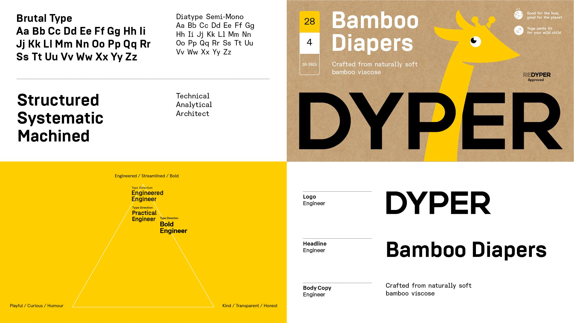
The Giraffe’s logic became clear by establishing a precise archetype blend alongside DYPER’s brand blade. Rechristened Frankie, the giraffe became the embodiment of the Visionary Angineer, an engineer of kind concepts with a vision bold enough (and a neck long enough) to look beyond the category noise.
Innocent questions, visionary answers
Arche-type
The Honest Engineer direction offered the perfect blend of innocence and engineering; with visual characteristics that blended with the bold machined nature of the existing logo and the softer illustrative style of Frankie, our mascot.
Packing a punch
“Working with Better has been transformative for our organisation. We have walked away with category-defining design and branding that is backed by consumer research and honours the identity of our company. Thanks to Better, we are fully equipped to scale to new heights.”
Alex Vailas
SVP, Brand Marketing, DYPER