
Redefining possible for a global operations consultancy
Client
Chartwell Consulting
Project
The Chartwell Rebrand
Services
Sector
The Brief
Following a decade of organic growth, Chartwell was gearing up for its next phase of growth with bold plans to triple in size, broaden its client base and increase outbound marketing. As a catalyst for this transition, the evolved brand must reflect Chartwell's dedication to excellence and its trusted role in delivering meaningful transformation for some of the industry's biggest players.
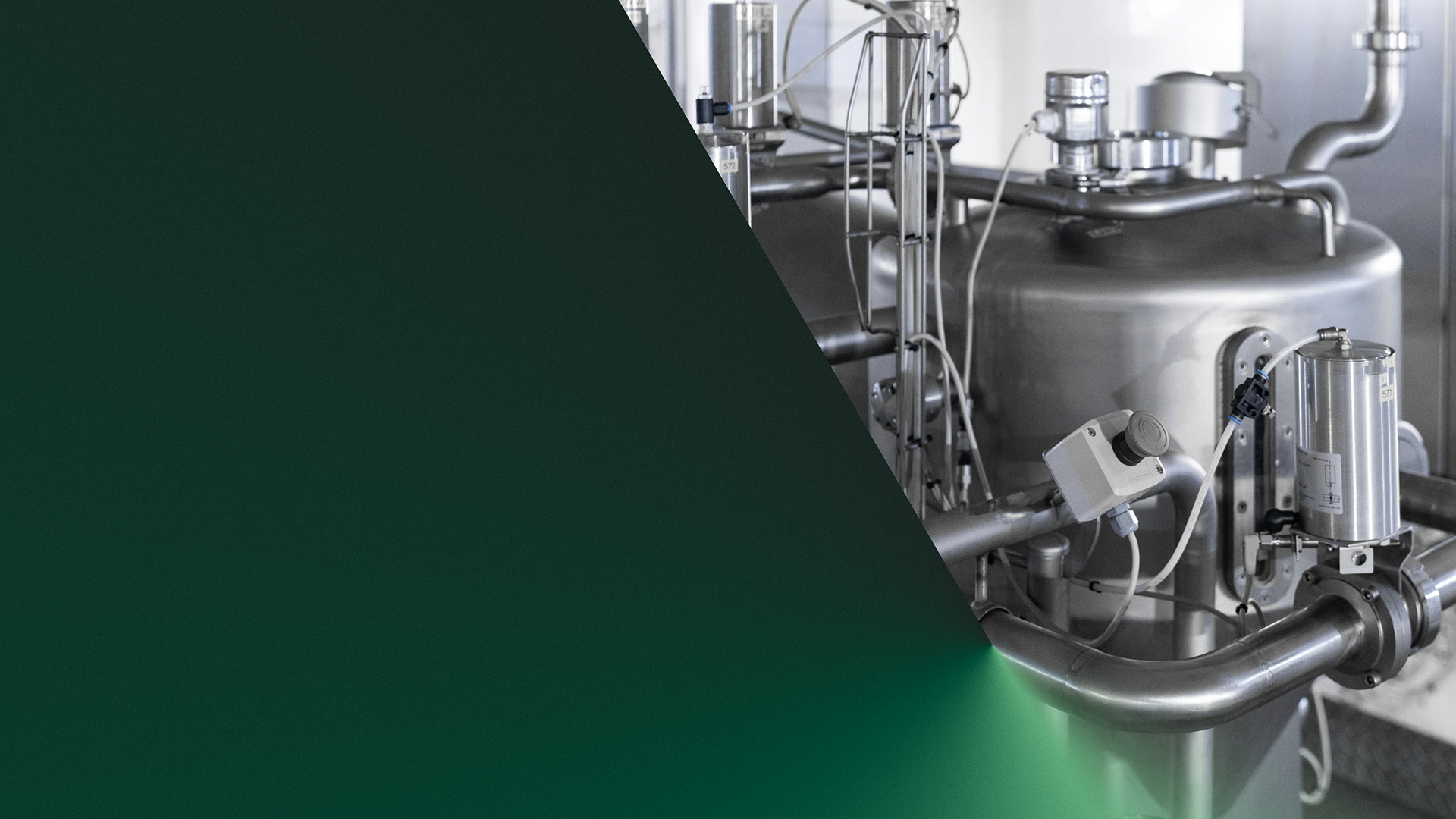
With an international presence spanning Europe, the US and further afield, Chartwell is a high-performance operations consultancy designed for ambitious manufacturing leaders. They unlock hidden potential across industries such as pharmaceuticals, speciality chemicals and consumer goods, delivering swift, tangible results which turn operational inefficiencies into lasting improvements.
The Solution
We built a distinctive verbal identity from the ground up, bringing a consistent voice and authentic narrative that told Chartwell's story. This confidently conveys their unique proposition, effectively communicating what truly sets them apart. After sharpening the strategy, we refreshed Chartwell's visual identity to position it as progressive and adaptable while still appealing to its core audience and challenging bigger competitors.
Redefining possible for a global operations consultancy
The Brief
Following a decade of organic growth, Chartwell was gearing up for its next phase of growth with bold plans to triple in size, broaden its client base and increase outbound marketing. As a catalyst for this transition, the evolved brand must reflect Chartwell's dedication to excellence and its trusted role in delivering meaningful transformation for some of the industry's biggest players.
With an international presence spanning Europe, the US and further afield, Chartwell is a high-performance operations consultancy designed for ambitious manufacturing leaders. They unlock hidden potential across industries such as pharmaceuticals, speciality chemicals and consumer goods, delivering swift, tangible results which turn operational inefficiencies into lasting improvements.
Following a decade of organic growth, Chartwell was gearing up for its next phase of growth with bold plans to triple in size, broaden its client base and increase outbound marketing. As a catalyst for this transition, the evolved brand must reflect Chartwell's dedication to excellence and its trusted role in delivering meaningful transformation for some of the industry's biggest players.
We built a distinctive verbal identity from the ground up, bringing a consistent voice and authentic narrative that told Chartwell's story. This confidently conveys their unique proposition, effectively communicating what truly sets them apart. After sharpening the strategy, we refreshed Chartwell's visual identity to position it as progressive and adaptable while still appealing to its core audience and challenging bigger competitors.

Redefining possible
They find possibility in places that have never been explored, in opportunities their clients didn't even know existed. Possibilities that boost productivity, drive growth and elevate impact.


Tenacious C
This tireless tenacity and commitment to maximise performance helped define a tone of voice that is focused, active and real. Never too blunt or too casual, the purposeful energy of this tone retains a rational straight talking tone that gets things done.


Edge of tomorrow
Engaging and empowering online
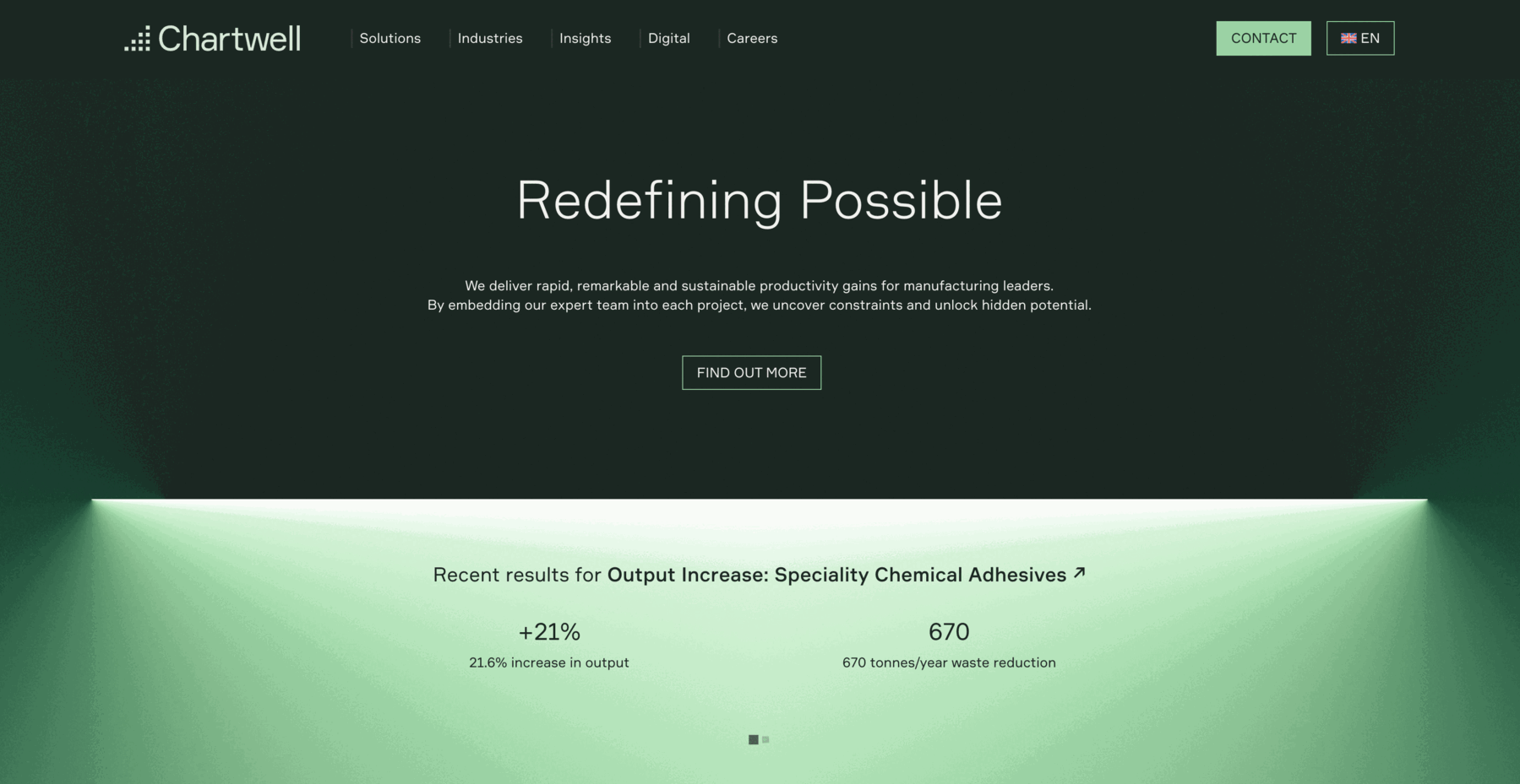
Chartwell’s new website was not only a pivotal component of their brand launch, but it also serves as the primary touchpoint for customers, designed to elevate brand awareness, drive sales, and attract talent. Tailored to their specific needs, the platform showcases Chartwell’s expertise through compelling statistics, featured and related case studies, and thought leadership insights.

Secret Formular
To preserve existing brand equity, the deep green colour palette were both retained with some subtle refinement and extension to include a secondary data palette.

"Driven by a deep understanding of our audience and a commitment to staying ahead in a dynamic market landscape, we are proud to present a brand that reflects our evolution, innovation, and relentless pursuit of step-change improvements."
Sam Scalamogna
Global Head of Marketing, Chartwell


"The rebranding is more than just a new logo or name. It's a comprehensive update of our visual identity, messaging, and user experience, better communicating our core values and meeting the changing needs of our clients."
Sam Scalamogna
Global Head of Marketing, Chartwell