
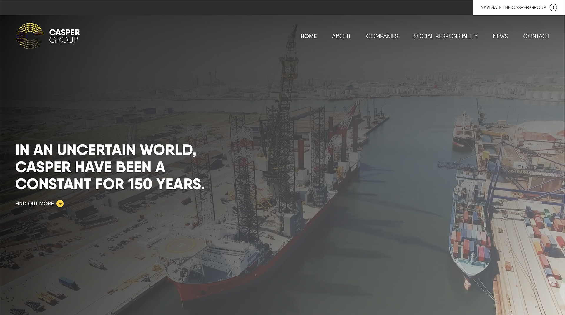
Unifying a 150 year old maritime family
Client
Casper Group
Project
The Casper Group Brand
Services
Sectors
The Brief
As Casper continues to experience consistent growth and new business acquisitions, they needed an aligned brand story and identity which showcased their scale, reputation and full service offering. As well as visual elements, this included the key role of rationalising its architecture, defining its proposition and crucially, unifying disparate divisions into one cohesive family under the Casper banner.
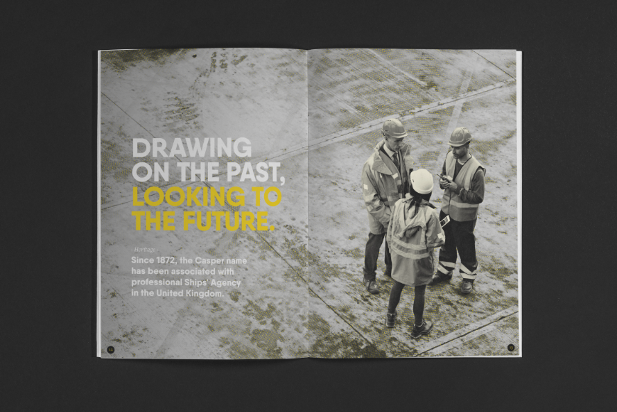
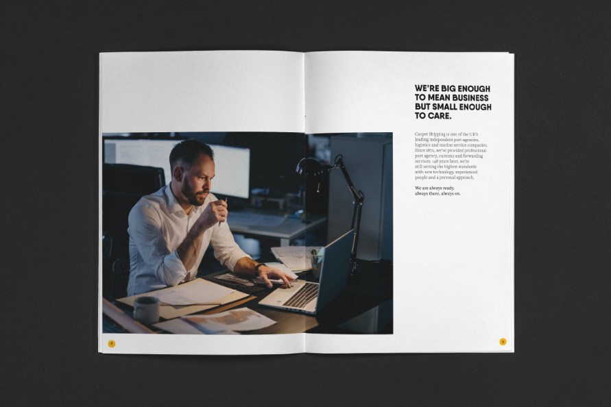
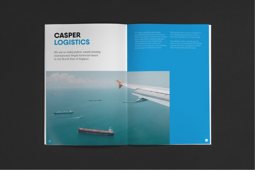
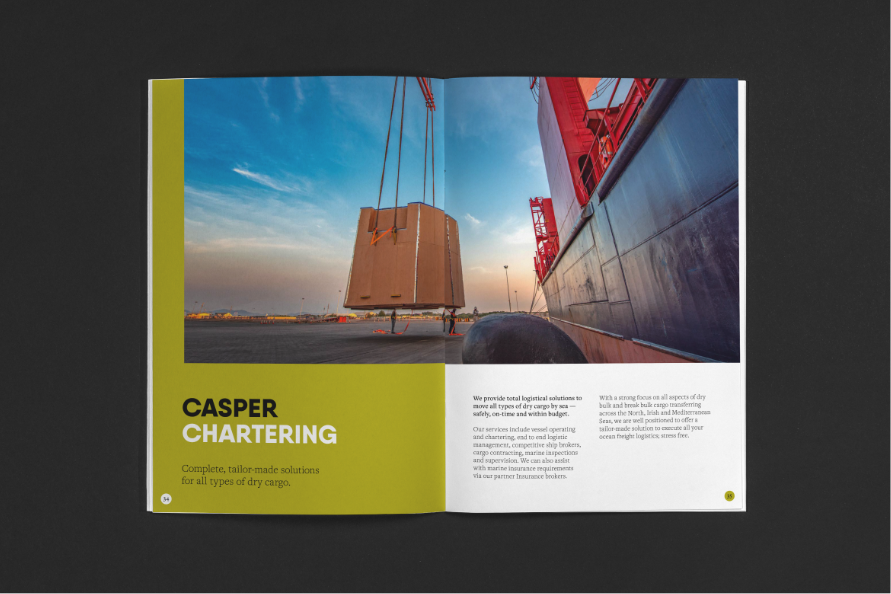
Since 1872, Casper has delivered a comprehensive shipping and maritime service with a professional and personal approach. Drawing on vast experience to offer a proven, ever-ready service, they blend the best of international scale and independent spirit. They also pass on their knowledge to the community, helping to shape future careers through extensive social commitments.
The Solution
Following an extensive DISCOVER phase, we defined Casper as an ever-ready guardian informed by 150 years of experience. They’re ready to offer strong intuitive support when things are going well and a calm, rapid response if things go wrong. Their approachable hands-on sensibility allows them to solve problems creatively, practically and quickly. But most importantly, there was one thing we heard time and time again — they are always there; always ready; always responsive; always present; always available. This unlocked the ALWAYS ON proposition.
Unifying a 150 year old maritime family
The Brief
As Casper continues to experience consistent growth and new business acquisitions, they needed an aligned brand story and identity which showcased their scale, reputation and full service offering. As well as visual elements, this included the key role of rationalising its architecture, defining its proposition and crucially, unifying disparate divisions into one cohesive family under the Casper banner.
Since 1872, Casper has delivered a comprehensive shipping and maritime service with a professional and personal approach. Drawing on vast experience to offer a proven, ever-ready service, they blend the best of international scale and independent spirit. They also pass on their knowledge to the community, helping to shape future careers through extensive social commitments.
As Casper continues to experience consistent growth and new business acquisitions, they needed an aligned brand story and identity which showcased their scale, reputation and full service offering. As well as visual elements, this included the key role of rationalising its architecture, defining its proposition and crucially, unifying disparate divisions into one cohesive family under the Casper banner.
Following an extensive DISCOVER phase, we defined Casper as an ever-ready guardian informed by 150 years of experience. They’re ready to offer strong intuitive support when things are going well and a calm, rapid response if things go wrong. Their approachable hands-on sensibility allows them to solve problems creatively, practically and quickly. But most importantly, there was one thing we heard time and time again — they are always there; always ready; always responsive; always present; always available. This unlocked the ALWAYS ON proposition.
High alert


High contrast


We are unified
It soon became apparent that the overarching Casper Group should take precedence with divisional elements positioned below, followed by services. This was achieved through adaptations of the top level brand, with divisional specific colours adding structure and clarity, while elevating the wider brand presence in-line with already established divisions.


Stronger together

Built on heritage, driven by progress
With history and heritage dating back to 1872, we helped Casper celebrate its 150 year anniversary by designing a celebratory logo. Developed from the existing ‘high alert’ identity, this shines a light on a key milestone that reflects confidence, assurance and peace of mind for customers.

"The brand process and strategic recommendations from Better were the catalyst for our transition to a group offering – helping us to realise our potential and provide consistency and alignment across the organisation. Since then, business acquisitions and new openings have further complemented our family of companies. We’ve evolved from a regional sector specialist to a national business with European satellite offices, numerous divisions and multiple revenue streams."
Michael Shakesheff
Managing Director, Casper Group