
Helping business prosper
Client
Durham County Council
Project
Business Durham Rebrand & Website Development
Services
Sectors
The Brief
With Business Durham’s logo firmly established, across a multitude of physical applications, a key part of the brief was to build on what already existed. Any modification to the existing elements had to be subtle enough to blend seamlessly with pre-existing executions. Alongside this, any new supporting elements had to amplify the brand's aims, be flexible enough to work both on and off screen, and connect sympathetically with the existing elements.
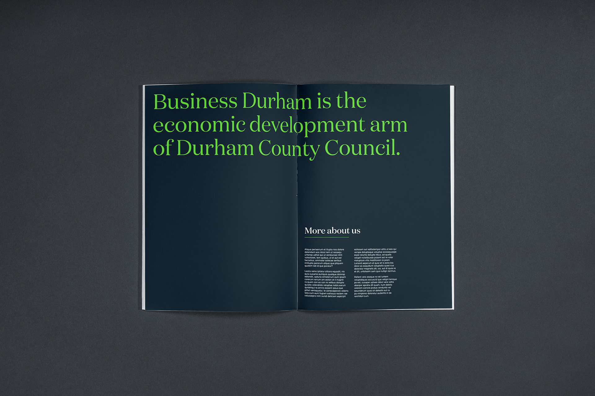
Durham County Council engaged Better to evolve the brand of Business Durham; their economic development arm. Business Durham feeds the economic growth of County Durham by offering guidance and support with funding, as well as sourcing property for new businesses in the region. Because Durham has one of the lowest rates of business start-ups in the country, they are a crucial service offering deep-rooted knowledge and unrivalled, all-encompassing and – most importantly – proven support.
The Solution
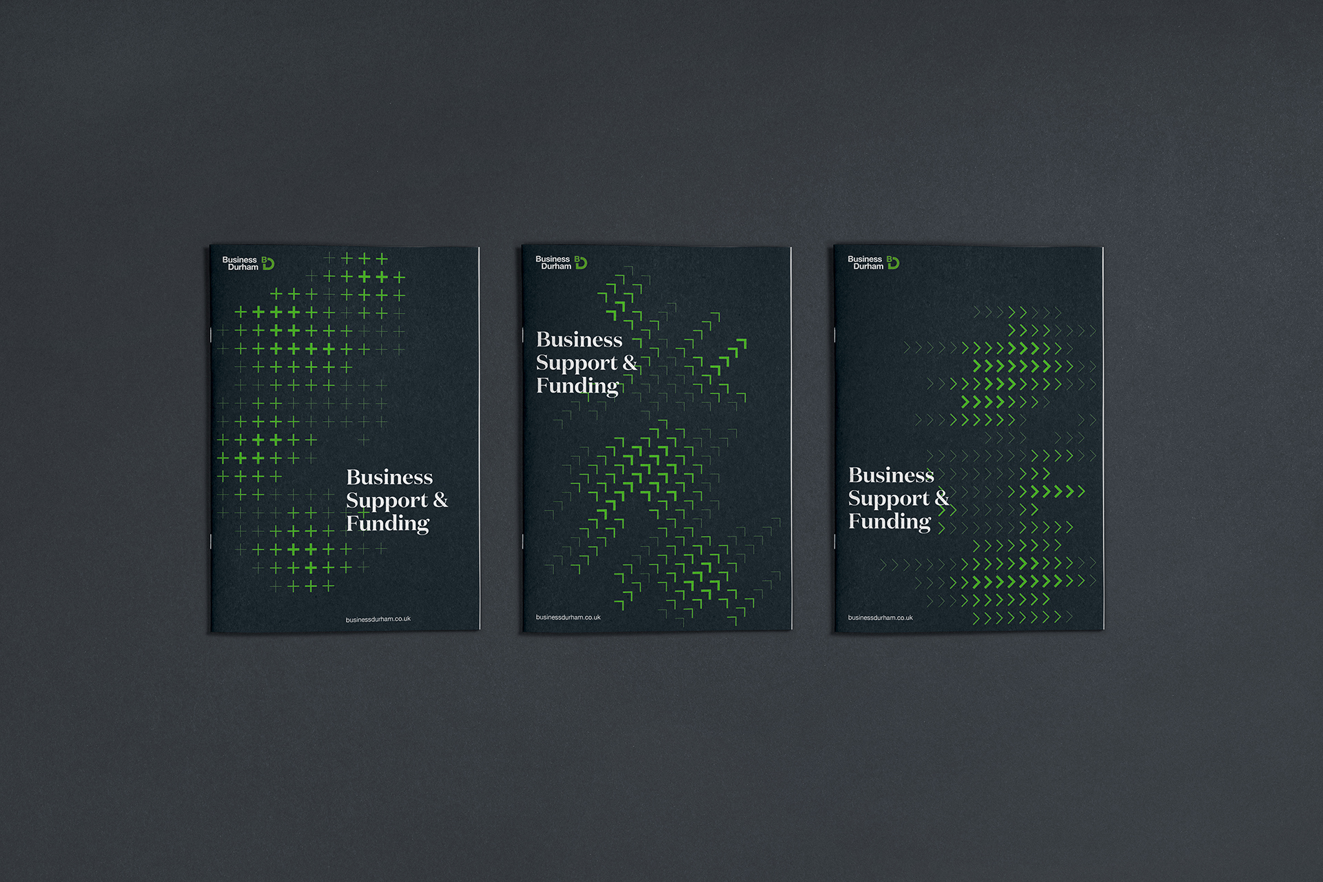
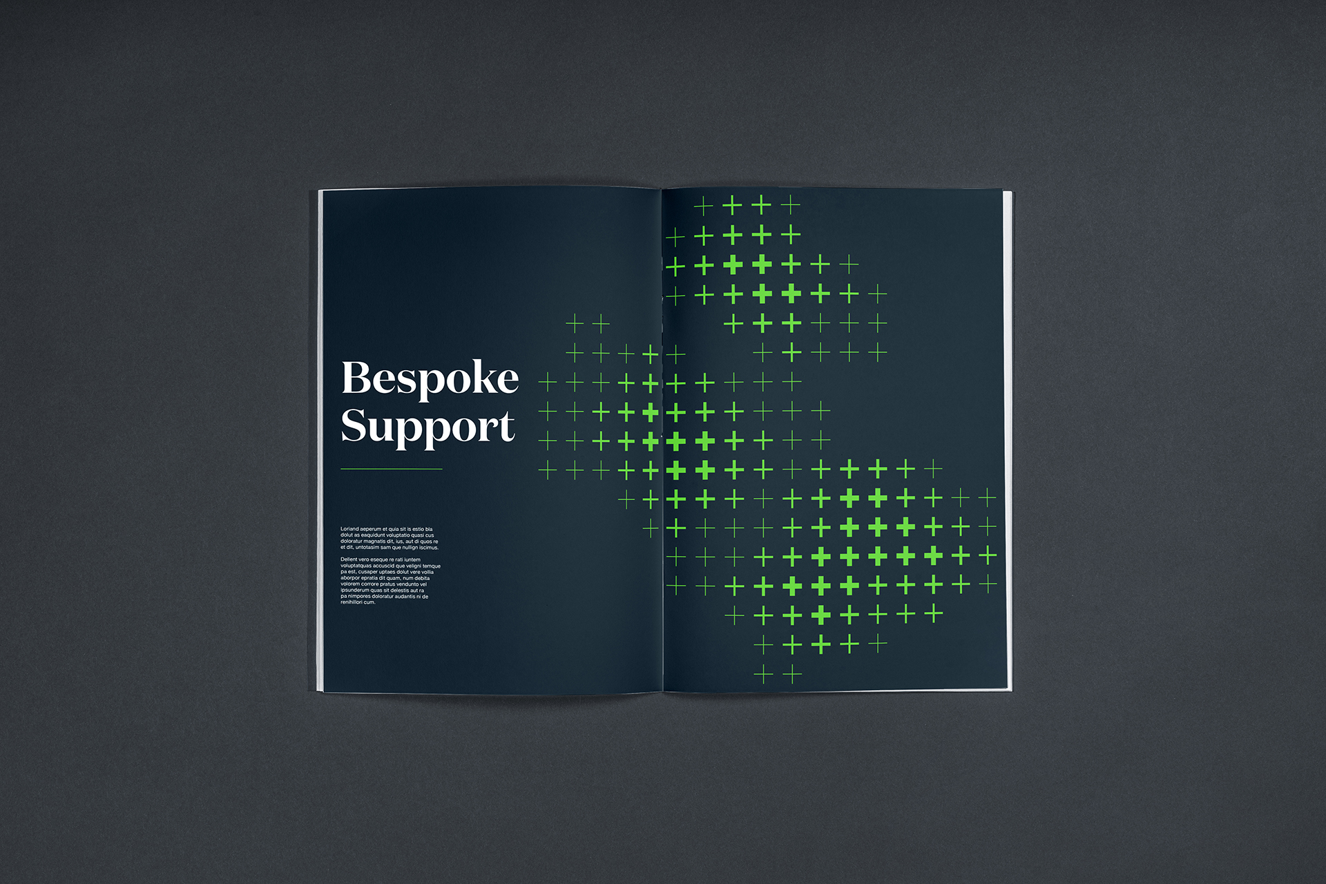
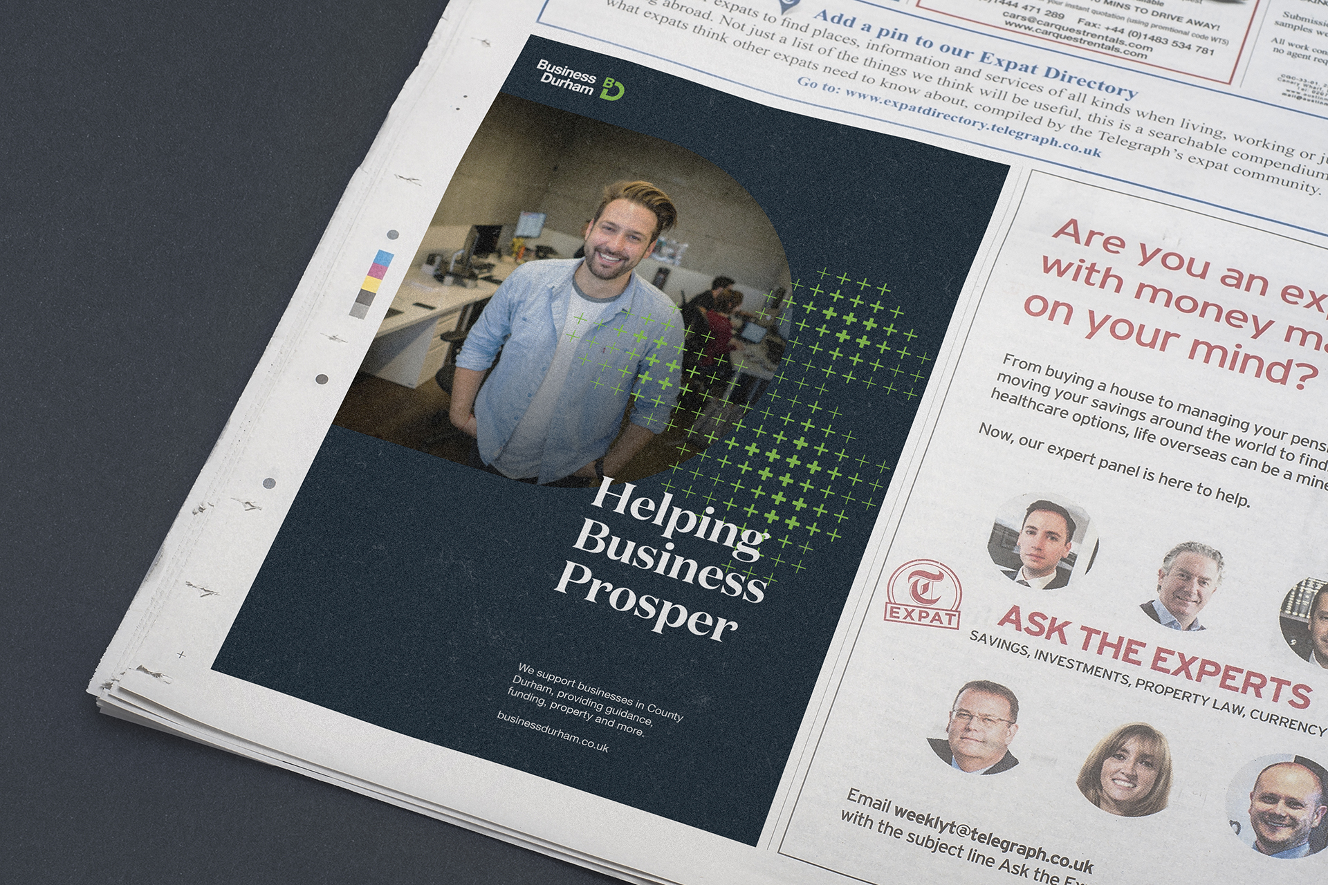
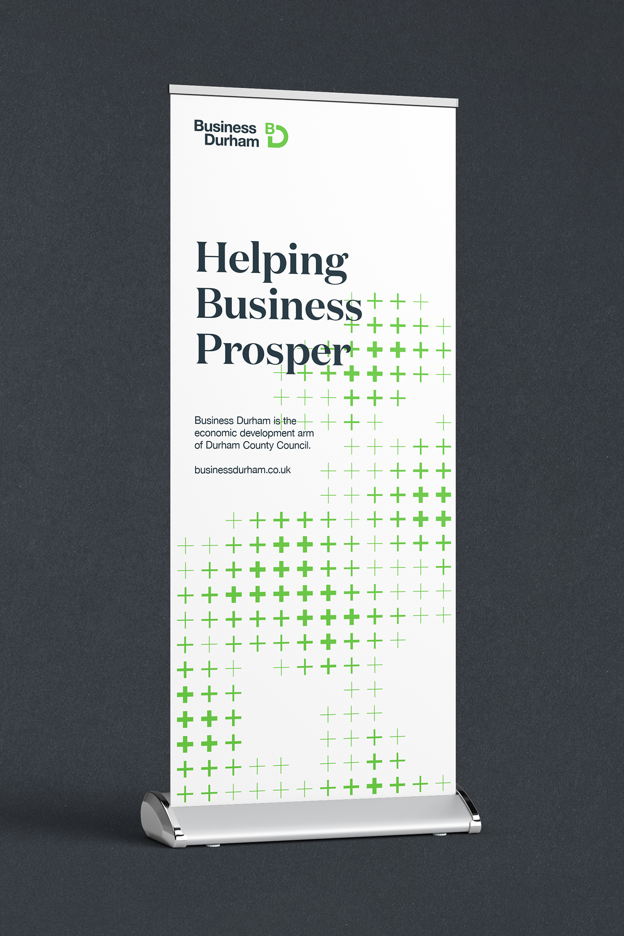
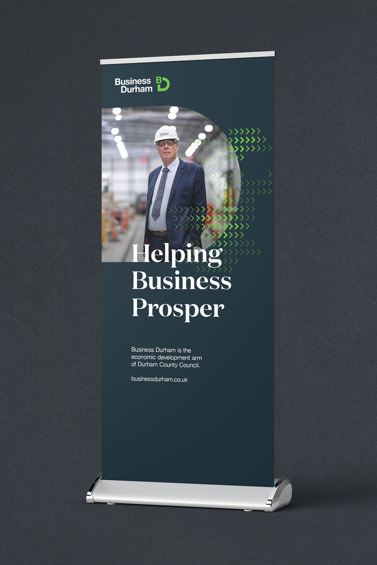
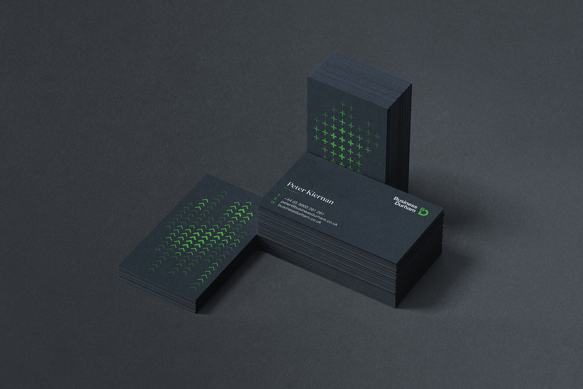
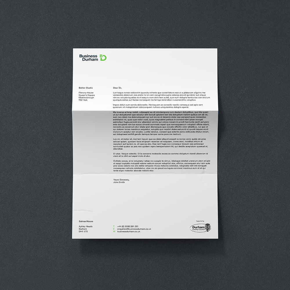
With a ‘blank page’ approach being ruled out, our challenge was to create elements that referenced and complemented the logo: updating and refreshing the supporting brand world, graphic devices, palette and typography to better reflect who Business Durham have become. The result was a versatile D-Frame device, distinctive accompanying typography and a system of dynamic Prosperity Patterns rendered in vibrant green.
Helping business prosper
The Brief
With Business Durham’s logo firmly established, across a multitude of physical applications, a key part of the brief was to build on what already existed. Any modification to the existing elements had to be subtle enough to blend seamlessly with pre-existing executions. Alongside this, any new supporting elements had to amplify the brand's aims, be flexible enough to work both on and off screen, and connect sympathetically with the existing elements.
Durham County Council engaged Better to evolve the brand of Business Durham; their economic development arm. Business Durham feeds the economic growth of County Durham by offering guidance and support with funding, as well as sourcing property for new businesses in the region. Because Durham has one of the lowest rates of business start-ups in the country, they are a crucial service offering deep-rooted knowledge and unrivalled, all-encompassing and – most importantly – proven support.
With Business Durham’s logo firmly established, across a multitude of physical applications, a key part of the brief was to build on what already existed. Any modification to the existing elements had to be subtle enough to blend seamlessly with pre-existing executions. Alongside this, any new supporting elements had to amplify the brand's aims, be flexible enough to work both on and off screen, and connect sympathetically with the existing elements.
With a ‘blank page’ approach being ruled out, our challenge was to create elements that referenced and complemented the logo: updating and refreshing the supporting brand world, graphic devices, palette and typography to better reflect who Business Durham have become. The result was a versatile D-Frame device, distinctive accompanying typography and a system of dynamic Prosperity Patterns rendered in vibrant green.

Frame and success
Helping
Business
Prosper
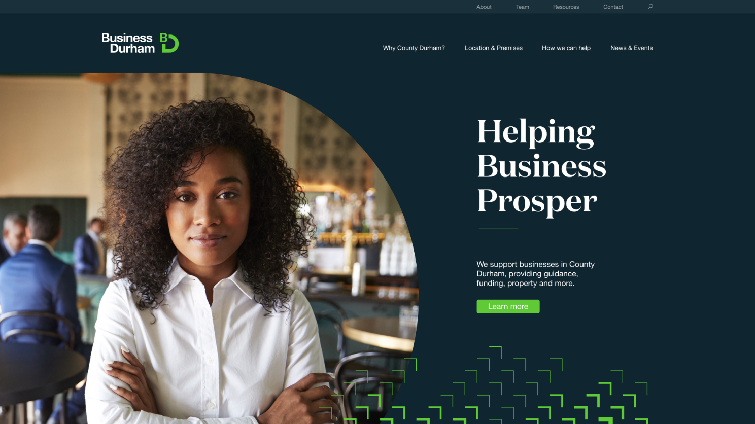
Bringing dynamic support into the digital realm
The Business Durham website is a core part of their marketing toolkit. It provides an essential communication channel to both new and existing businesses as well as stakeholders.
At its core, the site aims to promote the County, sharing success stories and news, offering support and advice, as well as showcasing available commercial property units in the area. More specifically, there were also aims to reduce the overall bounce rate across the website and increase engagement. To help with this, we started with defining the critical user journeys and wireframes, creating a more focused navigation structure. We worked in detail on key pages to ensure the right information balances with crucial calls to action.
Alongside a wealth of information on available support, news and case studies helped promote the success stories and activity within the County. Finally, a custom-built filterable property search and tenant directory add further functionality to help users find what they’re looking for and further promote the diversity of businesses in the area.


Setting the scene
“The talented team from Better were excellent in teasing out any views, ideas, concerns and issues and exploring each one. They were able to deal with some challenges expertly with tact and diplomacy, bringing the whole team along to a conclusion which everyone agreed to. A particular highlight was the process of engaging colleagues, impressing upon them the need for change and thinking about the personal and organisational impact for the businesses we support. The introspection was not expected when we set out on this journey, but it was a welcome benefit.”
Peter Kiernan
Marketing Manager, Business Durham

Proper guidance

“As we emerge and recover from lockdown, now more than ever, we need to provide our clients with the type of guidance, reassurance and confidence we feel we can offer and that now our brand and website reflects.”
Peter Kiernan
Marketing Manager, Business Durham