
15.03.23
Opening minds and freeing taste buds
HIPPEAS are all about peas, love and understanding. We helped reset their strategic approach to attack the category establishment while planting the seed for product expansion and growth.
 Written by James Bolton
James Bolton
Written by James Bolton,
Brand Strategist
In a category that can be joyous, juvenile and harmful in equal measure, HIPPEAS are reshuffling the pack. What began life as a smart idea for a single product brand, was now at a crucial tipping point.
Following a $50m investment from The Craftory, and some new high-level hires, HIPPEAS enlisted our help to reshape and broaden their brand strategy.
Product innovation and new packaging formats meant they’d quickly outgrown their original verbal and visual identity. To pave the way for the next stage of growth, they needed to evolve their brand system while honing in on a unifying Big Idea. Our task was to find this single, all encompassing central strategy that would serve as a larger and more robust platform for portfolio extension. At the same time, we needed to sharpen their story of far-out flavour and natural nourishment; two things that have traditionally been depicted as enemies by the category, but with HIPPEAS they live together in perfect harmony.
Stick it to the man
Snacking is one of life’s simple pleasures. The taste. The crunch. The temporary respite from hunger, boredom and low-mood. A cheeky but rewarding break from the fractured rhythms of modern life. It’s something we all indulge in.
But snacking currently exists in a blinkered, deceptive headspace. Pretending to be naive and consequence-free, it’s a category that intentionally plays on our desire for an occasional release. It exploits the time when our logical defences are down. It can be extreme, regressive, even dangerous.
For decades, snacking has established an accepted narrative: ‘snacking isn’t good for you – but that’s okay. After all, what harm can 30 grams do?’ Well, when it’s monocropped, over-processed, cut with nasty chemical additives and harmful to the environment… actually quite a lot.
The ingredients of this destructive recipe fit a certain agenda and business model – in the pursuit of profit, addictive low-cost junk reigns supreme. If that comes at the expense of people and the planet, then so be it. It’s a system where even ‘better for you’ options are really the best of the worst. Sure, the big players taste exciting – or at least they seem to – but that’s only because they’re packed with freaky franken-foods that are almost impossible to match naturally.
But revolution is in the air. With the world and our health at stake, the time has come to question authority; to challenge the system; to stick it to the man. What if a snack could taste good, be good and do good?
The revolution will be snackisfied
As a category, snacking plays on fun, happiness, satisfaction and nostalgia. By its very nature, it brings joy and a juvenile simplicity to everyday life. While we certainly didn’t want to change that, we did want to start having a more mature, grown up conversation about what snacking should be, and why it doesn’t have to be unhealthy.
Inherently, we wanted to change people’s snacking consciousness. A big challenge when faced against the might and millions of the corporate machines, but a cause that HIPPEAS were born to fight for.
As well as identifying and assessing the distinctiveness of elements like the name, logo, and packaging components, our process allowed us to create a richer Big Idea that could become the strategic springboard for any future product and brand expansion. A new verbal identity, including tone of voice, was developed alongside values and guiding principles, all ready to feed into upcoming campaign work.


The refined strategy directly aligns to HIPPEAS’ main health and sustainability claims, expanding on the hippy heart of the brand and staying flexible enough to evolve in an ever-changing category. At the core of this is a single-minded proposition that answers the needs of consumers – who want all the taste AND all of the health – while also being a true expression of what HIPPEAS are doing.
“As an internal GPS for product innovation and marketing, the idea is simple and direct enough to be easily applicable but that doesn’t mean it can’t be fun. Toned brand language helps to make the idea all the more memorable internally, making it more likely to be referenced consistently.”
John Taylor
Creative Director, Better
A packetful of sunshine
To reinforce this compelling reason to buy and further stress-test the new verbal identity, signature phrases and a manifesto were developed that unpack exactly how HIPPEAS will improve the world, the category and society. These act as a unique and powerful reminder of who HIPPEAS are and why they’re here. It also anchors their values and points of difference, as well as what’s truly important to the cause.
JP Thurlow, Craft Partner at The Craftory said: “The HIPPEAS Big Idea is a great example of taking the grain of something cool then expanding it to work for a much bigger brand future. It plays with language in a way that’s distinctive and direct but, crucially, it paves the way for growth by attacking the category dichotomy.”
One of our other key findings was that both the category landscape and HIPPEAS’ archetype gives them licence to deliver an important message with a smile. They might be provocative and serious about their cause, but everything they do is designed to brighten each day; even the packaging smiles right back.

Equally, it reinstated our belief that this was a brand that could – and in fact should – borrow from pop and counterculture. Its name was the golden ticket, but that didn’t mean it could turn into a haze of lazy tie dye clichés. Instead, it was about making 60s references fun and relevant to today’s world of snacking.
“Better created a platform that struck a delicate balance between retro nostalgia and relevancy; between the spirit of ‘67 and the reality of ‘23. There is real value added by defining where that line should be drawn.”
JP Thurlow
Craft Partner, The Craftory
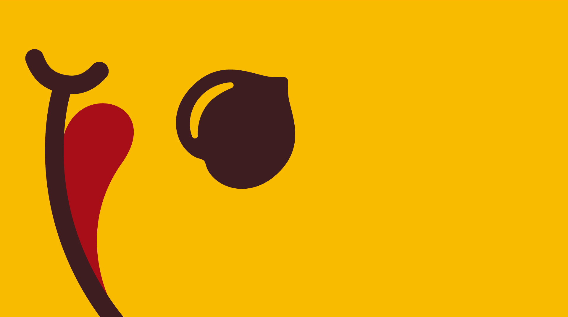
As well as the verbal executions, we assessed the disparate visual codes at play. From the bright yellow canvas and California photo style to acid house patches, surfers and sustainable farmers; it was a fairly messy mix, playing vaguely on a hippy happy, alternative lifestyle.
But beneath the sun kissed surface, most of these elements added little relevance or distinction to the brand. By identifying the Big Idea, this gave us a dominant concept against which to judge what to retire, what to keep, and what to develop. From there, things started to come into focus, harmonising and adding true meaning for each worthy component. This brought the brand to a place that takes a Summer of Love aesthetic, reinvented for the modern day.
Turn on, tune in, drop out
Using nature as the ultimate source of nutrition and sustainability, HIPPEAS are creating a healthier but flavour savouring snack choice. In a category with a short-sighted, childlike mindset, they’re growing up with a true sense of hope, love and humanity.
Armed with a stronger, differentiated strategy and tactics that amuse, surprise and provoke, HIPPEAS debunk category norms, turning the world on to new behaviours, while dropping out of the conventional approach to junk snacks. Positive stimulation, entertaining activism and a celebration of the humble chickpea sees HIPPEAS draw on sensory pleasures to elevate their message and deliver far-out flavours that never compromise health.
No more, will good taste mean bad health. No more, will good for you mean bad for your taste buds.
Snackrifice is dead. Long live maximum snackisfaction.
To find out more about our work across CPGs and challenger brands, head to our projects.


