06.09.19
New website launches for best-selling author, Philippa Gregory
We’re proud to launch the new website for historical novelist and author, Philippa Gregory.
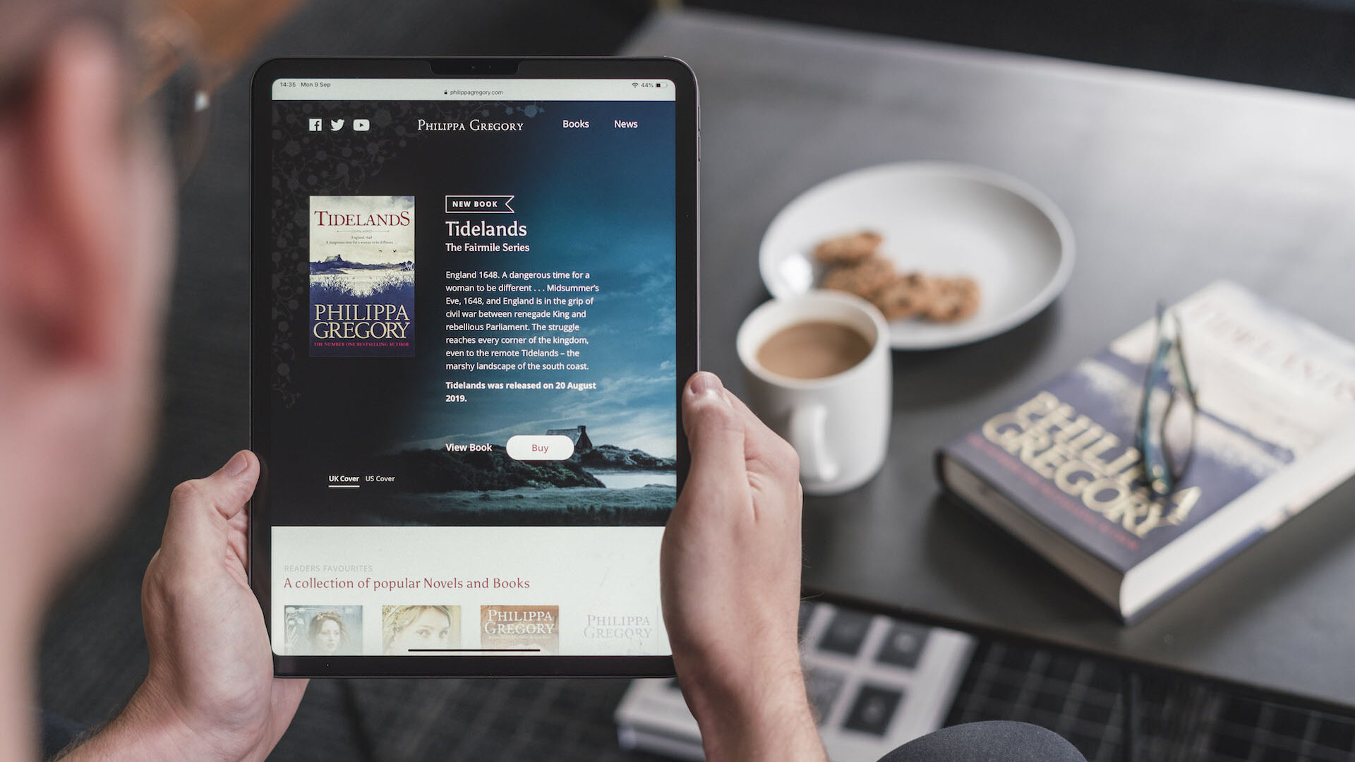
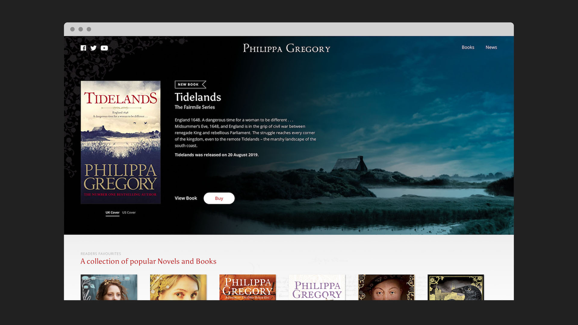
We’re proud to launch the new website for Philippa Gregory. Cementing our 10 year digital partnership, this is the third site we’ve launched for The Sunday Times Number 1 best-selling author.
The second site, launched five years ago, was recognised by Awwwards and NET magazine for its industry leading features. Since then, a lot’s changed. Not only in terms of design trends and user behaviour, but also in the way both readers and viewers consume their favourite books and shows. So, alongside the essential technical upgrades it was time for a visible change in the user experience. Our objective was to follow in the footsteps of the content streaming giants and craft a website experience that felt intuitive and informative as well as being fit for the future.
As with every digital project we started by working closely with Philippa, her team and her publisher Simon & Schuster to identify the key users, understand their goals and map out the user journey. This allowed us to sketch wireframes for key pages. With such a wide readership, spread across an international audience, there were a number of user challenges to consider.
Despite her traditional hardcopy past, many of Philippa’s readers are now consuming her books digitally through audiobooks, e-readers, tablets and phones. Nowadays digitally savvy readers expect more. They want to find more books in the same series, understand how books and storylines are interconnected or related. They also expect to be able to preview audio snippets, find the story behind the book, understand chronology, or even find a translated version of a book. And they want to be able to do all this quickly and in one place.
With such an impressive back catalog of books, including the White Queen which was turned into a Golden Globe nominated series by the BBC, Philippa’s fans could often be reading different books, from different series, at different stages. As a result, the presentation and timelines of books had to be carefully considered.
Scoping user journeys and wireframes is vital to a project like this in order to build a website which is aligned to their needs, as well as the wider commercial goals of the website.
Through the exploration of different layouts we agreed upon a design approach aligned to that of streaming services such as Netflix and Amazon Prime. With a horizontal timeline approach, we made use of the easily recognisable cover images grouping the books by series, and through simple interactions, offered key information behind a book. This helped create a useful and engaging experience which felt familiar and easy to navigate.
The site also had to incorporate a shopfront that users could easily navigate, before linking to external selling sites such as Amazon, Waterstones and Apple Books. The introduction of more prominent buy links, including options for different territories, means that users everywhere could find exactly what they were looking for.
The revamped news section offers updates, videos and posts from Philippa. Browser friendly audio snippets, better use of video and imagery provides far richer experience and visual appeal, helping to bring the worlds Philippa creates to life and better promote her books.
"We're thrilled with the site's new design. There's a huge amount of content but with some clever design elements, the team at Better has been able to balance the needs of our publishers and our readers, making a site which is simple, intuitive, and very beautiful."
Zahra Glibbery
CEO, Levon Publishing

"It’s been fantastic working with the Philippa Gregory team again building on the success of the last website. Authors websites are often quite un-inspiring, but they shouldn’t be! By building on the way streaming services deliver and display content, then aligning this to Philippa’s books, our approach helped readers get the right information quickly. It’s an intuitive and familiar experience that evolves Philippa’s online presence into 2019 and beyond. "
Adam Gatenby
Digital Director, Better
Overall the new website is a natural visual evolution of the online brand but one that is closely aligned to the needs and trends of 2019. As ever, a lot of love and hard work has gone into this project and building on the success of the previous website was a challenge but one we loved being part of.
You can visit the new website here.


